%22%3E%3C/path%3E%3Cpath d=%22M 63.072 7.554 C 62.258 8.022 61.577 8.689 61.092 9.493 L 61.092 7.076 L 57.158 7.076 L 57.158 22.64 L 61.089 22.64 L 61.089 14.888 C 61.089 13.446 61.403 12.434 62.03 11.853 C 62.818 11.218 63.818 10.907 64.826 10.982 L 65.868 10.982 L 65.868 6.851 C 64.891 6.834 63.926 7.076 63.073 7.554 Z%22 fill=%22rgb(17,17,17)%22%3E%3C/path%3E%3Cpath d=%22M 78.916 7.82 C 76.363 6.49 73.321 6.49 70.768 7.82 C 69.562 8.473 68.564 9.451 67.888 10.644 C 67.167 11.931 66.803 13.387 66.834 14.862 C 66.804 16.332 67.157 17.785 67.86 19.077 C 68.515 20.267 69.494 21.246 70.684 21.901 C 71.924 22.576 73.318 22.92 74.73 22.898 C 76.164 22.918 77.58 22.575 78.846 21.901 C 80.062 21.247 81.073 20.27 81.768 19.077 C 82.506 17.797 82.88 16.339 82.85 14.862 C 82.88 13.389 82.517 11.934 81.797 10.647 C 81.12 9.455 80.122 8.477 78.917 7.824 M 78.803 14.862 C 78.829 15.739 78.636 16.608 78.241 17.391 C 77.903 18.046 77.38 18.588 76.738 18.95 C 76.124 19.293 75.432 19.472 74.729 19.47 C 73.668 19.497 72.648 19.061 71.934 18.276 C 71.139 17.323 70.741 16.1 70.823 14.862 C 70.741 13.62 71.149 12.395 71.959 11.45 C 72.687 10.667 73.715 10.233 74.783 10.256 C 75.859 10.236 76.894 10.67 77.635 11.45 C 78.464 12.387 78.884 13.616 78.801 14.864%22 fill=%22rgb(17,17,17)%22%3E%3C/path%3E%3Cpath d=%22M 95.906 7.076 L 95.906 15.646 C 95.975 16.68 95.643 17.701 94.979 18.498 C 94.311 19.184 93.379 19.547 92.422 19.495 C 91.475 19.544 90.553 19.18 89.894 18.498 C 89.23 17.701 88.898 16.68 88.967 15.646 L 88.967 7.076 L 85.033 7.076 L 85.033 16.207 C 85 17.449 85.275 18.68 85.834 19.79 C 86.327 20.75 87.095 21.542 88.039 22.065 C 89.033 22.594 90.145 22.861 91.271 22.838 C 92.188 22.847 93.095 22.65 93.926 22.263 C 94.708 21.905 95.388 21.36 95.906 20.675 L 95.906 22.645 L 99.865 22.645 L 99.865 7.076 Z%22 fill=%22rgb(17,17,17)%22%3E%3C/path%3E%3Cpath d=%22M 4.513 15.626 C 4.511 10.815 7.606 6.549 12.181 5.059 C 16.756 3.57 21.77 5.195 24.601 9.086 L 27.816 5.87 C 24.074 1.186 17.981 -0.943 12.137 0.393 C 6.292 1.728 1.728 6.292 0.393 12.137 C -0.943 17.981 1.186 24.074 5.87 27.816 L 9.085 24.601 C 6.214 22.512 4.515 19.177 4.513 15.626%22 fill=%22rgb(32,62,235)%22%3E%3C/path%3E%3Cpath d=%22M 17.114 14.343 L 13.354 18.01 L 13.354 18.026 L 21.071 18.026 L 11.412 27.609 L 17.389 27.609 L 23.999 21.081 L 23.999 28.316 L 24.005 28.316 L 27.967 24.393 L 27.967 14.343 Z%22 fill=%22rgb(32,62,235)%22%3E%3C/path%3E%3C/g%3E%3C/svg%3E) ×
× ××
××›
›
›
›
Best practice landing page 2026: what actually converts
Best practice landing page 2026: what actually converts
Best practice landing page 2026: what actually converts
Best practice landing page 2026: what actually converts
Best practice landing page 2026: what actually converts
Best practice landing page 2026: what actually converts

Author
Aljaz Peklaj

Your outbound is busy, your paid clicks are coming in, and the calendar still looks thin. That usually means the landing page is filtering the wrong way. The page is asking visitors to decode your offer before it earns trust.
Message match beats decoration when the click promise and first screen disagree.
Dedicated pages benchmark better than sending traffic to a homepage, with a median dedicated landing page conversion rate of 6.6% across a large benchmark set of 41,000 landing pages, 464 million visits, and 57 million conversions (Unbounce benchmark report).
Traffic source changes the winner, because cold outbound and warm inbound need different page logic.
One proof point under the headline can do more than a wall of logos.
Your page should qualify, not just persuade, or sales ends up sorting through weak leads.
Table of Contents
Why most B2B landing pages leak pipeline before the scroll
A paid search visitor lands on a demo page, scans the hero, and still cannot tell whether the offer is for their role, their budget, or their stage. That is not a design problem. It is lead leakage, the page pulling qualified attention out of the funnel before the first scroll. See lead leakage for the broader definition.
The benchmark gap matters. A median dedicated landing page sits at 6.6% conversion across a massive sample, while the 75th percentile is 11.4% and the 25th percentile is 1.0% (Unbounce benchmark dataset). That spread tells you “good” is a distribution, not a style choice.
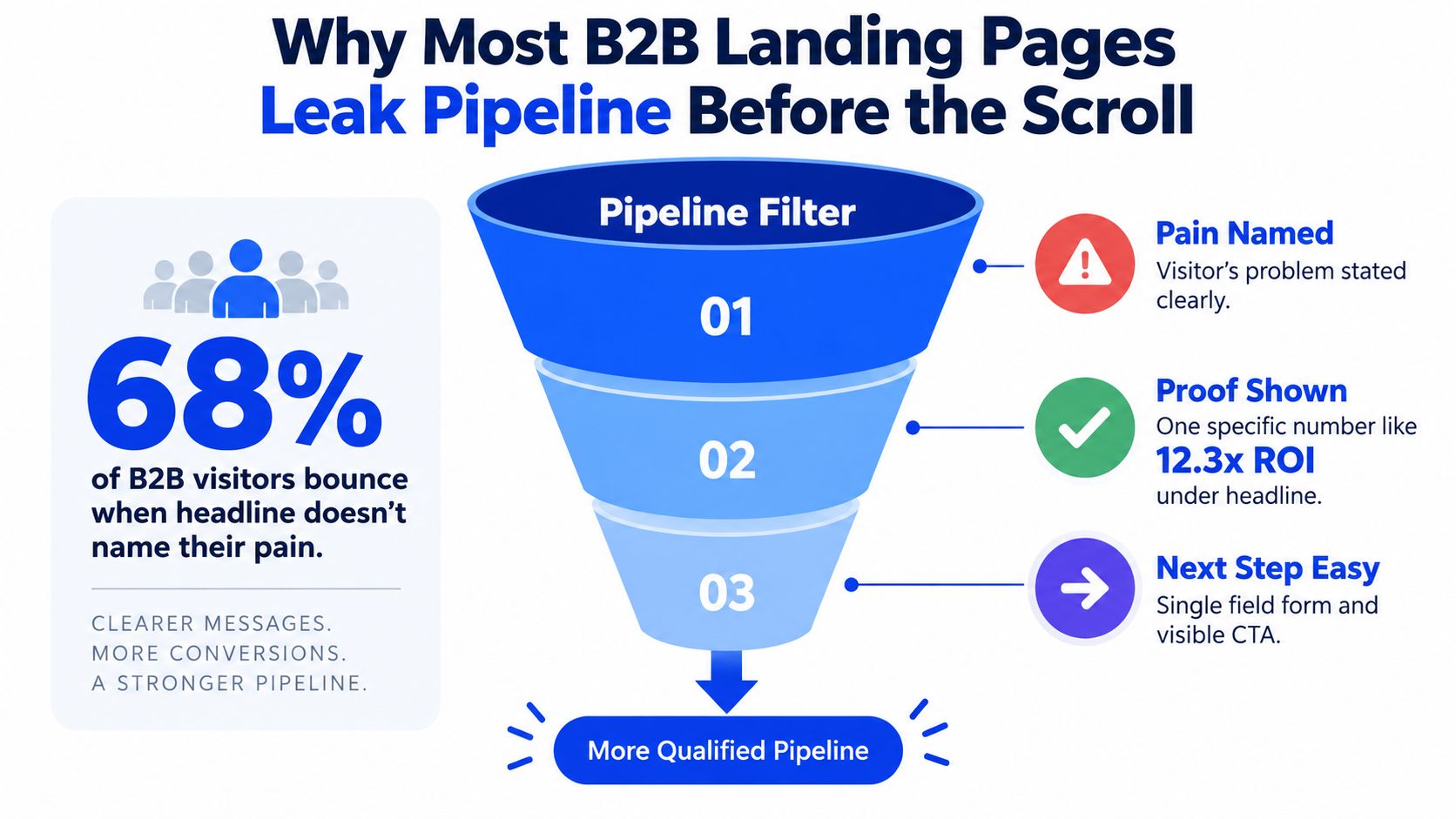
The first screen is a filter, not a banner
A headline that sounds like the buyer's problem does the first qualification job. A generic brand line does not. That difference shows up fast on cold outbound and paid traffic, where the visitor has no reason to decode vague positioning.
Published analysis on above-the-fold analysis reports that 74% of visitors scroll past the fold when the hero section is compelling, but only 31% scroll when the hero is weak. The first screen decides whether the page earns a second look.
For B2B traffic from LinkedIn ads or outbound sequences, the page should say, in the visitor's language, that they are in the right place. If that answer is unclear, the rest of the page never gets a fair read.
A dedicated page works like a pipeline filter. It should sort for fit early, then use the rest of the page for proof and action. Homepage logic tries to cover too many jobs, which usually weakens qualification.
If you want a practical reference for where the leakage shows up in reporting, Grou's glossary on lead leakage is useful. If your team builds on WordPress, SiteSelf WordPress landing page help is worth keeping nearby when structure and speed start colliding with campaign needs.
Benchmarking only works when you compare like with like
A SaaS demo page, a free-trial page, and a lead-gen page do not share the same job. A generic benchmark hides that. For example, a demo-request campaign for a mid-market SaaS tool can look weak next to a free-trial page even when it is producing more qualified pipeline, because the click asks for more commitment up front.
Benchmark coverage shows that median conversion varies sharply by business model, with B2B SaaS free-trial pages around 7.2%, SaaS demo-request pages around 3.8%, legal lead-gen pages around 5.6%, and home-services lead-gen pages around 8.5% in 2026 benchmark summaries (benchmark coverage). Compare the page to the right intent bucket first.
Practical rule: compare your page to the right intent bucket, then ask whether the first screen is doing enough qualification work.
That matters because the same structure can perform very differently by audience and offer. A page for cold outbound traffic has to earn trust faster than a page for warm inbound traffic. A homepage tries to serve everyone, which is exactly why it usually serves no one well.
For teams that want a quick sanity check, a dedicated landing page median of 4.02% versus 2.35% for general website pages is another reminder that message-matched pages earn the click better than broad site pages. I do not treat that as a law, but I do use it as a reminder that structure matters before fancy copy does.
Message match and headline that earns the scroll
On a high-performing landing page, the headline carries more weight than any other single element because it decides whether the visitor scrolls or bounces. If it reads like internal company copy, you lose the click you already paid for.
Name the pain before you name the service
Lead with the buyer's problem, not your category. If a visitor clicked a cold email about pipeline pressure, the page should echo that language immediately. If they came from a LinkedIn post about empty calendars, the headline should sound like the same thought, not a brand slogan.
That is the first discipline of message match. The ad, post, or email sets the promise. The landing page confirms that promise and keeps the story aligned from click to page. Grou's internal glossary on landing page message match is useful because the concept only works when the visitor feels continuity from click to page.
The headline should also sound like the buyer talks internally. For a founder, that might mean stalled pipeline or muted replies. For a head of sales, it might mean reps spending time without generating enough qualified conversations. Same principle, different language.
Put one proof point directly under it
Right under that pain-named headline, show one concrete proof point. Not a wall of logos. Not five badges. One verifiable number or one specific outcome, placed where the eye lands next. The point is specificity. A number can be checked, remembered, and repeated in a sales conversation.
That proof point does two jobs. It tells the visitor the problem is familiar, and it shows you have handled something similar before. When the headline says “we see your problem,” the proof says “we have dealt with it.” That pairing is stronger than a crowded hero section because it answers skepticism without asking for extra attention.
Headline rule: if the first four words do not sound like the buyer's internal monologue, the rest of the page has to work too hard.
Match the frame to the traffic source
Cold outbound traffic and warm inbound traffic do not want the same opening. Cold traffic needs more diagnosis and more proof because the trust debt is higher. Warm traffic can move faster into the offer and CTA because the relationship already exists.
I also test the emotional frame by buyer context. In a risk-heavy situation, loss framing can outperform gain framing. That is the same logic behind a cold email test we have run, where the risk-framed subject line outperformed the benefit-framed one and moved reply rate from 6.4% to 15.8%, a 147% improvement. The lesson was not that fear always wins, it was that the frame has to match what the buyer is defending.
Headline tests need discipline, because a win on replies means little if the meetings that follow are low quality. Test one variable at a time, give it enough sample to trust the result, and validate the downstream meeting stage before you keep the winner.
Layout and UX patterns that guide one clear action
Once the headline earns the scroll, layout decides whether the page keeps momentum or adds friction. The right structure doesn't feel clever. It feels obvious, especially on a phone.
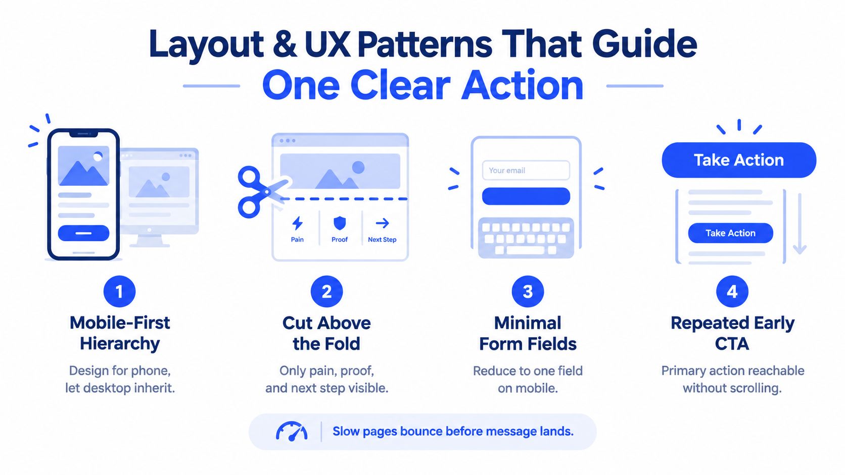
Design for the phone first
Mobile isn't a smaller desktop, it's a different reading mode. On a phone, the first screen gets maybe one thought before the scroll. That's why the pain-named headline has to carry more of the burden, and the next block has to feel like an immediate continuation.
Forms are the biggest mobile conversion killer I see in the wild. If the desktop form has six or seven fields, the phone version usually feels punitive. Cut hard, keep the first ask narrow, and let qualification happen later.
Cut anything that doesn't earn its space
The first screen should hold only the pain, the proof, and the next step. That means no decorative clutter, no extra stories, and no busy blocks that make people hunt for the action. A page can be short without being weak, as long as it's specific.
Navigation is more conditional than many teams admit. If the page is a campaign-specific conversion page, fewer exits can help. If traffic is warmer and the offer is more educational, a restrained nav can be acceptable, but only if it doesn't compete with the CTA. Recent benchmark-style guidance also points to form clarity, trust signals, and real-device mobile checks as more important than removing menus in isolation (design coverage).
Repeat the CTA where conviction happens
The CTA should be visible early and repeated where the eye lands again. On desktop, a single button can live lower on the page and still get found. On mobile, the primary action needs to be reachable without a scavenger hunt.
The page should never ask a visitor to remember the CTA from two scrolls ago.
For LinkedIn-heavy traffic, speed matters as much as structure because many visits happen on the phone, often between meetings. Slow pages bounce before the message lands, so I'd rather ship a simpler page that loads cleanly than a flashy one that feels heavy on mobile.
For teams working on structure, Grou's glossary entry on proof blocks is a good reference point for where visual proof belongs in the hierarchy. It helps keep the page from turning into a collage of unprioritized claims.
Copy and CTA frameworks that qualify while they convert
The right copy should do two things at once. It should help the right buyer say yes, and help the wrong buyer self-select out. That's how a landing page supports pipeline, not just form fills.
Write the subhead as a bridge from pain to outcome
A strong subhead translates the problem into the value of acting now. It doesn't re-state the headline. It clarifies the path forward. For example, if the headline names empty pipeline, the subhead should point to qualified conversations, faster routing, or clearer fit, depending on the offer stage.
The CTA should match that stage too. A low-friction offer can ask for a resource or a quick audit. A warmer page can ask for a demo or meeting request. Grou's call to action glossary page is a useful reminder that CTA wording should fit the offer, not the other way around.
Here's the simplest draft structure I use when I'm building a page from scratch:
Pain headline: name the problem in the buyer's words.
Single proof line: place one verifiable number or outcome under it.
Offer line: say what happens when they click.
CTA button: use the action that matches traffic temperature.
Use one proof point, then stop
One specific number under the headline usually does more work than a long credibility section near the bottom. It's immediate, and it's legible. A visitor doesn't have to scroll to find it or decode a row of logos.
Most pages overcompensate. They pile on testimonial blocks, badges, and logos because they're worried the visitor won't trust them. In practice, too much proof can slow the page down and blur the actual offer. One concrete signal, placed early, usually reads as more believable.
Keep the CTA language tied to intent
If the traffic is cold, softer verbs usually fit better. If the visitor already knows the company, a direct meeting request can work. The page should reflect what the visitor is ready to do, not what the sales team wishes they'd do.
For B2B teams that need a page inside a broader lead flow, Grou can build a landing page as part of a campaign workflow, then connect it to outbound and qualification logic. I'd still treat that as one option among several, because the bigger issue is always whether the copy matches the traffic source and the handoff into sales.
Forms tracking and testing that prove revenue impact
A landing page only matters if you can connect page behavior to meetings held. Otherwise you're looking at vanity signals and hoping they map to pipeline.
Reduce form friction before you add more logic
On mobile, every extra field costs attention. Keep the first form narrow, then use downstream enrichment for the fields sales needs. I'd rather collect less on the page and enrich later than ask for too much and lose the lead before qualification starts.
That's where tools like HubSpot, Apollo, and Clay fit into the workflow. HubSpot handles routing and CRM visibility, Apollo and Clay can fill gaps in company and contact data, and the page itself stays lean. The page's job is to capture intent, not to do full enrichment upfront.
Track the click to meeting chain
Conversion tracking only matters if it follows the whole path. That means source, page visit, form fill, routed lead, booked meeting, and held meeting. The page can look successful while sales sees junk if you stop measuring too early.
Grou's glossary page on conversion tracking is relevant here because the point isn't just form submissions, it's attribution you can trust when pipeline gets reviewed. I'd set the dashboard so page changes are compared against qualified meetings, not just reply volume or raw submissions.
Test one variable, then validate it downstream
The discipline is simple. Change one thing, wait for enough signal, and check whether the lift survives at the meeting stage. A test can win on clicks or replies and still lose on quality if the message over-promises.
Before I call a result real, I want enough sample size to avoid fooling myself. Small tests can create stories that feel true and aren't. That's why the test should isolate one variable, whether that's the headline, CTA, proof point, or form length.
A quick order of operations helps keep teams honest, especially when they're shipping fast. Uxia's guide on improve conversions with synthetic testing is useful when you need another lens on how visitors behave before you commit to a full rollout.
What to track and test first on your landing page | ||
|---|---|---|
Test area | What to change | Success metric at meeting stage |
Headline | Rewrite to name the buyer's pain in their words | More qualified meetings from the same source |
Proof block | Replace logo clutter with one concrete number | Higher meeting-held rate after form fill |
Form | Cut fields and route with enrichment later | Fewer drop-offs before submission |
CTA | Match the action to traffic temperature | Better booked-to-held meeting rate |
Your next step to turn attention into pipeline
Audit the last live page this week with a qualification lens. First, does the headline mirror the buyer's pain in their own words. Second, is there one proof point under the hero. Third, do the form and CTA change by traffic source, because cold visitors need more proof and warm visitors can move faster.
Then ship one change at a time. Rewrite the headline if it reads like internal marketing. Compress scattered proof into one concrete signal. Cut form fields if they slow the handoff, then let the CRM enrich the record after the click. If you want a checklist to turn that backlog into a test plan, use the growth operations guide and pair it with a review of qualified meeting booking.
Grou builds the landing page, the outbound motion, and the qualification logic together, so the page filters for fit instead of collecting empty form fills. Schedule a review of your next campaign as a pipeline system at Grou.
Your outbound is busy, your paid clicks are coming in, and the calendar still looks thin. That usually means the landing page is filtering the wrong way. The page is asking visitors to decode your offer before it earns trust.
Message match beats decoration when the click promise and first screen disagree.
Dedicated pages benchmark better than sending traffic to a homepage, with a median dedicated landing page conversion rate of 6.6% across a large benchmark set of 41,000 landing pages, 464 million visits, and 57 million conversions (Unbounce benchmark report).
Traffic source changes the winner, because cold outbound and warm inbound need different page logic.
One proof point under the headline can do more than a wall of logos.
Your page should qualify, not just persuade, or sales ends up sorting through weak leads.
Table of Contents
Why most B2B landing pages leak pipeline before the scroll
A paid search visitor lands on a demo page, scans the hero, and still cannot tell whether the offer is for their role, their budget, or their stage. That is not a design problem. It is lead leakage, the page pulling qualified attention out of the funnel before the first scroll. See lead leakage for the broader definition.
The benchmark gap matters. A median dedicated landing page sits at 6.6% conversion across a massive sample, while the 75th percentile is 11.4% and the 25th percentile is 1.0% (Unbounce benchmark dataset). That spread tells you “good” is a distribution, not a style choice.
The first screen is a filter, not a banner
A headline that sounds like the buyer's problem does the first qualification job. A generic brand line does not. That difference shows up fast on cold outbound and paid traffic, where the visitor has no reason to decode vague positioning.
Published analysis on above-the-fold analysis reports that 74% of visitors scroll past the fold when the hero section is compelling, but only 31% scroll when the hero is weak. The first screen decides whether the page earns a second look.
For B2B traffic from LinkedIn ads or outbound sequences, the page should say, in the visitor's language, that they are in the right place. If that answer is unclear, the rest of the page never gets a fair read.
A dedicated page works like a pipeline filter. It should sort for fit early, then use the rest of the page for proof and action. Homepage logic tries to cover too many jobs, which usually weakens qualification.
If you want a practical reference for where the leakage shows up in reporting, Grou's glossary on lead leakage is useful. If your team builds on WordPress, SiteSelf WordPress landing page help is worth keeping nearby when structure and speed start colliding with campaign needs.
Benchmarking only works when you compare like with like
A SaaS demo page, a free-trial page, and a lead-gen page do not share the same job. A generic benchmark hides that. For example, a demo-request campaign for a mid-market SaaS tool can look weak next to a free-trial page even when it is producing more qualified pipeline, because the click asks for more commitment up front.
Benchmark coverage shows that median conversion varies sharply by business model, with B2B SaaS free-trial pages around 7.2%, SaaS demo-request pages around 3.8%, legal lead-gen pages around 5.6%, and home-services lead-gen pages around 8.5% in 2026 benchmark summaries (benchmark coverage). Compare the page to the right intent bucket first.
Practical rule: compare your page to the right intent bucket, then ask whether the first screen is doing enough qualification work.
That matters because the same structure can perform very differently by audience and offer. A page for cold outbound traffic has to earn trust faster than a page for warm inbound traffic. A homepage tries to serve everyone, which is exactly why it usually serves no one well.
For teams that want a quick sanity check, a dedicated landing page median of 4.02% versus 2.35% for general website pages is another reminder that message-matched pages earn the click better than broad site pages. I do not treat that as a law, but I do use it as a reminder that structure matters before fancy copy does.
Message match and headline that earns the scroll
On a high-performing landing page, the headline carries more weight than any other single element because it decides whether the visitor scrolls or bounces. If it reads like internal company copy, you lose the click you already paid for.
Name the pain before you name the service
Lead with the buyer's problem, not your category. If a visitor clicked a cold email about pipeline pressure, the page should echo that language immediately. If they came from a LinkedIn post about empty calendars, the headline should sound like the same thought, not a brand slogan.
That is the first discipline of message match. The ad, post, or email sets the promise. The landing page confirms that promise and keeps the story aligned from click to page. Grou's internal glossary on landing page message match is useful because the concept only works when the visitor feels continuity from click to page.
The headline should also sound like the buyer talks internally. For a founder, that might mean stalled pipeline or muted replies. For a head of sales, it might mean reps spending time without generating enough qualified conversations. Same principle, different language.
Put one proof point directly under it
Right under that pain-named headline, show one concrete proof point. Not a wall of logos. Not five badges. One verifiable number or one specific outcome, placed where the eye lands next. The point is specificity. A number can be checked, remembered, and repeated in a sales conversation.
That proof point does two jobs. It tells the visitor the problem is familiar, and it shows you have handled something similar before. When the headline says “we see your problem,” the proof says “we have dealt with it.” That pairing is stronger than a crowded hero section because it answers skepticism without asking for extra attention.
Headline rule: if the first four words do not sound like the buyer's internal monologue, the rest of the page has to work too hard.
Match the frame to the traffic source
Cold outbound traffic and warm inbound traffic do not want the same opening. Cold traffic needs more diagnosis and more proof because the trust debt is higher. Warm traffic can move faster into the offer and CTA because the relationship already exists.
I also test the emotional frame by buyer context. In a risk-heavy situation, loss framing can outperform gain framing. That is the same logic behind a cold email test we have run, where the risk-framed subject line outperformed the benefit-framed one and moved reply rate from 6.4% to 15.8%, a 147% improvement. The lesson was not that fear always wins, it was that the frame has to match what the buyer is defending.
Headline tests need discipline, because a win on replies means little if the meetings that follow are low quality. Test one variable at a time, give it enough sample to trust the result, and validate the downstream meeting stage before you keep the winner.
Layout and UX patterns that guide one clear action
Once the headline earns the scroll, layout decides whether the page keeps momentum or adds friction. The right structure doesn't feel clever. It feels obvious, especially on a phone.
Design for the phone first
Mobile isn't a smaller desktop, it's a different reading mode. On a phone, the first screen gets maybe one thought before the scroll. That's why the pain-named headline has to carry more of the burden, and the next block has to feel like an immediate continuation.
Forms are the biggest mobile conversion killer I see in the wild. If the desktop form has six or seven fields, the phone version usually feels punitive. Cut hard, keep the first ask narrow, and let qualification happen later.
Cut anything that doesn't earn its space
The first screen should hold only the pain, the proof, and the next step. That means no decorative clutter, no extra stories, and no busy blocks that make people hunt for the action. A page can be short without being weak, as long as it's specific.
Navigation is more conditional than many teams admit. If the page is a campaign-specific conversion page, fewer exits can help. If traffic is warmer and the offer is more educational, a restrained nav can be acceptable, but only if it doesn't compete with the CTA. Recent benchmark-style guidance also points to form clarity, trust signals, and real-device mobile checks as more important than removing menus in isolation (design coverage).
Repeat the CTA where conviction happens
The CTA should be visible early and repeated where the eye lands again. On desktop, a single button can live lower on the page and still get found. On mobile, the primary action needs to be reachable without a scavenger hunt.
The page should never ask a visitor to remember the CTA from two scrolls ago.
For LinkedIn-heavy traffic, speed matters as much as structure because many visits happen on the phone, often between meetings. Slow pages bounce before the message lands, so I'd rather ship a simpler page that loads cleanly than a flashy one that feels heavy on mobile.
For teams working on structure, Grou's glossary entry on proof blocks is a good reference point for where visual proof belongs in the hierarchy. It helps keep the page from turning into a collage of unprioritized claims.
Copy and CTA frameworks that qualify while they convert
The right copy should do two things at once. It should help the right buyer say yes, and help the wrong buyer self-select out. That's how a landing page supports pipeline, not just form fills.
Write the subhead as a bridge from pain to outcome
A strong subhead translates the problem into the value of acting now. It doesn't re-state the headline. It clarifies the path forward. For example, if the headline names empty pipeline, the subhead should point to qualified conversations, faster routing, or clearer fit, depending on the offer stage.
The CTA should match that stage too. A low-friction offer can ask for a resource or a quick audit. A warmer page can ask for a demo or meeting request. Grou's call to action glossary page is a useful reminder that CTA wording should fit the offer, not the other way around.
Here's the simplest draft structure I use when I'm building a page from scratch:
Pain headline: name the problem in the buyer's words.
Single proof line: place one verifiable number or outcome under it.
Offer line: say what happens when they click.
CTA button: use the action that matches traffic temperature.
Use one proof point, then stop
One specific number under the headline usually does more work than a long credibility section near the bottom. It's immediate, and it's legible. A visitor doesn't have to scroll to find it or decode a row of logos.
Most pages overcompensate. They pile on testimonial blocks, badges, and logos because they're worried the visitor won't trust them. In practice, too much proof can slow the page down and blur the actual offer. One concrete signal, placed early, usually reads as more believable.
Keep the CTA language tied to intent
If the traffic is cold, softer verbs usually fit better. If the visitor already knows the company, a direct meeting request can work. The page should reflect what the visitor is ready to do, not what the sales team wishes they'd do.
For B2B teams that need a page inside a broader lead flow, Grou can build a landing page as part of a campaign workflow, then connect it to outbound and qualification logic. I'd still treat that as one option among several, because the bigger issue is always whether the copy matches the traffic source and the handoff into sales.
Forms tracking and testing that prove revenue impact
A landing page only matters if you can connect page behavior to meetings held. Otherwise you're looking at vanity signals and hoping they map to pipeline.
Reduce form friction before you add more logic
On mobile, every extra field costs attention. Keep the first form narrow, then use downstream enrichment for the fields sales needs. I'd rather collect less on the page and enrich later than ask for too much and lose the lead before qualification starts.
That's where tools like HubSpot, Apollo, and Clay fit into the workflow. HubSpot handles routing and CRM visibility, Apollo and Clay can fill gaps in company and contact data, and the page itself stays lean. The page's job is to capture intent, not to do full enrichment upfront.
Track the click to meeting chain
Conversion tracking only matters if it follows the whole path. That means source, page visit, form fill, routed lead, booked meeting, and held meeting. The page can look successful while sales sees junk if you stop measuring too early.
Grou's glossary page on conversion tracking is relevant here because the point isn't just form submissions, it's attribution you can trust when pipeline gets reviewed. I'd set the dashboard so page changes are compared against qualified meetings, not just reply volume or raw submissions.
Test one variable, then validate it downstream
The discipline is simple. Change one thing, wait for enough signal, and check whether the lift survives at the meeting stage. A test can win on clicks or replies and still lose on quality if the message over-promises.
Before I call a result real, I want enough sample size to avoid fooling myself. Small tests can create stories that feel true and aren't. That's why the test should isolate one variable, whether that's the headline, CTA, proof point, or form length.
A quick order of operations helps keep teams honest, especially when they're shipping fast. Uxia's guide on improve conversions with synthetic testing is useful when you need another lens on how visitors behave before you commit to a full rollout.
What to track and test first on your landing page | ||
|---|---|---|
Test area | What to change | Success metric at meeting stage |
Headline | Rewrite to name the buyer's pain in their words | More qualified meetings from the same source |
Proof block | Replace logo clutter with one concrete number | Higher meeting-held rate after form fill |
Form | Cut fields and route with enrichment later | Fewer drop-offs before submission |
CTA | Match the action to traffic temperature | Better booked-to-held meeting rate |
Your next step to turn attention into pipeline
Audit the last live page this week with a qualification lens. First, does the headline mirror the buyer's pain in their own words. Second, is there one proof point under the hero. Third, do the form and CTA change by traffic source, because cold visitors need more proof and warm visitors can move faster.
Then ship one change at a time. Rewrite the headline if it reads like internal marketing. Compress scattered proof into one concrete signal. Cut form fields if they slow the handoff, then let the CRM enrich the record after the click. If you want a checklist to turn that backlog into a test plan, use the growth operations guide and pair it with a review of qualified meeting booking.
Grou builds the landing page, the outbound motion, and the qualification logic together, so the page filters for fit instead of collecting empty form fills. Schedule a review of your next campaign as a pipeline system at Grou.
Your outbound is busy, your paid clicks are coming in, and the calendar still looks thin. That usually means the landing page is filtering the wrong way. The page is asking visitors to decode your offer before it earns trust.
Message match beats decoration when the click promise and first screen disagree.
Dedicated pages benchmark better than sending traffic to a homepage, with a median dedicated landing page conversion rate of 6.6% across a large benchmark set of 41,000 landing pages, 464 million visits, and 57 million conversions (Unbounce benchmark report).
Traffic source changes the winner, because cold outbound and warm inbound need different page logic.
One proof point under the headline can do more than a wall of logos.
Your page should qualify, not just persuade, or sales ends up sorting through weak leads.
Table of Contents
Why most B2B landing pages leak pipeline before the scroll
A paid search visitor lands on a demo page, scans the hero, and still cannot tell whether the offer is for their role, their budget, or their stage. That is not a design problem. It is lead leakage, the page pulling qualified attention out of the funnel before the first scroll. See lead leakage for the broader definition.
The benchmark gap matters. A median dedicated landing page sits at 6.6% conversion across a massive sample, while the 75th percentile is 11.4% and the 25th percentile is 1.0% (Unbounce benchmark dataset). That spread tells you “good” is a distribution, not a style choice.
The first screen is a filter, not a banner
A headline that sounds like the buyer's problem does the first qualification job. A generic brand line does not. That difference shows up fast on cold outbound and paid traffic, where the visitor has no reason to decode vague positioning.
Published analysis on above-the-fold analysis reports that 74% of visitors scroll past the fold when the hero section is compelling, but only 31% scroll when the hero is weak. The first screen decides whether the page earns a second look.
For B2B traffic from LinkedIn ads or outbound sequences, the page should say, in the visitor's language, that they are in the right place. If that answer is unclear, the rest of the page never gets a fair read.
A dedicated page works like a pipeline filter. It should sort for fit early, then use the rest of the page for proof and action. Homepage logic tries to cover too many jobs, which usually weakens qualification.
If you want a practical reference for where the leakage shows up in reporting, Grou's glossary on lead leakage is useful. If your team builds on WordPress, SiteSelf WordPress landing page help is worth keeping nearby when structure and speed start colliding with campaign needs.
Benchmarking only works when you compare like with like
A SaaS demo page, a free-trial page, and a lead-gen page do not share the same job. A generic benchmark hides that. For example, a demo-request campaign for a mid-market SaaS tool can look weak next to a free-trial page even when it is producing more qualified pipeline, because the click asks for more commitment up front.
Benchmark coverage shows that median conversion varies sharply by business model, with B2B SaaS free-trial pages around 7.2%, SaaS demo-request pages around 3.8%, legal lead-gen pages around 5.6%, and home-services lead-gen pages around 8.5% in 2026 benchmark summaries (benchmark coverage). Compare the page to the right intent bucket first.
Practical rule: compare your page to the right intent bucket, then ask whether the first screen is doing enough qualification work.
That matters because the same structure can perform very differently by audience and offer. A page for cold outbound traffic has to earn trust faster than a page for warm inbound traffic. A homepage tries to serve everyone, which is exactly why it usually serves no one well.
For teams that want a quick sanity check, a dedicated landing page median of 4.02% versus 2.35% for general website pages is another reminder that message-matched pages earn the click better than broad site pages. I do not treat that as a law, but I do use it as a reminder that structure matters before fancy copy does.
Message match and headline that earns the scroll
On a high-performing landing page, the headline carries more weight than any other single element because it decides whether the visitor scrolls or bounces. If it reads like internal company copy, you lose the click you already paid for.
Name the pain before you name the service
Lead with the buyer's problem, not your category. If a visitor clicked a cold email about pipeline pressure, the page should echo that language immediately. If they came from a LinkedIn post about empty calendars, the headline should sound like the same thought, not a brand slogan.
That is the first discipline of message match. The ad, post, or email sets the promise. The landing page confirms that promise and keeps the story aligned from click to page. Grou's internal glossary on landing page message match is useful because the concept only works when the visitor feels continuity from click to page.
The headline should also sound like the buyer talks internally. For a founder, that might mean stalled pipeline or muted replies. For a head of sales, it might mean reps spending time without generating enough qualified conversations. Same principle, different language.
Put one proof point directly under it
Right under that pain-named headline, show one concrete proof point. Not a wall of logos. Not five badges. One verifiable number or one specific outcome, placed where the eye lands next. The point is specificity. A number can be checked, remembered, and repeated in a sales conversation.
That proof point does two jobs. It tells the visitor the problem is familiar, and it shows you have handled something similar before. When the headline says “we see your problem,” the proof says “we have dealt with it.” That pairing is stronger than a crowded hero section because it answers skepticism without asking for extra attention.
Headline rule: if the first four words do not sound like the buyer's internal monologue, the rest of the page has to work too hard.
Match the frame to the traffic source
Cold outbound traffic and warm inbound traffic do not want the same opening. Cold traffic needs more diagnosis and more proof because the trust debt is higher. Warm traffic can move faster into the offer and CTA because the relationship already exists.
I also test the emotional frame by buyer context. In a risk-heavy situation, loss framing can outperform gain framing. That is the same logic behind a cold email test we have run, where the risk-framed subject line outperformed the benefit-framed one and moved reply rate from 6.4% to 15.8%, a 147% improvement. The lesson was not that fear always wins, it was that the frame has to match what the buyer is defending.
Headline tests need discipline, because a win on replies means little if the meetings that follow are low quality. Test one variable at a time, give it enough sample to trust the result, and validate the downstream meeting stage before you keep the winner.
Layout and UX patterns that guide one clear action
Once the headline earns the scroll, layout decides whether the page keeps momentum or adds friction. The right structure doesn't feel clever. It feels obvious, especially on a phone.
Design for the phone first
Mobile isn't a smaller desktop, it's a different reading mode. On a phone, the first screen gets maybe one thought before the scroll. That's why the pain-named headline has to carry more of the burden, and the next block has to feel like an immediate continuation.
Forms are the biggest mobile conversion killer I see in the wild. If the desktop form has six or seven fields, the phone version usually feels punitive. Cut hard, keep the first ask narrow, and let qualification happen later.
Cut anything that doesn't earn its space
The first screen should hold only the pain, the proof, and the next step. That means no decorative clutter, no extra stories, and no busy blocks that make people hunt for the action. A page can be short without being weak, as long as it's specific.
Navigation is more conditional than many teams admit. If the page is a campaign-specific conversion page, fewer exits can help. If traffic is warmer and the offer is more educational, a restrained nav can be acceptable, but only if it doesn't compete with the CTA. Recent benchmark-style guidance also points to form clarity, trust signals, and real-device mobile checks as more important than removing menus in isolation (design coverage).
Repeat the CTA where conviction happens
The CTA should be visible early and repeated where the eye lands again. On desktop, a single button can live lower on the page and still get found. On mobile, the primary action needs to be reachable without a scavenger hunt.
The page should never ask a visitor to remember the CTA from two scrolls ago.
For LinkedIn-heavy traffic, speed matters as much as structure because many visits happen on the phone, often between meetings. Slow pages bounce before the message lands, so I'd rather ship a simpler page that loads cleanly than a flashy one that feels heavy on mobile.
For teams working on structure, Grou's glossary entry on proof blocks is a good reference point for where visual proof belongs in the hierarchy. It helps keep the page from turning into a collage of unprioritized claims.
Copy and CTA frameworks that qualify while they convert
The right copy should do two things at once. It should help the right buyer say yes, and help the wrong buyer self-select out. That's how a landing page supports pipeline, not just form fills.
Write the subhead as a bridge from pain to outcome
A strong subhead translates the problem into the value of acting now. It doesn't re-state the headline. It clarifies the path forward. For example, if the headline names empty pipeline, the subhead should point to qualified conversations, faster routing, or clearer fit, depending on the offer stage.
The CTA should match that stage too. A low-friction offer can ask for a resource or a quick audit. A warmer page can ask for a demo or meeting request. Grou's call to action glossary page is a useful reminder that CTA wording should fit the offer, not the other way around.
Here's the simplest draft structure I use when I'm building a page from scratch:
Pain headline: name the problem in the buyer's words.
Single proof line: place one verifiable number or outcome under it.
Offer line: say what happens when they click.
CTA button: use the action that matches traffic temperature.
Use one proof point, then stop
One specific number under the headline usually does more work than a long credibility section near the bottom. It's immediate, and it's legible. A visitor doesn't have to scroll to find it or decode a row of logos.
Most pages overcompensate. They pile on testimonial blocks, badges, and logos because they're worried the visitor won't trust them. In practice, too much proof can slow the page down and blur the actual offer. One concrete signal, placed early, usually reads as more believable.
Keep the CTA language tied to intent
If the traffic is cold, softer verbs usually fit better. If the visitor already knows the company, a direct meeting request can work. The page should reflect what the visitor is ready to do, not what the sales team wishes they'd do.
For B2B teams that need a page inside a broader lead flow, Grou can build a landing page as part of a campaign workflow, then connect it to outbound and qualification logic. I'd still treat that as one option among several, because the bigger issue is always whether the copy matches the traffic source and the handoff into sales.
Forms tracking and testing that prove revenue impact
A landing page only matters if you can connect page behavior to meetings held. Otherwise you're looking at vanity signals and hoping they map to pipeline.
Reduce form friction before you add more logic
On mobile, every extra field costs attention. Keep the first form narrow, then use downstream enrichment for the fields sales needs. I'd rather collect less on the page and enrich later than ask for too much and lose the lead before qualification starts.
That's where tools like HubSpot, Apollo, and Clay fit into the workflow. HubSpot handles routing and CRM visibility, Apollo and Clay can fill gaps in company and contact data, and the page itself stays lean. The page's job is to capture intent, not to do full enrichment upfront.
Track the click to meeting chain
Conversion tracking only matters if it follows the whole path. That means source, page visit, form fill, routed lead, booked meeting, and held meeting. The page can look successful while sales sees junk if you stop measuring too early.
Grou's glossary page on conversion tracking is relevant here because the point isn't just form submissions, it's attribution you can trust when pipeline gets reviewed. I'd set the dashboard so page changes are compared against qualified meetings, not just reply volume or raw submissions.
Test one variable, then validate it downstream
The discipline is simple. Change one thing, wait for enough signal, and check whether the lift survives at the meeting stage. A test can win on clicks or replies and still lose on quality if the message over-promises.
Before I call a result real, I want enough sample size to avoid fooling myself. Small tests can create stories that feel true and aren't. That's why the test should isolate one variable, whether that's the headline, CTA, proof point, or form length.
A quick order of operations helps keep teams honest, especially when they're shipping fast. Uxia's guide on improve conversions with synthetic testing is useful when you need another lens on how visitors behave before you commit to a full rollout.
What to track and test first on your landing page | ||
|---|---|---|
Test area | What to change | Success metric at meeting stage |
Headline | Rewrite to name the buyer's pain in their words | More qualified meetings from the same source |
Proof block | Replace logo clutter with one concrete number | Higher meeting-held rate after form fill |
Form | Cut fields and route with enrichment later | Fewer drop-offs before submission |
CTA | Match the action to traffic temperature | Better booked-to-held meeting rate |
Your next step to turn attention into pipeline
Audit the last live page this week with a qualification lens. First, does the headline mirror the buyer's pain in their own words. Second, is there one proof point under the hero. Third, do the form and CTA change by traffic source, because cold visitors need more proof and warm visitors can move faster.
Then ship one change at a time. Rewrite the headline if it reads like internal marketing. Compress scattered proof into one concrete signal. Cut form fields if they slow the handoff, then let the CRM enrich the record after the click. If you want a checklist to turn that backlog into a test plan, use the growth operations guide and pair it with a review of qualified meeting booking.
Grou builds the landing page, the outbound motion, and the qualification logic together, so the page filters for fit instead of collecting empty form fills. Schedule a review of your next campaign as a pipeline system at Grou.
Pipeline OS Newsletter
Build qualified pipeline
Get weekly tactics to generate demand, improve lead quality, and book more meetings.





Trusted by industry leaders
Trusted by industry leaders
Trusted by industry leaders
Ready to build qualified pipeline?
Ready to build qualified pipeline?
Ready to build qualified pipeline?
Book a call to see if we're the right fit, or take the 2-minute quiz to get a clear starting point.
Book a call to see if we're the right fit, or take the 2-minute quiz to get a clear starting point.
Book a call to see if we're the right fit, or take the 2-minute quiz to get a clear starting point.
" height="30.21639343089746px" id="hfGbXmQR2" width="30.216393430897455px"/></svg>)
Copyright © 2026 – All Right Reserved
Copyright © 2026 – All Right Reserved
Copyright © 2026 – All Right Reserved