%22%3E%3C/path%3E%3Cpath d=%22M 63.072 7.554 C 62.258 8.022 61.577 8.689 61.092 9.493 L 61.092 7.076 L 57.158 7.076 L 57.158 22.64 L 61.089 22.64 L 61.089 14.888 C 61.089 13.446 61.403 12.434 62.03 11.853 C 62.818 11.218 63.818 10.907 64.826 10.982 L 65.868 10.982 L 65.868 6.851 C 64.891 6.834 63.926 7.076 63.073 7.554 Z%22 fill=%22rgb(17,17,17)%22%3E%3C/path%3E%3Cpath d=%22M 78.916 7.82 C 76.363 6.49 73.321 6.49 70.768 7.82 C 69.562 8.473 68.564 9.451 67.888 10.644 C 67.167 11.931 66.803 13.387 66.834 14.862 C 66.804 16.332 67.157 17.785 67.86 19.077 C 68.515 20.267 69.494 21.246 70.684 21.901 C 71.924 22.576 73.318 22.92 74.73 22.898 C 76.164 22.918 77.58 22.575 78.846 21.901 C 80.062 21.247 81.073 20.27 81.768 19.077 C 82.506 17.797 82.88 16.339 82.85 14.862 C 82.88 13.389 82.517 11.934 81.797 10.647 C 81.12 9.455 80.122 8.477 78.917 7.824 M 78.803 14.862 C 78.829 15.739 78.636 16.608 78.241 17.391 C 77.903 18.046 77.38 18.588 76.738 18.95 C 76.124 19.293 75.432 19.472 74.729 19.47 C 73.668 19.497 72.648 19.061 71.934 18.276 C 71.139 17.323 70.741 16.1 70.823 14.862 C 70.741 13.62 71.149 12.395 71.959 11.45 C 72.687 10.667 73.715 10.233 74.783 10.256 C 75.859 10.236 76.894 10.67 77.635 11.45 C 78.464 12.387 78.884 13.616 78.801 14.864%22 fill=%22rgb(17,17,17)%22%3E%3C/path%3E%3Cpath d=%22M 95.906 7.076 L 95.906 15.646 C 95.975 16.68 95.643 17.701 94.979 18.498 C 94.311 19.184 93.379 19.547 92.422 19.495 C 91.475 19.544 90.553 19.18 89.894 18.498 C 89.23 17.701 88.898 16.68 88.967 15.646 L 88.967 7.076 L 85.033 7.076 L 85.033 16.207 C 85 17.449 85.275 18.68 85.834 19.79 C 86.327 20.75 87.095 21.542 88.039 22.065 C 89.033 22.594 90.145 22.861 91.271 22.838 C 92.188 22.847 93.095 22.65 93.926 22.263 C 94.708 21.905 95.388 21.36 95.906 20.675 L 95.906 22.645 L 99.865 22.645 L 99.865 7.076 Z%22 fill=%22rgb(17,17,17)%22%3E%3C/path%3E%3Cpath d=%22M 4.513 15.626 C 4.511 10.815 7.606 6.549 12.181 5.059 C 16.756 3.57 21.77 5.195 24.601 9.086 L 27.816 5.87 C 24.074 1.186 17.981 -0.943 12.137 0.393 C 6.292 1.728 1.728 6.292 0.393 12.137 C -0.943 17.981 1.186 24.074 5.87 27.816 L 9.085 24.601 C 6.214 22.512 4.515 19.177 4.513 15.626%22 fill=%22rgb(32,62,235)%22%3E%3C/path%3E%3Cpath d=%22M 17.114 14.343 L 13.354 18.01 L 13.354 18.026 L 21.071 18.026 L 11.412 27.609 L 17.389 27.609 L 23.999 21.081 L 23.999 28.316 L 24.005 28.316 L 27.967 24.393 L 27.967 14.343 Z%22 fill=%22rgb(32,62,235)%22%3E%3C/path%3E%3C/g%3E%3C/svg%3E) ×
× ××
××›
›
›
›
Lead conversion rate: benchmarks and how to improve it
Lead conversion rate: benchmarks and how to improve it
Lead conversion rate: benchmarks and how to improve it
Lead conversion rate: benchmarks and how to improve it
Lead conversion rate: benchmarks and how to improve it
Lead conversion rate: benchmarks and how to improve it

Author
Aljaz Peklaj

Your dashboard says the lead conversion rate is fine, but revenue stays flat. Sales says the leads are weak. Marketing says follow-up is slow. RevOps gets stuck reconciling three different answers, and the leak never gets fixed.
Track stage rates, not one blended number. Visitor to lead, lead to MQL, MQL to SQL, SQL to opportunity, and opportunity to closed-won all tell different stories.
Plan against the right benchmark. Channel and company size change what “good” looks like, and broad averages can mislead.
Measure speed to lead as a conversion lever. Slow routing and slow follow-up can distort the number more than copy ever will.
Fix delivery, list, message, then handoff. Rewriting copy on a bad list just produces prettier waste.
Judge by qualified pipeline, not lead volume. A tighter ICP can lower the headline rate and still improve revenue.
Table of Contents
Why your lead conversion rate is probably the wrong number
Teams often quote one percentage and stop. That number flatters the dashboard and hides the leak.
A single lead conversion rate usually collapses several stages into one blur. That makes it hard to tell whether the problem sits in targeting, qualification, routing, or sales acceptance. If your team is debating the average instead of the handoff, you're already looking at the wrong object.
The better starting point is vanity metrics versus pipeline evidence. A high form-fill count can still mean weak revenue if the wrong people are submitting. A lower rate on a tighter list can be the healthier result.
Practical rule: if two teams use the same phrase but count different denominators, their numbers can't guide the same decision.
What follows is the operating view:
Stage-by-stage rates so you can see where the funnel leaks.
Channel benchmarks so you're comparing like with like.
Measurement rules so CRM data matches the number you publish.
A top-down triage order so you fix the biggest bottleneck first.
Real campaign examples so the changes are concrete, not theoretical.
That structure matters for B2B teams in iGaming, SaaS, manufacturing, legal tech, and pharma. Structure turns attention into pipeline, but only if you measure the right stage at the right time.
What lead conversion rate means
A lead conversion rate only makes sense when you tie it to a specific stage. A booked meeting, an accepted SQL, and a closed-won deal are different events, and each one needs its own denominator.
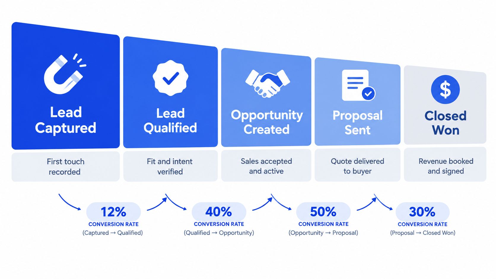
The formulas the team needs
Use the stage that matches the action.
Visitor to lead = leads ÷ visitors
Lead to MQL = MQLs ÷ leads
MQL to SQL = SQLs ÷ MQLs
SQL to opportunity = opportunities ÷ SQLs
Opportunity to closed-won = customers ÷ opportunities
A booked meeting that sales rejects is a handoff failure, and it should not appear in the conversion count.
That distinction changes the diagnosis. Visitor-to-lead tells you about capture quality and offer fit. SQL-to-opportunity tells you whether sales accepted the conversation as real pipeline. Blended reporting hides those leaks and turns the discussion into a fight over averages.
Before launch, define the stage in the CRM and map it to a field the team can point to. If the record does not show where a lead entered the stage, the rate is too loose to trust.
A conversion rate only works when the denominator stays fixed.
For a shared glossary, conversion rate should mean the stage under review, not a generic dashboard percentage. The same discipline applies to multi-touch attribution, because account influence and person-level conversion often point to different outcomes.
Benchmarks by channel and company size
Benchmarks only help when you compare like with like. A strong SEO program, a weak PPC program, and a webinar motion can all produce different visitor-to-lead rates for good reasons.
The cleanest directional benchmark in the available data is the B2B median visitor-to-lead rate of 2.9% from an analysis of more than 100 million conversion data points across 14 industries. That figure is useful as a broad reference, not a target you force onto every channel, because traffic source and conversion definition change the result Ruler Analytics benchmark.
Stage rates by acquisition channel
Channel | Visitor to lead | Lead to MQL | MQL to SQL |
|---|---|---|---|
SEO | 2.1% | 41% | 51% |
PPC | 0.7% | 36% | 26% |
Webinars | 2.2% | 38% | not specified in the source data |
not specified in the source data | not specified in the source data | 46% |
That table gives you the planning logic. SEO often brings better visitor-to-lead quality than PPC in the compiled benchmark data, but a lower top-of-funnel rate on PPC doesn't automatically mean worse pipeline. You still need the later-stage rates.
Company size changes the picture too. Available benchmark data reports visitor-to-lead conversion of 1.4% for SMB companies with $10 million to $100 million in revenue versus 0.7% for enterprises above $1 billion Prospeo benchmark. It also reports MQL-to-SQL conversion of 39% for SMBs and 31% for enterprises, with SQL-to-opportunity at 42% and 36%.
For planning, I'd trust the segment-specific benchmark over the blended one. If your ICP is tight and your qualification rules are strict, a broad average will flatten the picture. If you need to connect acquisition cost to pipeline math, the cost per lead calculation guide is a useful companion, because rate without cost still leaves you guessing about efficiency.
Measurement, attribution, and speed to lead
A conversion rate is only as clean as the fields behind it. If the CRM is missing timestamps, stage logic, or source data, the number becomes a guess with a decimal point.
What to capture in the CRM
Capture these fields on every record:
Source
Campaign name
First touch date
Stage entered date
First response date
Qualification outcome
Deal value
That's enough to separate traffic quality from routing quality. It also lets you calculate conversion by fixed cohort windows instead of blending fresh leads with old opportunities.
For attribution, don't settle for only first-touch or only last-touch. If the account researches anonymously for most of the journey, person-level form data misses too much of the story. A practical reference on view-through thinking is MyMentions attribution insights, especially when you need a cleaner way to think about influence before a form fill.
Practical rule: publish the rate only after data hygiene is verified.

Speed to lead needs response buckets
The response-time issue is bigger than often acknowledged. A Harvard Business Review study summarized in the available evidence found that organizations attempting contact within one hour were nearly seven times more likely to qualify a lead than organizations waiting an additional hour, and companies waiting at least 24 hours were more than 60 times less likely to qualify leads Venture Harbour summary. Another audit found that 23% of U.S. companies never responded to a web-generated lead, and among those that did respond within 30 days, the average response time was 42 hours Carly summary.
Build these buckets into reporting:
Under 5 minutes
5 to 60 minutes
1 to 24 hours
Over 24 hours
That makes the bottleneck visible. If under-5-minute leads convert and 24-hour leads don't, the problem isn't demand generation. It's routing, staffing, or qualification rules.
The top-down optimization sequence
Starting with copy is common. That's usually the wrong repair order.

Delivery first
Check sending domains, warm-up, and daily limits before you touch messaging. If delivery is broken, every other test is noise.
Delivery failures usually look like low reply volume and inconsistent inbox placement. Fixing copy won't help if the messages aren't landing.
List second
If emails land but replies stay flat, the list is usually the issue. ICP drift and stale data are more common than weak copy.
Segment-level reply rates matter. A clean list tied to a real buying trigger will usually outperform a bigger one with fuzzy fit. For a lead capture angle that works at the page level, the high-converting lead capture landing page tips resource is worth reading, because offer fit and list fit tend to fail together.
Message third
Only after delivery and targeting are clean should you test angles. Change one variable at a time, then judge on replies rather than opens.
If you test subject lines, offer, and CTA at once, you won't know what changed the outcome. That's how teams end up arguing about opinion instead of evidence.
Handoff last
If positive replies are healthy but meetings aren't, the bottleneck is reply speed or qualification. Interested replies should go to a person immediately, while the prospect is still warm.
The internal operating metric I care about most here is booked to qualified, because a booked meeting sales rejects isn't a conversion. If the meeting isn't accepted, the funnel stopped earlier than your report says.
For teams building the reporting stack, lead generation KPIs should sit beside this sequence, not replace it. The dashboard has to reflect the order of the failure, not the order of the meeting agenda.
What a real lift looks like in practice
The fastest lift usually comes from targeting, not copy. That is where teams feel the most resistance, because list quality is harder to admit than message quality.
Plastit is the clearest example. Across five LinkedIn and email campaigns, the program produced 97 leads, a 48.9% average open rate, and a 7.9% average reply rate. In the trade-show campaign, where buyers were targeted around an event they were already attending, reply rate reached 16.0%.
The lift came from timing and relevance. The message did not need to become magical. The audience was already in market when the outreach landed.
T-2 showed the same pattern from another angle. Splitting outreach by role pushed the IT segment to a 19.2% reply rate against an 11.8% average T-2 and Sportradar benchmark. Role fit changed the outcome more than volume did.
The inverse case matters too
Joan ran 8 LinkedIn campaigns and generated 489 conversations, but only 57 interested leads. That is what happens when ICP fit and pain urgency are the constraint. More conversations did not fix the funnel.
The lesson is blunt. More output only helps when the list is already right. If the wrong accounts are in the sequence, more sends just scale the wrong result.
One other signal is useful for pipeline teams. For Sportradar, 80% of the 800+ qualified leads became SQLs once targeting and qualification rules were aligned. Stage alignment can change the handoff outcome materially, and the Sportradar numbers show the size of that swing.
Reporting templates and common mistakes to avoid
A useful dashboard doesn't start with a blended percentage. It starts with the handoffs.
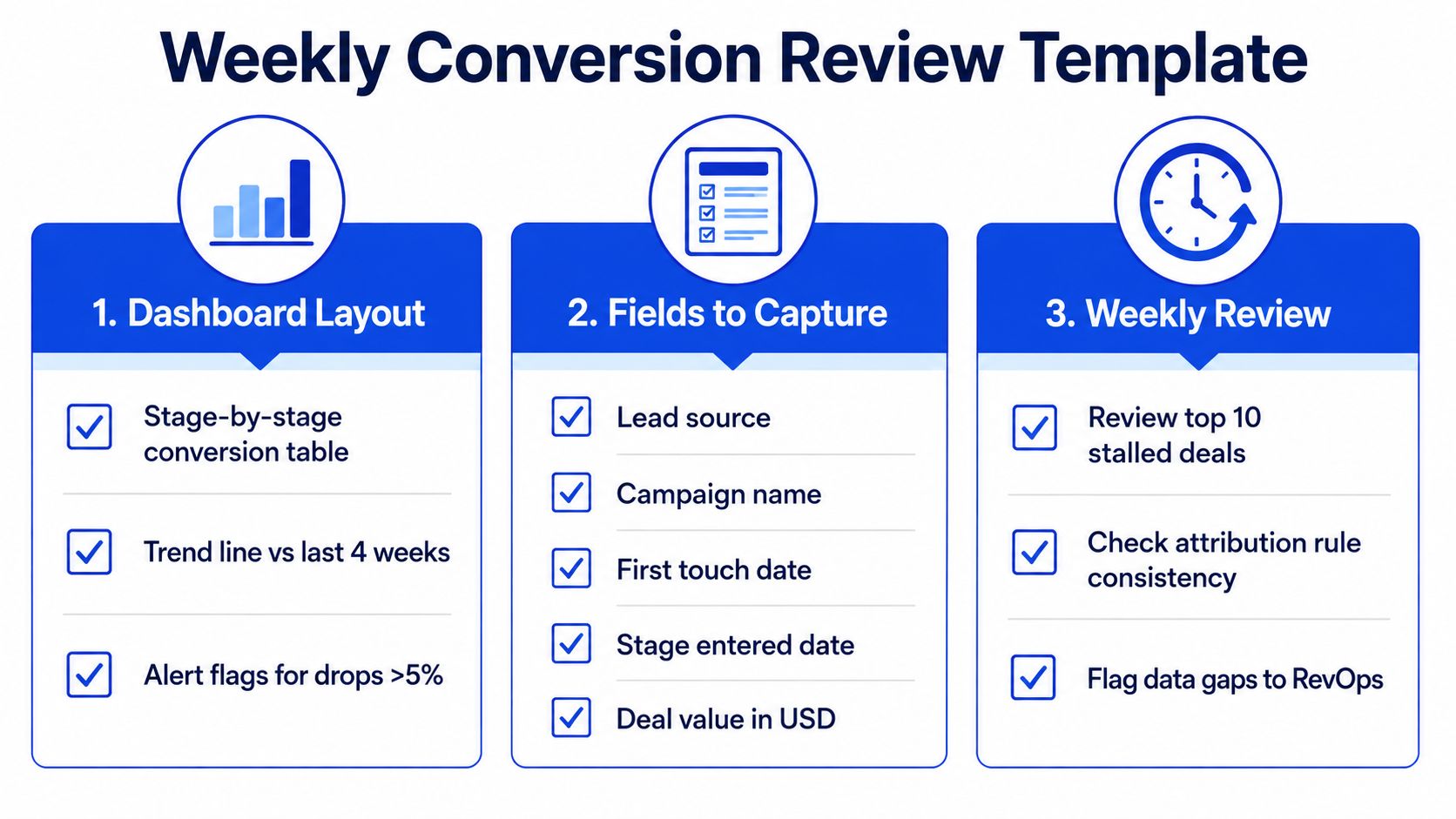
Weekly review template
Dashboard layout
Stage-by-stage conversion table
Trend line vs last 4 weeks
Alert flags for drops above threshold
Fields to capture
Lead source
Campaign name
First touch date
Stage entered date
Deal value in USD
Weekly review
Review top stalled deals
Check attribution rule consistency
Flag data gaps to RevOps
If the team meets weekly, keep the review cadence fixed. Reporting cadence only works when the same stages are checked on the same day with the same denominator.
The five mistakes that keep showing up
One blended percentage. It hides where the leak is.
Mixed denominators. New leads and mature opportunities don't belong in the same bucket.
Open rate obsession. Opens don't prove qualification.
High lead volume worship. More leads don't matter if SQL count is flat.
Speed treated as a vibe. If response time isn't bucketed, it's not managed.
A tighter ICP can lower the headline rate and still raise revenue. That isn't a paradox. It just means you stopped paying for low-fit volume and started paying for qualified progression.
Audit your booked-to-qualified rate this Friday, then add response-time buckets to the CRM by Monday. If you want a pipeline system that ties targeting, outbound, and reporting into one operating model, Grou builds that structure for B2B teams and keeps the measurement tied to qualified conversations. The methodology is simple, stage by stage, because the only conversion rate that matters is the one that explains where revenue leaks.
Your dashboard says the lead conversion rate is fine, but revenue stays flat. Sales says the leads are weak. Marketing says follow-up is slow. RevOps gets stuck reconciling three different answers, and the leak never gets fixed.
Track stage rates, not one blended number. Visitor to lead, lead to MQL, MQL to SQL, SQL to opportunity, and opportunity to closed-won all tell different stories.
Plan against the right benchmark. Channel and company size change what “good” looks like, and broad averages can mislead.
Measure speed to lead as a conversion lever. Slow routing and slow follow-up can distort the number more than copy ever will.
Fix delivery, list, message, then handoff. Rewriting copy on a bad list just produces prettier waste.
Judge by qualified pipeline, not lead volume. A tighter ICP can lower the headline rate and still improve revenue.
Table of Contents
Why your lead conversion rate is probably the wrong number
Teams often quote one percentage and stop. That number flatters the dashboard and hides the leak.
A single lead conversion rate usually collapses several stages into one blur. That makes it hard to tell whether the problem sits in targeting, qualification, routing, or sales acceptance. If your team is debating the average instead of the handoff, you're already looking at the wrong object.
The better starting point is vanity metrics versus pipeline evidence. A high form-fill count can still mean weak revenue if the wrong people are submitting. A lower rate on a tighter list can be the healthier result.
Practical rule: if two teams use the same phrase but count different denominators, their numbers can't guide the same decision.
What follows is the operating view:
Stage-by-stage rates so you can see where the funnel leaks.
Channel benchmarks so you're comparing like with like.
Measurement rules so CRM data matches the number you publish.
A top-down triage order so you fix the biggest bottleneck first.
Real campaign examples so the changes are concrete, not theoretical.
That structure matters for B2B teams in iGaming, SaaS, manufacturing, legal tech, and pharma. Structure turns attention into pipeline, but only if you measure the right stage at the right time.
What lead conversion rate means
A lead conversion rate only makes sense when you tie it to a specific stage. A booked meeting, an accepted SQL, and a closed-won deal are different events, and each one needs its own denominator.
The formulas the team needs
Use the stage that matches the action.
Visitor to lead = leads ÷ visitors
Lead to MQL = MQLs ÷ leads
MQL to SQL = SQLs ÷ MQLs
SQL to opportunity = opportunities ÷ SQLs
Opportunity to closed-won = customers ÷ opportunities
A booked meeting that sales rejects is a handoff failure, and it should not appear in the conversion count.
That distinction changes the diagnosis. Visitor-to-lead tells you about capture quality and offer fit. SQL-to-opportunity tells you whether sales accepted the conversation as real pipeline. Blended reporting hides those leaks and turns the discussion into a fight over averages.
Before launch, define the stage in the CRM and map it to a field the team can point to. If the record does not show where a lead entered the stage, the rate is too loose to trust.
A conversion rate only works when the denominator stays fixed.
For a shared glossary, conversion rate should mean the stage under review, not a generic dashboard percentage. The same discipline applies to multi-touch attribution, because account influence and person-level conversion often point to different outcomes.
Benchmarks by channel and company size
Benchmarks only help when you compare like with like. A strong SEO program, a weak PPC program, and a webinar motion can all produce different visitor-to-lead rates for good reasons.
The cleanest directional benchmark in the available data is the B2B median visitor-to-lead rate of 2.9% from an analysis of more than 100 million conversion data points across 14 industries. That figure is useful as a broad reference, not a target you force onto every channel, because traffic source and conversion definition change the result Ruler Analytics benchmark.
Stage rates by acquisition channel
Channel | Visitor to lead | Lead to MQL | MQL to SQL |
|---|---|---|---|
SEO | 2.1% | 41% | 51% |
PPC | 0.7% | 36% | 26% |
Webinars | 2.2% | 38% | not specified in the source data |
not specified in the source data | not specified in the source data | 46% |
That table gives you the planning logic. SEO often brings better visitor-to-lead quality than PPC in the compiled benchmark data, but a lower top-of-funnel rate on PPC doesn't automatically mean worse pipeline. You still need the later-stage rates.
Company size changes the picture too. Available benchmark data reports visitor-to-lead conversion of 1.4% for SMB companies with $10 million to $100 million in revenue versus 0.7% for enterprises above $1 billion Prospeo benchmark. It also reports MQL-to-SQL conversion of 39% for SMBs and 31% for enterprises, with SQL-to-opportunity at 42% and 36%.
For planning, I'd trust the segment-specific benchmark over the blended one. If your ICP is tight and your qualification rules are strict, a broad average will flatten the picture. If you need to connect acquisition cost to pipeline math, the cost per lead calculation guide is a useful companion, because rate without cost still leaves you guessing about efficiency.
Measurement, attribution, and speed to lead
A conversion rate is only as clean as the fields behind it. If the CRM is missing timestamps, stage logic, or source data, the number becomes a guess with a decimal point.
What to capture in the CRM
Capture these fields on every record:
Source
Campaign name
First touch date
Stage entered date
First response date
Qualification outcome
Deal value
That's enough to separate traffic quality from routing quality. It also lets you calculate conversion by fixed cohort windows instead of blending fresh leads with old opportunities.
For attribution, don't settle for only first-touch or only last-touch. If the account researches anonymously for most of the journey, person-level form data misses too much of the story. A practical reference on view-through thinking is MyMentions attribution insights, especially when you need a cleaner way to think about influence before a form fill.
Practical rule: publish the rate only after data hygiene is verified.
Speed to lead needs response buckets
The response-time issue is bigger than often acknowledged. A Harvard Business Review study summarized in the available evidence found that organizations attempting contact within one hour were nearly seven times more likely to qualify a lead than organizations waiting an additional hour, and companies waiting at least 24 hours were more than 60 times less likely to qualify leads Venture Harbour summary. Another audit found that 23% of U.S. companies never responded to a web-generated lead, and among those that did respond within 30 days, the average response time was 42 hours Carly summary.
Build these buckets into reporting:
Under 5 minutes
5 to 60 minutes
1 to 24 hours
Over 24 hours
That makes the bottleneck visible. If under-5-minute leads convert and 24-hour leads don't, the problem isn't demand generation. It's routing, staffing, or qualification rules.
The top-down optimization sequence
Starting with copy is common. That's usually the wrong repair order.
Delivery first
Check sending domains, warm-up, and daily limits before you touch messaging. If delivery is broken, every other test is noise.
Delivery failures usually look like low reply volume and inconsistent inbox placement. Fixing copy won't help if the messages aren't landing.
List second
If emails land but replies stay flat, the list is usually the issue. ICP drift and stale data are more common than weak copy.
Segment-level reply rates matter. A clean list tied to a real buying trigger will usually outperform a bigger one with fuzzy fit. For a lead capture angle that works at the page level, the high-converting lead capture landing page tips resource is worth reading, because offer fit and list fit tend to fail together.
Message third
Only after delivery and targeting are clean should you test angles. Change one variable at a time, then judge on replies rather than opens.
If you test subject lines, offer, and CTA at once, you won't know what changed the outcome. That's how teams end up arguing about opinion instead of evidence.
Handoff last
If positive replies are healthy but meetings aren't, the bottleneck is reply speed or qualification. Interested replies should go to a person immediately, while the prospect is still warm.
The internal operating metric I care about most here is booked to qualified, because a booked meeting sales rejects isn't a conversion. If the meeting isn't accepted, the funnel stopped earlier than your report says.
For teams building the reporting stack, lead generation KPIs should sit beside this sequence, not replace it. The dashboard has to reflect the order of the failure, not the order of the meeting agenda.
What a real lift looks like in practice
The fastest lift usually comes from targeting, not copy. That is where teams feel the most resistance, because list quality is harder to admit than message quality.
Plastit is the clearest example. Across five LinkedIn and email campaigns, the program produced 97 leads, a 48.9% average open rate, and a 7.9% average reply rate. In the trade-show campaign, where buyers were targeted around an event they were already attending, reply rate reached 16.0%.
The lift came from timing and relevance. The message did not need to become magical. The audience was already in market when the outreach landed.
T-2 showed the same pattern from another angle. Splitting outreach by role pushed the IT segment to a 19.2% reply rate against an 11.8% average T-2 and Sportradar benchmark. Role fit changed the outcome more than volume did.
The inverse case matters too
Joan ran 8 LinkedIn campaigns and generated 489 conversations, but only 57 interested leads. That is what happens when ICP fit and pain urgency are the constraint. More conversations did not fix the funnel.
The lesson is blunt. More output only helps when the list is already right. If the wrong accounts are in the sequence, more sends just scale the wrong result.
One other signal is useful for pipeline teams. For Sportradar, 80% of the 800+ qualified leads became SQLs once targeting and qualification rules were aligned. Stage alignment can change the handoff outcome materially, and the Sportradar numbers show the size of that swing.
Reporting templates and common mistakes to avoid
A useful dashboard doesn't start with a blended percentage. It starts with the handoffs.
Weekly review template
Dashboard layout
Stage-by-stage conversion table
Trend line vs last 4 weeks
Alert flags for drops above threshold
Fields to capture
Lead source
Campaign name
First touch date
Stage entered date
Deal value in USD
Weekly review
Review top stalled deals
Check attribution rule consistency
Flag data gaps to RevOps
If the team meets weekly, keep the review cadence fixed. Reporting cadence only works when the same stages are checked on the same day with the same denominator.
The five mistakes that keep showing up
One blended percentage. It hides where the leak is.
Mixed denominators. New leads and mature opportunities don't belong in the same bucket.
Open rate obsession. Opens don't prove qualification.
High lead volume worship. More leads don't matter if SQL count is flat.
Speed treated as a vibe. If response time isn't bucketed, it's not managed.
A tighter ICP can lower the headline rate and still raise revenue. That isn't a paradox. It just means you stopped paying for low-fit volume and started paying for qualified progression.
Audit your booked-to-qualified rate this Friday, then add response-time buckets to the CRM by Monday. If you want a pipeline system that ties targeting, outbound, and reporting into one operating model, Grou builds that structure for B2B teams and keeps the measurement tied to qualified conversations. The methodology is simple, stage by stage, because the only conversion rate that matters is the one that explains where revenue leaks.
Your dashboard says the lead conversion rate is fine, but revenue stays flat. Sales says the leads are weak. Marketing says follow-up is slow. RevOps gets stuck reconciling three different answers, and the leak never gets fixed.
Track stage rates, not one blended number. Visitor to lead, lead to MQL, MQL to SQL, SQL to opportunity, and opportunity to closed-won all tell different stories.
Plan against the right benchmark. Channel and company size change what “good” looks like, and broad averages can mislead.
Measure speed to lead as a conversion lever. Slow routing and slow follow-up can distort the number more than copy ever will.
Fix delivery, list, message, then handoff. Rewriting copy on a bad list just produces prettier waste.
Judge by qualified pipeline, not lead volume. A tighter ICP can lower the headline rate and still improve revenue.
Table of Contents
Why your lead conversion rate is probably the wrong number
Teams often quote one percentage and stop. That number flatters the dashboard and hides the leak.
A single lead conversion rate usually collapses several stages into one blur. That makes it hard to tell whether the problem sits in targeting, qualification, routing, or sales acceptance. If your team is debating the average instead of the handoff, you're already looking at the wrong object.
The better starting point is vanity metrics versus pipeline evidence. A high form-fill count can still mean weak revenue if the wrong people are submitting. A lower rate on a tighter list can be the healthier result.
Practical rule: if two teams use the same phrase but count different denominators, their numbers can't guide the same decision.
What follows is the operating view:
Stage-by-stage rates so you can see where the funnel leaks.
Channel benchmarks so you're comparing like with like.
Measurement rules so CRM data matches the number you publish.
A top-down triage order so you fix the biggest bottleneck first.
Real campaign examples so the changes are concrete, not theoretical.
That structure matters for B2B teams in iGaming, SaaS, manufacturing, legal tech, and pharma. Structure turns attention into pipeline, but only if you measure the right stage at the right time.
What lead conversion rate means
A lead conversion rate only makes sense when you tie it to a specific stage. A booked meeting, an accepted SQL, and a closed-won deal are different events, and each one needs its own denominator.
The formulas the team needs
Use the stage that matches the action.
Visitor to lead = leads ÷ visitors
Lead to MQL = MQLs ÷ leads
MQL to SQL = SQLs ÷ MQLs
SQL to opportunity = opportunities ÷ SQLs
Opportunity to closed-won = customers ÷ opportunities
A booked meeting that sales rejects is a handoff failure, and it should not appear in the conversion count.
That distinction changes the diagnosis. Visitor-to-lead tells you about capture quality and offer fit. SQL-to-opportunity tells you whether sales accepted the conversation as real pipeline. Blended reporting hides those leaks and turns the discussion into a fight over averages.
Before launch, define the stage in the CRM and map it to a field the team can point to. If the record does not show where a lead entered the stage, the rate is too loose to trust.
A conversion rate only works when the denominator stays fixed.
For a shared glossary, conversion rate should mean the stage under review, not a generic dashboard percentage. The same discipline applies to multi-touch attribution, because account influence and person-level conversion often point to different outcomes.
Benchmarks by channel and company size
Benchmarks only help when you compare like with like. A strong SEO program, a weak PPC program, and a webinar motion can all produce different visitor-to-lead rates for good reasons.
The cleanest directional benchmark in the available data is the B2B median visitor-to-lead rate of 2.9% from an analysis of more than 100 million conversion data points across 14 industries. That figure is useful as a broad reference, not a target you force onto every channel, because traffic source and conversion definition change the result Ruler Analytics benchmark.
Stage rates by acquisition channel
Channel | Visitor to lead | Lead to MQL | MQL to SQL |
|---|---|---|---|
SEO | 2.1% | 41% | 51% |
PPC | 0.7% | 36% | 26% |
Webinars | 2.2% | 38% | not specified in the source data |
not specified in the source data | not specified in the source data | 46% |
That table gives you the planning logic. SEO often brings better visitor-to-lead quality than PPC in the compiled benchmark data, but a lower top-of-funnel rate on PPC doesn't automatically mean worse pipeline. You still need the later-stage rates.
Company size changes the picture too. Available benchmark data reports visitor-to-lead conversion of 1.4% for SMB companies with $10 million to $100 million in revenue versus 0.7% for enterprises above $1 billion Prospeo benchmark. It also reports MQL-to-SQL conversion of 39% for SMBs and 31% for enterprises, with SQL-to-opportunity at 42% and 36%.
For planning, I'd trust the segment-specific benchmark over the blended one. If your ICP is tight and your qualification rules are strict, a broad average will flatten the picture. If you need to connect acquisition cost to pipeline math, the cost per lead calculation guide is a useful companion, because rate without cost still leaves you guessing about efficiency.
Measurement, attribution, and speed to lead
A conversion rate is only as clean as the fields behind it. If the CRM is missing timestamps, stage logic, or source data, the number becomes a guess with a decimal point.
What to capture in the CRM
Capture these fields on every record:
Source
Campaign name
First touch date
Stage entered date
First response date
Qualification outcome
Deal value
That's enough to separate traffic quality from routing quality. It also lets you calculate conversion by fixed cohort windows instead of blending fresh leads with old opportunities.
For attribution, don't settle for only first-touch or only last-touch. If the account researches anonymously for most of the journey, person-level form data misses too much of the story. A practical reference on view-through thinking is MyMentions attribution insights, especially when you need a cleaner way to think about influence before a form fill.
Practical rule: publish the rate only after data hygiene is verified.
Speed to lead needs response buckets
The response-time issue is bigger than often acknowledged. A Harvard Business Review study summarized in the available evidence found that organizations attempting contact within one hour were nearly seven times more likely to qualify a lead than organizations waiting an additional hour, and companies waiting at least 24 hours were more than 60 times less likely to qualify leads Venture Harbour summary. Another audit found that 23% of U.S. companies never responded to a web-generated lead, and among those that did respond within 30 days, the average response time was 42 hours Carly summary.
Build these buckets into reporting:
Under 5 minutes
5 to 60 minutes
1 to 24 hours
Over 24 hours
That makes the bottleneck visible. If under-5-minute leads convert and 24-hour leads don't, the problem isn't demand generation. It's routing, staffing, or qualification rules.
The top-down optimization sequence
Starting with copy is common. That's usually the wrong repair order.
Delivery first
Check sending domains, warm-up, and daily limits before you touch messaging. If delivery is broken, every other test is noise.
Delivery failures usually look like low reply volume and inconsistent inbox placement. Fixing copy won't help if the messages aren't landing.
List second
If emails land but replies stay flat, the list is usually the issue. ICP drift and stale data are more common than weak copy.
Segment-level reply rates matter. A clean list tied to a real buying trigger will usually outperform a bigger one with fuzzy fit. For a lead capture angle that works at the page level, the high-converting lead capture landing page tips resource is worth reading, because offer fit and list fit tend to fail together.
Message third
Only after delivery and targeting are clean should you test angles. Change one variable at a time, then judge on replies rather than opens.
If you test subject lines, offer, and CTA at once, you won't know what changed the outcome. That's how teams end up arguing about opinion instead of evidence.
Handoff last
If positive replies are healthy but meetings aren't, the bottleneck is reply speed or qualification. Interested replies should go to a person immediately, while the prospect is still warm.
The internal operating metric I care about most here is booked to qualified, because a booked meeting sales rejects isn't a conversion. If the meeting isn't accepted, the funnel stopped earlier than your report says.
For teams building the reporting stack, lead generation KPIs should sit beside this sequence, not replace it. The dashboard has to reflect the order of the failure, not the order of the meeting agenda.
What a real lift looks like in practice
The fastest lift usually comes from targeting, not copy. That is where teams feel the most resistance, because list quality is harder to admit than message quality.
Plastit is the clearest example. Across five LinkedIn and email campaigns, the program produced 97 leads, a 48.9% average open rate, and a 7.9% average reply rate. In the trade-show campaign, where buyers were targeted around an event they were already attending, reply rate reached 16.0%.
The lift came from timing and relevance. The message did not need to become magical. The audience was already in market when the outreach landed.
T-2 showed the same pattern from another angle. Splitting outreach by role pushed the IT segment to a 19.2% reply rate against an 11.8% average T-2 and Sportradar benchmark. Role fit changed the outcome more than volume did.
The inverse case matters too
Joan ran 8 LinkedIn campaigns and generated 489 conversations, but only 57 interested leads. That is what happens when ICP fit and pain urgency are the constraint. More conversations did not fix the funnel.
The lesson is blunt. More output only helps when the list is already right. If the wrong accounts are in the sequence, more sends just scale the wrong result.
One other signal is useful for pipeline teams. For Sportradar, 80% of the 800+ qualified leads became SQLs once targeting and qualification rules were aligned. Stage alignment can change the handoff outcome materially, and the Sportradar numbers show the size of that swing.
Reporting templates and common mistakes to avoid
A useful dashboard doesn't start with a blended percentage. It starts with the handoffs.
Weekly review template
Dashboard layout
Stage-by-stage conversion table
Trend line vs last 4 weeks
Alert flags for drops above threshold
Fields to capture
Lead source
Campaign name
First touch date
Stage entered date
Deal value in USD
Weekly review
Review top stalled deals
Check attribution rule consistency
Flag data gaps to RevOps
If the team meets weekly, keep the review cadence fixed. Reporting cadence only works when the same stages are checked on the same day with the same denominator.
The five mistakes that keep showing up
One blended percentage. It hides where the leak is.
Mixed denominators. New leads and mature opportunities don't belong in the same bucket.
Open rate obsession. Opens don't prove qualification.
High lead volume worship. More leads don't matter if SQL count is flat.
Speed treated as a vibe. If response time isn't bucketed, it's not managed.
A tighter ICP can lower the headline rate and still raise revenue. That isn't a paradox. It just means you stopped paying for low-fit volume and started paying for qualified progression.
Audit your booked-to-qualified rate this Friday, then add response-time buckets to the CRM by Monday. If you want a pipeline system that ties targeting, outbound, and reporting into one operating model, Grou builds that structure for B2B teams and keeps the measurement tied to qualified conversations. The methodology is simple, stage by stage, because the only conversion rate that matters is the one that explains where revenue leaks.

Pipeline OS Newsletter
Build qualified pipeline
Get weekly tactics to generate demand, improve lead quality, and book more meetings.







Trusted by industry leaders
Trusted by industry leaders
Trusted by industry leaders
Ready to build qualified pipeline?
Ready to build qualified pipeline?
Ready to build qualified pipeline?
Book a call to see if we're the right fit, or take the 2-minute quiz to get a clear starting point.
Book a call to see if we're the right fit, or take the 2-minute quiz to get a clear starting point.
Book a call to see if we're the right fit, or take the 2-minute quiz to get a clear starting point.
" height="30.21639343089746px" id="hfGbXmQR2" width="30.216393430897455px"/></svg>)
Copyright © 2026 – All Right Reserved
Copyright © 2026 – All Right Reserved
Copyright © 2026 – All Right Reserved