%22%3E%3C/path%3E%3Cpath d=%22M 63.072 7.554 C 62.258 8.022 61.577 8.689 61.092 9.493 L 61.092 7.076 L 57.158 7.076 L 57.158 22.64 L 61.089 22.64 L 61.089 14.888 C 61.089 13.446 61.403 12.434 62.03 11.853 C 62.818 11.218 63.818 10.907 64.826 10.982 L 65.868 10.982 L 65.868 6.851 C 64.891 6.834 63.926 7.076 63.073 7.554 Z%22 fill=%22rgb(17,17,17)%22%3E%3C/path%3E%3Cpath d=%22M 78.916 7.82 C 76.363 6.49 73.321 6.49 70.768 7.82 C 69.562 8.473 68.564 9.451 67.888 10.644 C 67.167 11.931 66.803 13.387 66.834 14.862 C 66.804 16.332 67.157 17.785 67.86 19.077 C 68.515 20.267 69.494 21.246 70.684 21.901 C 71.924 22.576 73.318 22.92 74.73 22.898 C 76.164 22.918 77.58 22.575 78.846 21.901 C 80.062 21.247 81.073 20.27 81.768 19.077 C 82.506 17.797 82.88 16.339 82.85 14.862 C 82.88 13.389 82.517 11.934 81.797 10.647 C 81.12 9.455 80.122 8.477 78.917 7.824 M 78.803 14.862 C 78.829 15.739 78.636 16.608 78.241 17.391 C 77.903 18.046 77.38 18.588 76.738 18.95 C 76.124 19.293 75.432 19.472 74.729 19.47 C 73.668 19.497 72.648 19.061 71.934 18.276 C 71.139 17.323 70.741 16.1 70.823 14.862 C 70.741 13.62 71.149 12.395 71.959 11.45 C 72.687 10.667 73.715 10.233 74.783 10.256 C 75.859 10.236 76.894 10.67 77.635 11.45 C 78.464 12.387 78.884 13.616 78.801 14.864%22 fill=%22rgb(17,17,17)%22%3E%3C/path%3E%3Cpath d=%22M 95.906 7.076 L 95.906 15.646 C 95.975 16.68 95.643 17.701 94.979 18.498 C 94.311 19.184 93.379 19.547 92.422 19.495 C 91.475 19.544 90.553 19.18 89.894 18.498 C 89.23 17.701 88.898 16.68 88.967 15.646 L 88.967 7.076 L 85.033 7.076 L 85.033 16.207 C 85 17.449 85.275 18.68 85.834 19.79 C 86.327 20.75 87.095 21.542 88.039 22.065 C 89.033 22.594 90.145 22.861 91.271 22.838 C 92.188 22.847 93.095 22.65 93.926 22.263 C 94.708 21.905 95.388 21.36 95.906 20.675 L 95.906 22.645 L 99.865 22.645 L 99.865 7.076 Z%22 fill=%22rgb(17,17,17)%22%3E%3C/path%3E%3Cpath d=%22M 4.513 15.626 C 4.511 10.815 7.606 6.549 12.181 5.059 C 16.756 3.57 21.77 5.195 24.601 9.086 L 27.816 5.87 C 24.074 1.186 17.981 -0.943 12.137 0.393 C 6.292 1.728 1.728 6.292 0.393 12.137 C -0.943 17.981 1.186 24.074 5.87 27.816 L 9.085 24.601 C 6.214 22.512 4.515 19.177 4.513 15.626%22 fill=%22rgb(32,62,235)%22%3E%3C/path%3E%3Cpath d=%22M 17.114 14.343 L 13.354 18.01 L 13.354 18.026 L 21.071 18.026 L 11.412 27.609 L 17.389 27.609 L 23.999 21.081 L 23.999 28.316 L 24.005 28.316 L 27.967 24.393 L 27.967 14.343 Z%22 fill=%22rgb(32,62,235)%22%3E%3C/path%3E%3C/g%3E%3C/svg%3E) ×
× ××
××

Almost every article about pricing page optimisation quotes a conversion lift. Almost none of them can tell you where the number came from, because the number came from a tool vendor with a product to sell.
So this one is built from things that can be checked: published usability research on what business buyers do when a price is missing, the published rules for comparison tables, the accessibility standard that people cite incorrectly, and what real B2B vendors actually put on their pricing pages.
TL;DR
Nielsen Norman Group's research on business buyers is blunt: pricing is the top most needed piece of information online, participants go to competitors' sites when websites do not show prices, and people view companies that hide costs as evasive and untrustworthy. Where an exact price is impossible, the recommendation is sample prices for typical scenarios, a range, or a list price, and specifically not a calculator, because most pricing tools proved complex, time-consuming and error prone in testing. On the table itself, comparison tables support decision making only when there are few alternatives, so beyond five options you need filters rather than more columns, headers should stay fixed as the user scrolls, and the layout should be options as columns and attributes as rows. On accessibility, WCAG's Reflow criterion asks for content at 320 CSS pixels without two-dimensional scrolling, but it explicitly excepts data tables, which means a horizontally scrolling pricing table is not automatically a failure and the rest of the page still has to reflow. Publish something, keep the table under five options, and stop looking for the lift figure.
Hiding the price sends the buyer to a competitor
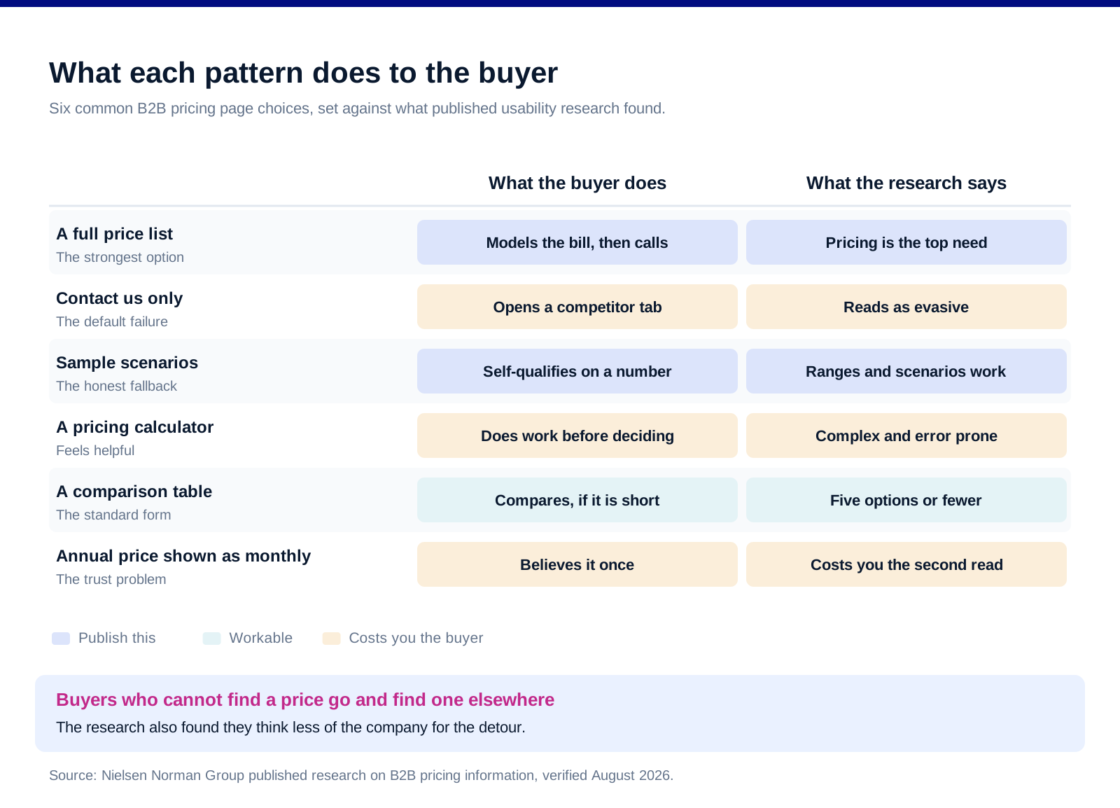
This is the finding everything else sits on. Nielsen Norman Group's research on business customers reports pricing as "the top most needed piece of information online", and observed that "participants go to competitors' sites when websites do not show prices".
The cost of hiding it is reputational, not just mechanical. The same research states that "People view companies that hide costs as being evasive and untrustworthy". That is a brand outcome, and it does not show up in the conversion rate of the page you removed the price from.
Sample prices are the answer when an exact price is impossible. The recommendation is to show "prices for typical scenarios, price range, or manufacturer's suggested retail price" rather than nothing. A named example configuration with a real number attached does most of the work a full price list would.
Calculators are not the answer. The research is direct about it: "most pricing tools proved complex, time-consuming, and error prone". A calculator asks the buyer to do work in order to find out whether they should keep reading, which is the wrong order.
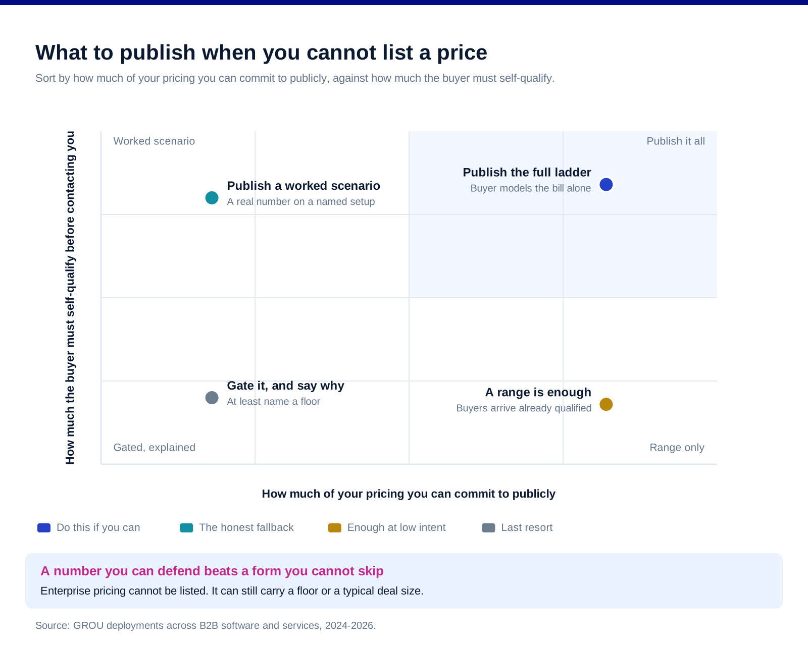
Which means the hard case has a published answer. Enterprise pricing genuinely cannot be listed. Enterprise pricing can still carry a floor, a typical deal size, or a worked scenario, and the alternative is not privacy, it is the competitor's tab.
What a comparison table is allowed to do
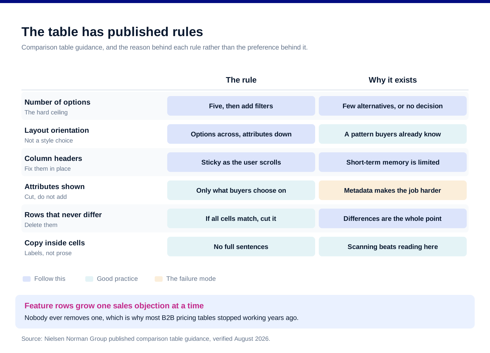
Five options is the working ceiling. NN/g's comparison table guidance explains that these tables "support compensatory decision making, in which people engage only when they have relatively few alternatives to consider", and that "When more than 5 items need to be compared, add other mechanisms such as filters".
The orientation is not a style choice. The guidance is to "Stick to the standard table layout: options as columns, attributes as rows, with row labels on the left and column labels above". Every pricing page that flips this to look distinctive is making its buyer relearn a pattern they already knew.
Headers have to stay visible. The reason given is memory rather than aesthetics: "Human short-term memory is limited, and users will easily forget which column is for which product." A forty-row feature table with headers that scroll away is a table nobody finishes.
Cut the attributes nobody chooses on. The guidance warns against throwing "every piece of metadata you have into the table, because it will make the job harder for users". Feature lists on B2B pricing pages grow by accretion, one sales objection at a time, and nobody ever removes a row.
Say what is different, not just what exists. The pattern NN/g highlights is letting users identify differences directly rather than reading two columns and diffing them mentally. On a three-tier SaaS table, that usually means the rows where all three cells are identical should not be rows at all.
Full sentences do not belong in cells. Short labels, consistent phrasing down each row, and no marketing copy inside the grid.
The accessibility rule people cite wrongly
Reflow asks for 320 CSS pixels. WCAG's Reflow criterion, a Level AA requirement, asks that content be presented "without requiring scrolling in two dimensions" for "Vertical scrolling content at a width equivalent to 320 CSS pixels".
That width is a zoom target, not a phone. The standard explains that "320 CSS pixels is equivalent to a starting viewport width of 1280 CSS pixels wide at 400% zoom", which is the case it was written for.
And data tables are excepted. The criterion excludes "parts of the content which require two-dimensional layout for usage or meaning", and the understanding document names "data tables (not individual cells)" among them. A pricing table that scrolls sideways at 320 pixels is not automatically a conformance failure.
Which is not permission to ignore small screens. The exception covers the table. It does not cover the headline, the plan cards, the FAQ or the call to action, all of which still have to reflow. Most pricing pages fail on those, not on the grid.
The practical version is simpler than the standard. Below the breakpoint, stop trying to be a table. Stacked plan cards with the differences stated per card beat a compressed grid, and they sidestep the argument entirely.
What real vendors actually publish
Some publish the exact unit rate. Twilio's US voice pricing lists outbound to US local numbers at "$0.0140 / min" and a US local number at "$1.15 / mo". A buyer can model their bill before speaking to anyone, and the page becomes a reference that people return to.
Some split the price across pages and lose the thread. Klenty publishes platform tiers on one page and dialer tiers on a separate one, with neither page mentioning the other. The prices are all there. The buyer still cannot answer what it costs, which is the only question the page exists to answer. We covered the arithmetic in our Klenty pricing breakdown.
Some make the buyer set a variable before seeing a number. Reply.io scales its per-seat price by active contacts, from "$49 per user/month" upward. It is honest and it is legible, but it also means no single number can be quoted, which is a real cost in a comparison.
The pattern across all three is the same. Buyers are trying to reach one figure they can defend internally. Any structure that delays that figure by one more click, one more slider, or one more page is spending the buyer's patience to protect information they will get on the call anyway.
And annual toggles are worth a specific warning. Defaulting to the annual price and labelling it "per month" is the most common piece of quiet dishonesty on B2B pricing pages. It survives because it works on the first read and fails on the second, which is the read where trust is decided.
What nobody can tell you
No conversion lift figure appears in this article. Every one in circulation comes from a vendor, a consultancy or an agency with a commercial interest in the number, on a sample and a baseline that are never disclosed.
No universal number of tiers. Three is common because it is under the five-option ceiling, not because it is optimal.
No benchmark for how much traffic a pricing page should convert. It depends entirely on what fraction of your traffic is in a buying cycle, which is not a property of the page.
Test on your own page or do not claim a result. The only credible number is the one you measured yourself, on your own traffic, over enough volume to mean something.
FAQ
Should B2B companies show pricing on their website?
Published usability research on business buyers says yes. Nielsen Norman Group reports pricing as the top most needed piece of information online, and observed participants leaving for competitors' sites when a website does not show prices. The same research found people view companies that hide costs as evasive and untrustworthy, which is a cost that does not appear in page analytics.
What if our pricing is genuinely custom?
Publish something anyway. The recommendation from the research is sample prices for typical scenarios, a price range, or a list price. A worked example with a real number attached lets a buyer decide whether they are in your market, which is the job the page is doing. Avoid a calculator, because most pricing tools tested as complex, time consuming and error prone.
How many pricing tiers should a comparison table have?
Five is the practical ceiling, because comparison tables only support the kind of decision making they are meant to support when there are relatively few alternatives. Beyond five options, the guidance is to add filters so the user can narrow the set rather than to widen the table. Three tiers is common in B2B software because it sits comfortably under that ceiling.
Does a pricing table have to work on mobile for accessibility?
Not in the way most people assume. WCAG's Reflow criterion asks for content at a width equivalent to 320 CSS pixels without two-dimensional scrolling, but it explicitly excepts data tables, which means a horizontally scrolling pricing table is not automatically a failure. The rest of the page still has to reflow, and in practice stacked plan cards below the breakpoint are easier to build and easier to read than a compressed grid.
Should the pricing page default to annual or monthly?
Show whichever you want, but label it honestly. Defaulting to the annual rate while presenting it as a monthly figure is the most common credibility problem on B2B pricing pages. It works on the first read and is caught on the second, and the second read is the one where the buyer decides whether to trust the rest of the page.
What is a good conversion rate for a B2B pricing page?
There is no honest answer to this. The rate depends almost entirely on what share of your traffic is already in a buying cycle, which is a property of your acquisition rather than of the page. Every benchmark in circulation comes from a source selling optimisation services, on an undisclosed sample. Measure your own page against its own history instead.
Bottom line
Publish a number. If you cannot publish the number, publish a scenario with a number in it, because the research says buyers who cannot find a price go and find one somewhere else and think less of you for the detour. Keep the comparison to five options or fewer, put options in columns and attributes in rows, fix the headers, and delete every row where all the cells say the same thing. Below the breakpoint, stop being a table and start being cards, which is easier than arguing about whether the data table exception applies to you. And when you read the next pricing page teardown with a conversion lift in the headline, ask where the number came from, because the honest ones are the ones measured on your own traffic.
Want the demand built rather than the pricing page argued about? Book a call with GROU. We run lead generation and outbound inside B2B revenue engines across verticals. If the question is what to charge rather than how to present it, our pricing strategy piece covers the other half.
We are GROU, a B2B pipeline agency that runs lead generation, outbound, and LinkedIn content for clients across manufacturing, fintech, iGaming, software, and professional services. The vendor pricing pages referenced above were read first-hand in August 2026 and are cited as observed examples rather than as endorsements.
Almost every article about pricing page optimisation quotes a conversion lift. Almost none of them can tell you where the number came from, because the number came from a tool vendor with a product to sell.
So this one is built from things that can be checked: published usability research on what business buyers do when a price is missing, the published rules for comparison tables, the accessibility standard that people cite incorrectly, and what real B2B vendors actually put on their pricing pages.
TL;DR
Nielsen Norman Group's research on business buyers is blunt: pricing is the top most needed piece of information online, participants go to competitors' sites when websites do not show prices, and people view companies that hide costs as evasive and untrustworthy. Where an exact price is impossible, the recommendation is sample prices for typical scenarios, a range, or a list price, and specifically not a calculator, because most pricing tools proved complex, time-consuming and error prone in testing. On the table itself, comparison tables support decision making only when there are few alternatives, so beyond five options you need filters rather than more columns, headers should stay fixed as the user scrolls, and the layout should be options as columns and attributes as rows. On accessibility, WCAG's Reflow criterion asks for content at 320 CSS pixels without two-dimensional scrolling, but it explicitly excepts data tables, which means a horizontally scrolling pricing table is not automatically a failure and the rest of the page still has to reflow. Publish something, keep the table under five options, and stop looking for the lift figure.
Hiding the price sends the buyer to a competitor
This is the finding everything else sits on. Nielsen Norman Group's research on business customers reports pricing as "the top most needed piece of information online", and observed that "participants go to competitors' sites when websites do not show prices".
The cost of hiding it is reputational, not just mechanical. The same research states that "People view companies that hide costs as being evasive and untrustworthy". That is a brand outcome, and it does not show up in the conversion rate of the page you removed the price from.
Sample prices are the answer when an exact price is impossible. The recommendation is to show "prices for typical scenarios, price range, or manufacturer's suggested retail price" rather than nothing. A named example configuration with a real number attached does most of the work a full price list would.
Calculators are not the answer. The research is direct about it: "most pricing tools proved complex, time-consuming, and error prone". A calculator asks the buyer to do work in order to find out whether they should keep reading, which is the wrong order.
Which means the hard case has a published answer. Enterprise pricing genuinely cannot be listed. Enterprise pricing can still carry a floor, a typical deal size, or a worked scenario, and the alternative is not privacy, it is the competitor's tab.
What a comparison table is allowed to do
Five options is the working ceiling. NN/g's comparison table guidance explains that these tables "support compensatory decision making, in which people engage only when they have relatively few alternatives to consider", and that "When more than 5 items need to be compared, add other mechanisms such as filters".
The orientation is not a style choice. The guidance is to "Stick to the standard table layout: options as columns, attributes as rows, with row labels on the left and column labels above". Every pricing page that flips this to look distinctive is making its buyer relearn a pattern they already knew.
Headers have to stay visible. The reason given is memory rather than aesthetics: "Human short-term memory is limited, and users will easily forget which column is for which product." A forty-row feature table with headers that scroll away is a table nobody finishes.
Cut the attributes nobody chooses on. The guidance warns against throwing "every piece of metadata you have into the table, because it will make the job harder for users". Feature lists on B2B pricing pages grow by accretion, one sales objection at a time, and nobody ever removes a row.
Say what is different, not just what exists. The pattern NN/g highlights is letting users identify differences directly rather than reading two columns and diffing them mentally. On a three-tier SaaS table, that usually means the rows where all three cells are identical should not be rows at all.
Full sentences do not belong in cells. Short labels, consistent phrasing down each row, and no marketing copy inside the grid.
The accessibility rule people cite wrongly
Reflow asks for 320 CSS pixels. WCAG's Reflow criterion, a Level AA requirement, asks that content be presented "without requiring scrolling in two dimensions" for "Vertical scrolling content at a width equivalent to 320 CSS pixels".
That width is a zoom target, not a phone. The standard explains that "320 CSS pixels is equivalent to a starting viewport width of 1280 CSS pixels wide at 400% zoom", which is the case it was written for.
And data tables are excepted. The criterion excludes "parts of the content which require two-dimensional layout for usage or meaning", and the understanding document names "data tables (not individual cells)" among them. A pricing table that scrolls sideways at 320 pixels is not automatically a conformance failure.
Which is not permission to ignore small screens. The exception covers the table. It does not cover the headline, the plan cards, the FAQ or the call to action, all of which still have to reflow. Most pricing pages fail on those, not on the grid.
The practical version is simpler than the standard. Below the breakpoint, stop trying to be a table. Stacked plan cards with the differences stated per card beat a compressed grid, and they sidestep the argument entirely.
What real vendors actually publish
Some publish the exact unit rate. Twilio's US voice pricing lists outbound to US local numbers at "$0.0140 / min" and a US local number at "$1.15 / mo". A buyer can model their bill before speaking to anyone, and the page becomes a reference that people return to.
Some split the price across pages and lose the thread. Klenty publishes platform tiers on one page and dialer tiers on a separate one, with neither page mentioning the other. The prices are all there. The buyer still cannot answer what it costs, which is the only question the page exists to answer. We covered the arithmetic in our Klenty pricing breakdown.
Some make the buyer set a variable before seeing a number. Reply.io scales its per-seat price by active contacts, from "$49 per user/month" upward. It is honest and it is legible, but it also means no single number can be quoted, which is a real cost in a comparison.
The pattern across all three is the same. Buyers are trying to reach one figure they can defend internally. Any structure that delays that figure by one more click, one more slider, or one more page is spending the buyer's patience to protect information they will get on the call anyway.
And annual toggles are worth a specific warning. Defaulting to the annual price and labelling it "per month" is the most common piece of quiet dishonesty on B2B pricing pages. It survives because it works on the first read and fails on the second, which is the read where trust is decided.
What nobody can tell you
No conversion lift figure appears in this article. Every one in circulation comes from a vendor, a consultancy or an agency with a commercial interest in the number, on a sample and a baseline that are never disclosed.
No universal number of tiers. Three is common because it is under the five-option ceiling, not because it is optimal.
No benchmark for how much traffic a pricing page should convert. It depends entirely on what fraction of your traffic is in a buying cycle, which is not a property of the page.
Test on your own page or do not claim a result. The only credible number is the one you measured yourself, on your own traffic, over enough volume to mean something.
FAQ
Should B2B companies show pricing on their website?
Published usability research on business buyers says yes. Nielsen Norman Group reports pricing as the top most needed piece of information online, and observed participants leaving for competitors' sites when a website does not show prices. The same research found people view companies that hide costs as evasive and untrustworthy, which is a cost that does not appear in page analytics.
What if our pricing is genuinely custom?
Publish something anyway. The recommendation from the research is sample prices for typical scenarios, a price range, or a list price. A worked example with a real number attached lets a buyer decide whether they are in your market, which is the job the page is doing. Avoid a calculator, because most pricing tools tested as complex, time consuming and error prone.
How many pricing tiers should a comparison table have?
Five is the practical ceiling, because comparison tables only support the kind of decision making they are meant to support when there are relatively few alternatives. Beyond five options, the guidance is to add filters so the user can narrow the set rather than to widen the table. Three tiers is common in B2B software because it sits comfortably under that ceiling.
Does a pricing table have to work on mobile for accessibility?
Not in the way most people assume. WCAG's Reflow criterion asks for content at a width equivalent to 320 CSS pixels without two-dimensional scrolling, but it explicitly excepts data tables, which means a horizontally scrolling pricing table is not automatically a failure. The rest of the page still has to reflow, and in practice stacked plan cards below the breakpoint are easier to build and easier to read than a compressed grid.
Should the pricing page default to annual or monthly?
Show whichever you want, but label it honestly. Defaulting to the annual rate while presenting it as a monthly figure is the most common credibility problem on B2B pricing pages. It works on the first read and is caught on the second, and the second read is the one where the buyer decides whether to trust the rest of the page.
What is a good conversion rate for a B2B pricing page?
There is no honest answer to this. The rate depends almost entirely on what share of your traffic is already in a buying cycle, which is a property of your acquisition rather than of the page. Every benchmark in circulation comes from a source selling optimisation services, on an undisclosed sample. Measure your own page against its own history instead.
Bottom line
Publish a number. If you cannot publish the number, publish a scenario with a number in it, because the research says buyers who cannot find a price go and find one somewhere else and think less of you for the detour. Keep the comparison to five options or fewer, put options in columns and attributes in rows, fix the headers, and delete every row where all the cells say the same thing. Below the breakpoint, stop being a table and start being cards, which is easier than arguing about whether the data table exception applies to you. And when you read the next pricing page teardown with a conversion lift in the headline, ask where the number came from, because the honest ones are the ones measured on your own traffic.
Want the demand built rather than the pricing page argued about? Book a call with GROU. We run lead generation and outbound inside B2B revenue engines across verticals. If the question is what to charge rather than how to present it, our pricing strategy piece covers the other half.
We are GROU, a B2B pipeline agency that runs lead generation, outbound, and LinkedIn content for clients across manufacturing, fintech, iGaming, software, and professional services. The vendor pricing pages referenced above were read first-hand in August 2026 and are cited as observed examples rather than as endorsements.
Almost every article about pricing page optimisation quotes a conversion lift. Almost none of them can tell you where the number came from, because the number came from a tool vendor with a product to sell.
So this one is built from things that can be checked: published usability research on what business buyers do when a price is missing, the published rules for comparison tables, the accessibility standard that people cite incorrectly, and what real B2B vendors actually put on their pricing pages.
TL;DR
Nielsen Norman Group's research on business buyers is blunt: pricing is the top most needed piece of information online, participants go to competitors' sites when websites do not show prices, and people view companies that hide costs as evasive and untrustworthy. Where an exact price is impossible, the recommendation is sample prices for typical scenarios, a range, or a list price, and specifically not a calculator, because most pricing tools proved complex, time-consuming and error prone in testing. On the table itself, comparison tables support decision making only when there are few alternatives, so beyond five options you need filters rather than more columns, headers should stay fixed as the user scrolls, and the layout should be options as columns and attributes as rows. On accessibility, WCAG's Reflow criterion asks for content at 320 CSS pixels without two-dimensional scrolling, but it explicitly excepts data tables, which means a horizontally scrolling pricing table is not automatically a failure and the rest of the page still has to reflow. Publish something, keep the table under five options, and stop looking for the lift figure.
Hiding the price sends the buyer to a competitor
This is the finding everything else sits on. Nielsen Norman Group's research on business customers reports pricing as "the top most needed piece of information online", and observed that "participants go to competitors' sites when websites do not show prices".
The cost of hiding it is reputational, not just mechanical. The same research states that "People view companies that hide costs as being evasive and untrustworthy". That is a brand outcome, and it does not show up in the conversion rate of the page you removed the price from.
Sample prices are the answer when an exact price is impossible. The recommendation is to show "prices for typical scenarios, price range, or manufacturer's suggested retail price" rather than nothing. A named example configuration with a real number attached does most of the work a full price list would.
Calculators are not the answer. The research is direct about it: "most pricing tools proved complex, time-consuming, and error prone". A calculator asks the buyer to do work in order to find out whether they should keep reading, which is the wrong order.
Which means the hard case has a published answer. Enterprise pricing genuinely cannot be listed. Enterprise pricing can still carry a floor, a typical deal size, or a worked scenario, and the alternative is not privacy, it is the competitor's tab.
What a comparison table is allowed to do
Five options is the working ceiling. NN/g's comparison table guidance explains that these tables "support compensatory decision making, in which people engage only when they have relatively few alternatives to consider", and that "When more than 5 items need to be compared, add other mechanisms such as filters".
The orientation is not a style choice. The guidance is to "Stick to the standard table layout: options as columns, attributes as rows, with row labels on the left and column labels above". Every pricing page that flips this to look distinctive is making its buyer relearn a pattern they already knew.
Headers have to stay visible. The reason given is memory rather than aesthetics: "Human short-term memory is limited, and users will easily forget which column is for which product." A forty-row feature table with headers that scroll away is a table nobody finishes.
Cut the attributes nobody chooses on. The guidance warns against throwing "every piece of metadata you have into the table, because it will make the job harder for users". Feature lists on B2B pricing pages grow by accretion, one sales objection at a time, and nobody ever removes a row.
Say what is different, not just what exists. The pattern NN/g highlights is letting users identify differences directly rather than reading two columns and diffing them mentally. On a three-tier SaaS table, that usually means the rows where all three cells are identical should not be rows at all.
Full sentences do not belong in cells. Short labels, consistent phrasing down each row, and no marketing copy inside the grid.
The accessibility rule people cite wrongly
Reflow asks for 320 CSS pixels. WCAG's Reflow criterion, a Level AA requirement, asks that content be presented "without requiring scrolling in two dimensions" for "Vertical scrolling content at a width equivalent to 320 CSS pixels".
That width is a zoom target, not a phone. The standard explains that "320 CSS pixels is equivalent to a starting viewport width of 1280 CSS pixels wide at 400% zoom", which is the case it was written for.
And data tables are excepted. The criterion excludes "parts of the content which require two-dimensional layout for usage or meaning", and the understanding document names "data tables (not individual cells)" among them. A pricing table that scrolls sideways at 320 pixels is not automatically a conformance failure.
Which is not permission to ignore small screens. The exception covers the table. It does not cover the headline, the plan cards, the FAQ or the call to action, all of which still have to reflow. Most pricing pages fail on those, not on the grid.
The practical version is simpler than the standard. Below the breakpoint, stop trying to be a table. Stacked plan cards with the differences stated per card beat a compressed grid, and they sidestep the argument entirely.
What real vendors actually publish
Some publish the exact unit rate. Twilio's US voice pricing lists outbound to US local numbers at "$0.0140 / min" and a US local number at "$1.15 / mo". A buyer can model their bill before speaking to anyone, and the page becomes a reference that people return to.
Some split the price across pages and lose the thread. Klenty publishes platform tiers on one page and dialer tiers on a separate one, with neither page mentioning the other. The prices are all there. The buyer still cannot answer what it costs, which is the only question the page exists to answer. We covered the arithmetic in our Klenty pricing breakdown.
Some make the buyer set a variable before seeing a number. Reply.io scales its per-seat price by active contacts, from "$49 per user/month" upward. It is honest and it is legible, but it also means no single number can be quoted, which is a real cost in a comparison.
The pattern across all three is the same. Buyers are trying to reach one figure they can defend internally. Any structure that delays that figure by one more click, one more slider, or one more page is spending the buyer's patience to protect information they will get on the call anyway.
And annual toggles are worth a specific warning. Defaulting to the annual price and labelling it "per month" is the most common piece of quiet dishonesty on B2B pricing pages. It survives because it works on the first read and fails on the second, which is the read where trust is decided.
What nobody can tell you
No conversion lift figure appears in this article. Every one in circulation comes from a vendor, a consultancy or an agency with a commercial interest in the number, on a sample and a baseline that are never disclosed.
No universal number of tiers. Three is common because it is under the five-option ceiling, not because it is optimal.
No benchmark for how much traffic a pricing page should convert. It depends entirely on what fraction of your traffic is in a buying cycle, which is not a property of the page.
Test on your own page or do not claim a result. The only credible number is the one you measured yourself, on your own traffic, over enough volume to mean something.
FAQ
Should B2B companies show pricing on their website?
Published usability research on business buyers says yes. Nielsen Norman Group reports pricing as the top most needed piece of information online, and observed participants leaving for competitors' sites when a website does not show prices. The same research found people view companies that hide costs as evasive and untrustworthy, which is a cost that does not appear in page analytics.
What if our pricing is genuinely custom?
Publish something anyway. The recommendation from the research is sample prices for typical scenarios, a price range, or a list price. A worked example with a real number attached lets a buyer decide whether they are in your market, which is the job the page is doing. Avoid a calculator, because most pricing tools tested as complex, time consuming and error prone.
How many pricing tiers should a comparison table have?
Five is the practical ceiling, because comparison tables only support the kind of decision making they are meant to support when there are relatively few alternatives. Beyond five options, the guidance is to add filters so the user can narrow the set rather than to widen the table. Three tiers is common in B2B software because it sits comfortably under that ceiling.
Does a pricing table have to work on mobile for accessibility?
Not in the way most people assume. WCAG's Reflow criterion asks for content at a width equivalent to 320 CSS pixels without two-dimensional scrolling, but it explicitly excepts data tables, which means a horizontally scrolling pricing table is not automatically a failure. The rest of the page still has to reflow, and in practice stacked plan cards below the breakpoint are easier to build and easier to read than a compressed grid.
Should the pricing page default to annual or monthly?
Show whichever you want, but label it honestly. Defaulting to the annual rate while presenting it as a monthly figure is the most common credibility problem on B2B pricing pages. It works on the first read and is caught on the second, and the second read is the one where the buyer decides whether to trust the rest of the page.
What is a good conversion rate for a B2B pricing page?
There is no honest answer to this. The rate depends almost entirely on what share of your traffic is already in a buying cycle, which is a property of your acquisition rather than of the page. Every benchmark in circulation comes from a source selling optimisation services, on an undisclosed sample. Measure your own page against its own history instead.
Bottom line
Publish a number. If you cannot publish the number, publish a scenario with a number in it, because the research says buyers who cannot find a price go and find one somewhere else and think less of you for the detour. Keep the comparison to five options or fewer, put options in columns and attributes in rows, fix the headers, and delete every row where all the cells say the same thing. Below the breakpoint, stop being a table and start being cards, which is easier than arguing about whether the data table exception applies to you. And when you read the next pricing page teardown with a conversion lift in the headline, ask where the number came from, because the honest ones are the ones measured on your own traffic.
Want the demand built rather than the pricing page argued about? Book a call with GROU. We run lead generation and outbound inside B2B revenue engines across verticals. If the question is what to charge rather than how to present it, our pricing strategy piece covers the other half.
We are GROU, a B2B pipeline agency that runs lead generation, outbound, and LinkedIn content for clients across manufacturing, fintech, iGaming, software, and professional services. The vendor pricing pages referenced above were read first-hand in August 2026 and are cited as observed examples rather than as endorsements.

Pipeline OS Newsletter
Build qualified pipeline
Get weekly tactics to generate demand, improve lead quality, and book more meetings.





Trusted by industry leaders
Trusted by industry leaders
Trusted by industry leaders
Ready to build qualified pipeline?
Ready to build qualified pipeline?
Ready to build qualified pipeline?
Book a call to see if we're the right fit, or take the 2-minute quiz to get a clear starting point.
Book a call to see if we're the right fit, or take the 2-minute quiz to get a clear starting point.
Book a call to see if we're the right fit, or take the 2-minute quiz to get a clear starting point.
" height="30.21639343089746px" id="hfGbXmQR2" width="30.216393430897455px"/></svg>)
Copyright © 2026 – All Right Reserved
Copyright © 2026 – All Right Reserved
Copyright © 2026 – All Right Reserved