%22%3E%3C/path%3E%3Cpath d=%22M 63.072 7.554 C 62.258 8.022 61.577 8.689 61.092 9.493 L 61.092 7.076 L 57.158 7.076 L 57.158 22.64 L 61.089 22.64 L 61.089 14.888 C 61.089 13.446 61.403 12.434 62.03 11.853 C 62.818 11.218 63.818 10.907 64.826 10.982 L 65.868 10.982 L 65.868 6.851 C 64.891 6.834 63.926 7.076 63.073 7.554 Z%22 fill=%22rgb(17,17,17)%22%3E%3C/path%3E%3Cpath d=%22M 78.916 7.82 C 76.363 6.49 73.321 6.49 70.768 7.82 C 69.562 8.473 68.564 9.451 67.888 10.644 C 67.167 11.931 66.803 13.387 66.834 14.862 C 66.804 16.332 67.157 17.785 67.86 19.077 C 68.515 20.267 69.494 21.246 70.684 21.901 C 71.924 22.576 73.318 22.92 74.73 22.898 C 76.164 22.918 77.58 22.575 78.846 21.901 C 80.062 21.247 81.073 20.27 81.768 19.077 C 82.506 17.797 82.88 16.339 82.85 14.862 C 82.88 13.389 82.517 11.934 81.797 10.647 C 81.12 9.455 80.122 8.477 78.917 7.824 M 78.803 14.862 C 78.829 15.739 78.636 16.608 78.241 17.391 C 77.903 18.046 77.38 18.588 76.738 18.95 C 76.124 19.293 75.432 19.472 74.729 19.47 C 73.668 19.497 72.648 19.061 71.934 18.276 C 71.139 17.323 70.741 16.1 70.823 14.862 C 70.741 13.62 71.149 12.395 71.959 11.45 C 72.687 10.667 73.715 10.233 74.783 10.256 C 75.859 10.236 76.894 10.67 77.635 11.45 C 78.464 12.387 78.884 13.616 78.801 14.864%22 fill=%22rgb(17,17,17)%22%3E%3C/path%3E%3Cpath d=%22M 95.906 7.076 L 95.906 15.646 C 95.975 16.68 95.643 17.701 94.979 18.498 C 94.311 19.184 93.379 19.547 92.422 19.495 C 91.475 19.544 90.553 19.18 89.894 18.498 C 89.23 17.701 88.898 16.68 88.967 15.646 L 88.967 7.076 L 85.033 7.076 L 85.033 16.207 C 85 17.449 85.275 18.68 85.834 19.79 C 86.327 20.75 87.095 21.542 88.039 22.065 C 89.033 22.594 90.145 22.861 91.271 22.838 C 92.188 22.847 93.095 22.65 93.926 22.263 C 94.708 21.905 95.388 21.36 95.906 20.675 L 95.906 22.645 L 99.865 22.645 L 99.865 7.076 Z%22 fill=%22rgb(17,17,17)%22%3E%3C/path%3E%3Cpath d=%22M 4.513 15.626 C 4.511 10.815 7.606 6.549 12.181 5.059 C 16.756 3.57 21.77 5.195 24.601 9.086 L 27.816 5.87 C 24.074 1.186 17.981 -0.943 12.137 0.393 C 6.292 1.728 1.728 6.292 0.393 12.137 C -0.943 17.981 1.186 24.074 5.87 27.816 L 9.085 24.601 C 6.214 22.512 4.515 19.177 4.513 15.626%22 fill=%22rgb(32,62,235)%22%3E%3C/path%3E%3Cpath d=%22M 17.114 14.343 L 13.354 18.01 L 13.354 18.026 L 21.071 18.026 L 11.412 27.609 L 17.389 27.609 L 23.999 21.081 L 23.999 28.316 L 24.005 28.316 L 27.967 24.393 L 27.967 14.343 Z%22 fill=%22rgb(32,62,235)%22%3E%3C/path%3E%3C/g%3E%3C/svg%3E) ×
× ××
××›
›
›
›
LinkedIn lead gen ad specs 2026: sizes, limits, and formats
LinkedIn lead gen ad specs 2026: sizes, limits, and formats
LinkedIn lead gen ad specs 2026: sizes, limits, and formats
LinkedIn lead gen ad specs 2026: sizes, limits, and formats
LinkedIn lead gen ad specs 2026: sizes, limits, and formats
LinkedIn lead gen ad specs 2026: sizes, limits, and formats

Author
Aljaz Peklaj

Thought Leader Ads carry a 2.68% median CTR versus 0.42% for single image ads, but CTR is not pipeline. If your LinkedIn lead generation ad specs are right and your structure is wrong, you still buy clicks that don't turn into meetings.
Ad format matters, because LinkedIn now supports Lead Gen Forms across feed, message, document, event, video, carousel, and conversation placements.
Copy limits matter, because recommended lengths protect the message from truncation and keep the CTA readable on mobile.
Form fields matter, because prefill changes the friction equation, and three to four fields is the published sweet spot.
Mobile versus desktop matters, because the same creative behaves differently by placement, especially when “Read more” creates paid clicks without intent.
Proof matters, because results-based claims, landing page mismatch, and spam rules can kill approvals before launch.
Table of Contents
Pipeline first, specs second
Many marketers treat LinkedIn ad specs like a design checklist. That misses the job of the format, which is to protect intent on the way to pipeline. ZenABM's dataset of 161,256 LinkedIn ads across 211 companies found Thought Leader Ads at 2.68% median CTR versus 0.42% for single image ads, with CPC at $2.29 versus $13.23, yet higher CTR still didn't guarantee more pipeline.
That's the mistake. A feed of strong-looking clicks can still feed weak qualification if the ad, form, and follow-up are misaligned. GROU measures qualified leads, SQL rate, and sourced pipeline, not vanity clicks, because a click is only useful when the structure behind it holds.
Practical rule: Start with the outcome, then design the ad unit backward from that outcome.
For a useful external map of how a full system hangs together, sistema de lead generation para LinkedIn is a helpful reference point. The platform logic is simple, native forms exist to shorten the path, and the spec sheet exists to keep that path clean.
If you already run a LinkedIn motion, use the internal benchmark on LinkedIn ads to compare creative constraints against pipeline outputs. The rest of this article follows the same logic, format by format.
Single image and carousel are where most feed programs start.
Video and document work better when you want attention to stay inside LinkedIn longer.
Conversation and message ads fit warmer audiences and tighter ABM lists.
Lead Gen Forms are the friction gate, where qualified data capture either stays short or gets bloated.
Single image ad dimensions and copy limits
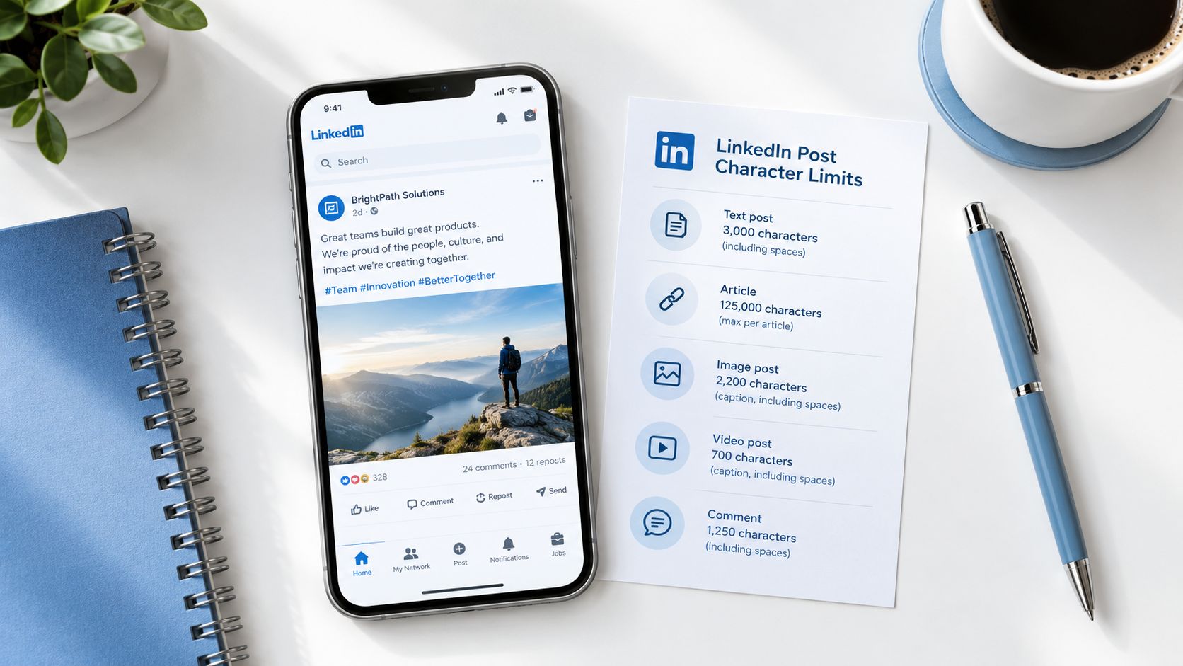
Single image ads are the cleanest place to apply discipline. LinkedIn's published specs allow up to 600 characters of introductory text, but 150 characters is the recommended ceiling to avoid truncation, and headlines go up to 200 characters, with 70 characters recommended for mobile. The default image is 1200 x 1200 px at 1:1 (LinkedIn sponsored-content specs).
Write for the cut-off, not the canvas
If you go past the recommended intro length, the feed hides the rest behind Read more. That matters because those clicks can count as paid clicks, which inflates CTR without adding intent. You get prettier metrics and weaker attribution.
Use short, outcome-led copy. Lead with the offer, the pain, or the proof, then stop. A line like “800+ qualified leads at €15 per lead” only belongs in creative if it also appears on the destination page, because GROU's proof rule only permits verified figures from published case studies.
Keep the image and claim in the same lane
The strongest single image ads don't try to explain everything. They hold one visual idea and one written promise. That keeps the ad legible on mobile and prevents the headline from doing the work of a landing page.
If you need a sharper comparison for approved fields, pair the ad with the same verified proof block used on the landing page. That's the pattern that keeps agencies out of review trouble and keeps buyers from feeling baited.
Carousel ad card counts and content rules
Carousel gives you more room, but not more forgiveness. LinkedIn allows 2 to 10 cards, each at 1080 x 1080 px, with JPG or PNG only. Card headlines are capped at 45 characters, and intro text should stay within 255 characters (LinkedIn Lead Gen Forms playbook).
Use card count to shape the story
Too few cards, and the sequence doesn't carry enough context for a B2B buyer. Too many, and the point fragments. For pipeline work, the best carousels usually behave like a short sales sequence, one problem, one shift, one proof point, one next step.
That structure matters more in industries like SaaS, pharma, legal tech, manufacturing, and iGaming, where the buyer often needs staged clarity before a form submission. A carousel can do that, but only if each card earns its place.
Don't use carousel as a storage unit for every feature you can think of.
The file-type restriction matters too. Since the format is image-based, you're choosing static narrative over motion. That's fine when the buyer needs a linear story, and it's a mistake when the idea really belongs in video.
If you need a deeper tactical lens on sequencing, the LinkedIn carousel strategy resource helps frame card flow around decision stages. The constraint isn't the weakness. It's what forces the message to stay tight.
Video ad file sizes and recommended copy
Video ads accept files from 75 KB to 200 MB, with a recommended headline of 70 characters and a maximum of 200. Intro text follows the same pattern as single image ads, 150 characters recommended, 600 maximum, so the copy limit still matters even when the creative moves (LinkedIn help page).
Treat the first line like a hook, not a caption
Video on LinkedIn is a stopping device, and the intro text has to carry the close. Motion can win the pause, but the first line still needs to state the offer fast enough that the viewer knows why to continue.
I keep video openings blunt for a reason. One claim. One audience. One reason to care. If the opening tries to do too much, the cut gets buried.
Video should be judged on the buyer's movement into the next step, not on whether the creative gets consumed like a report. For B2B teams building that sequence, LinkedIn video strategy for B2B is a useful companion. Keep the text short enough for mobile, and make the visual earn the pause.
Document and conversation ad constraints
Document ads and conversation ads support different points in the buying process. Document ads accept PDF, PPT, or DOC files up to 100 MB and 300 pages. Conversation ads allow up to 8,000 characters of message text and 25 characters per call-to-action button (LinkedIn help page). Those limits protect usability: a readable asset supports evaluation, while a concise button keeps the next action clear.
Document ads work because the reader stays put
The buyer can review the asset inside LinkedIn, so a document may create intent before a form or landing-page visit. A low click-out rate does not automatically mean the format failed. The useful question is whether the document answers enough of the buyer's question to justify the next step.
Put the main point on the opening pages. Use large fonts, simple layouts, and scannable sections. Dense slides and decorative design slow comprehension, especially on a phone. If the headline requires zooming, the document is carrying too much information at once.
Conversation ads need restraint
Message ads and conversation ads require tighter audience control. LinkedIn applies anti-spam protections, including frequency caps, so these formats fit warm audiences and ABM motions better than broad cold prospecting. The trade-off is reach versus relevance: a narrow audience reduces volume, but it gives the message a better chance of feeling expected.
Keep the path short unless each branch serves a clear buyer question. A known brand can make a direct offer. An unfamiliar one should give the recipient a relevant next action rather than force an immediate sales conversation.
Mobile versus desktop creative trade-offs
Square creative is the safest default for cross-device consistency, because LinkedIn serves 1:1.91 and 4:5 vertical images only on mobile, while 1:1 works on both mobile and desktop (LinkedIn sponsored-content specs). If the campaign needs one asset to carry the full job, square usually protects the experience best.
Engagement and intent don't always travel together
Vertical creative can still win more mobile engagement in feed-heavy campaigns. Desktop traffic often gives you cleaner reads and stronger conversion behavior once buyers move deeper into the process. That trade-off matters when the KPI is qualified leads, not just activity.
Mobile also changes how copy behaves. Intro text beyond 150 characters sits behind Read more, which can create paid clicks that look useful but say little about intent. A strong image does not fix weak copy hierarchy.
Any landing page should be fully responsive and easy to complete on a phone. GROU builds landing pages as part of paid programs, because the ad spec and the page spec have to agree.
Lead generation form fields and limits
Lead form friction is where qualification lives. LinkedIn Lead Gen Forms let you use up to 12 selectable profile fields, with 3 to 4 fields usually the cleaner range, plus up to 3 custom questions. Form copy stays tight too: a 256-character form name, 60-character offer headline, 160-character offer detail, 20-character CTA, and 300-character confirmation message.
Prefill changes the math
LinkedIn pre-populates member contact and profile data after the CTA click, so the form can stay short while still collecting usable lead detail across contact, work, company, and education fields. Treat the form as a fit filter, and let prefill handle the volume collection.
Keep the field stack as lean as sales will tolerate. If the team needs more qualification, put it into targeting and one or two custom questions instead of loading the form with extra friction. The goal is enough structure to protect lead quality without making the buyer abandon the flow.
For teams that route leads through multiple systems, the Email Validation API matters once form captures need clean data for scoring and assignment rules. Keep the form name, offer headline, and confirmation message concise, because the user experiences them as one continuous step.
If you want the form logic mapped to a pipeline workflow, the LinkedIn lead gen forms playbook is a useful reference point. The strongest forms feel short to the buyer, even when the backend model is more detailed.
Quick-reference table for all ad formats
Format | Recommended size or file | Headline limit | Intro text limit | Best use case |
|---|---|---|---|---|
Single image | 1200 x 1200 px | 70 recommended, 200 max | 150 recommended, 600 max | Fast feed offers |
Carousel | 1080 x 1080 px, 2 to 10 cards | 45 per card | 255 per card intro | Multi-step stories |
Video | 75 KB to 200 MB | 70 recommended, 200 max | 150 recommended, 600 max | Motion-led awareness |
Document | PDF, PPT, DOC up to 100 MB and 300 pages | 70 recommended, 200 max | 150 recommended, 600 max | In-platform content consumption |
Conversation | Message text up to 8,000 characters | 60 subject line | 8,000 message text | Warm outreach and ABM |
Text ads | 100 x 100 px image, desktop only | 25 characters | 75 characters | Low-friction desktop visibility |
LinkedIn changes specs over time, so always confirm in Campaign Manager before launch. A quick scan like this saves time, but the true value is knowing which format matches buyer temperature instead of defaulting to whatever the creative team built last.
Common ad rejections and the proof rule
The three rejection risks that matter most are unverifiable results claims, landing page mismatch, and message ads hitting spam rules. LinkedIn checks whether the ad promise and the destination page say the same thing, and that check is usually harsher than the technical spec review. Results claims fail fastest when the figures are rounded, merged, or pulled from memory.
Build proof the same way every time
GROU's proof rule is simple. Only use verified figures from published case studies, never invent or smooth them, and make sure the landing page repeats the exact same number. If an ad says 800+ qualified leads at €15 per lead, the case study should show exactly that and nothing softer.
That consistency matters more than many teams admit. Sales teams often want stronger copy, but stronger copy that can't be defended just creates rejection risk and trust risk at the same time.
The proof block is the right place to anchor those claims so the ad, page, and sales conversation all tell the same story. For agencies and in-house teams alike, the safest route is not creative exaggeration. It's documented proof with no drift.
Pre-flight checklist and next step
Before launch, check five things. Creative size matches the format, intro copy stays within the recommended cut-off, form fields stay close to the minimum needed for qualification, landing page matches the ad promise, and proof stays identical across every surface.
If you want a broader launch discipline, the 8-step preflight checklist is a good companion to this process. It keeps review errors, routing errors, and proof errors from landing at the same time.
Audit your meeting-held rate this Friday and compare it against your last ten lead gen ads. If clicks are high and meetings are flat, your spec probably isn't the main problem, but your structure is.
GROU works with B2B teams that need LinkedIn content, lead generation, and outbound to feed one pipeline system. The team uses a single message, a single target list, and a single reporting line, then tests structure against qualified conversation quality rather than surface clicks.
Run the next campaign through that same lens, from creative ratio to proof block to form fields. If you want help building the system around your LinkedIn motion, visit Grou and review how the pipeline model fits your current ad setup.
Thought Leader Ads carry a 2.68% median CTR versus 0.42% for single image ads, but CTR is not pipeline. If your LinkedIn lead generation ad specs are right and your structure is wrong, you still buy clicks that don't turn into meetings.
Ad format matters, because LinkedIn now supports Lead Gen Forms across feed, message, document, event, video, carousel, and conversation placements.
Copy limits matter, because recommended lengths protect the message from truncation and keep the CTA readable on mobile.
Form fields matter, because prefill changes the friction equation, and three to four fields is the published sweet spot.
Mobile versus desktop matters, because the same creative behaves differently by placement, especially when “Read more” creates paid clicks without intent.
Proof matters, because results-based claims, landing page mismatch, and spam rules can kill approvals before launch.
Table of Contents
Pipeline first, specs second
Many marketers treat LinkedIn ad specs like a design checklist. That misses the job of the format, which is to protect intent on the way to pipeline. ZenABM's dataset of 161,256 LinkedIn ads across 211 companies found Thought Leader Ads at 2.68% median CTR versus 0.42% for single image ads, with CPC at $2.29 versus $13.23, yet higher CTR still didn't guarantee more pipeline.
That's the mistake. A feed of strong-looking clicks can still feed weak qualification if the ad, form, and follow-up are misaligned. GROU measures qualified leads, SQL rate, and sourced pipeline, not vanity clicks, because a click is only useful when the structure behind it holds.
Practical rule: Start with the outcome, then design the ad unit backward from that outcome.
For a useful external map of how a full system hangs together, sistema de lead generation para LinkedIn is a helpful reference point. The platform logic is simple, native forms exist to shorten the path, and the spec sheet exists to keep that path clean.
If you already run a LinkedIn motion, use the internal benchmark on LinkedIn ads to compare creative constraints against pipeline outputs. The rest of this article follows the same logic, format by format.
Single image and carousel are where most feed programs start.
Video and document work better when you want attention to stay inside LinkedIn longer.
Conversation and message ads fit warmer audiences and tighter ABM lists.
Lead Gen Forms are the friction gate, where qualified data capture either stays short or gets bloated.
Single image ad dimensions and copy limits
Single image ads are the cleanest place to apply discipline. LinkedIn's published specs allow up to 600 characters of introductory text, but 150 characters is the recommended ceiling to avoid truncation, and headlines go up to 200 characters, with 70 characters recommended for mobile. The default image is 1200 x 1200 px at 1:1 (LinkedIn sponsored-content specs).
Write for the cut-off, not the canvas
If you go past the recommended intro length, the feed hides the rest behind Read more. That matters because those clicks can count as paid clicks, which inflates CTR without adding intent. You get prettier metrics and weaker attribution.
Use short, outcome-led copy. Lead with the offer, the pain, or the proof, then stop. A line like “800+ qualified leads at €15 per lead” only belongs in creative if it also appears on the destination page, because GROU's proof rule only permits verified figures from published case studies.
Keep the image and claim in the same lane
The strongest single image ads don't try to explain everything. They hold one visual idea and one written promise. That keeps the ad legible on mobile and prevents the headline from doing the work of a landing page.
If you need a sharper comparison for approved fields, pair the ad with the same verified proof block used on the landing page. That's the pattern that keeps agencies out of review trouble and keeps buyers from feeling baited.
Carousel ad card counts and content rules
Carousel gives you more room, but not more forgiveness. LinkedIn allows 2 to 10 cards, each at 1080 x 1080 px, with JPG or PNG only. Card headlines are capped at 45 characters, and intro text should stay within 255 characters (LinkedIn Lead Gen Forms playbook).
Use card count to shape the story
Too few cards, and the sequence doesn't carry enough context for a B2B buyer. Too many, and the point fragments. For pipeline work, the best carousels usually behave like a short sales sequence, one problem, one shift, one proof point, one next step.
That structure matters more in industries like SaaS, pharma, legal tech, manufacturing, and iGaming, where the buyer often needs staged clarity before a form submission. A carousel can do that, but only if each card earns its place.
Don't use carousel as a storage unit for every feature you can think of.
The file-type restriction matters too. Since the format is image-based, you're choosing static narrative over motion. That's fine when the buyer needs a linear story, and it's a mistake when the idea really belongs in video.
If you need a deeper tactical lens on sequencing, the LinkedIn carousel strategy resource helps frame card flow around decision stages. The constraint isn't the weakness. It's what forces the message to stay tight.
Video ad file sizes and recommended copy
Video ads accept files from 75 KB to 200 MB, with a recommended headline of 70 characters and a maximum of 200. Intro text follows the same pattern as single image ads, 150 characters recommended, 600 maximum, so the copy limit still matters even when the creative moves (LinkedIn help page).
Treat the first line like a hook, not a caption
Video on LinkedIn is a stopping device, and the intro text has to carry the close. Motion can win the pause, but the first line still needs to state the offer fast enough that the viewer knows why to continue.
I keep video openings blunt for a reason. One claim. One audience. One reason to care. If the opening tries to do too much, the cut gets buried.
Video should be judged on the buyer's movement into the next step, not on whether the creative gets consumed like a report. For B2B teams building that sequence, LinkedIn video strategy for B2B is a useful companion. Keep the text short enough for mobile, and make the visual earn the pause.
Document and conversation ad constraints
Document ads and conversation ads support different points in the buying process. Document ads accept PDF, PPT, or DOC files up to 100 MB and 300 pages. Conversation ads allow up to 8,000 characters of message text and 25 characters per call-to-action button (LinkedIn help page). Those limits protect usability: a readable asset supports evaluation, while a concise button keeps the next action clear.
Document ads work because the reader stays put
The buyer can review the asset inside LinkedIn, so a document may create intent before a form or landing-page visit. A low click-out rate does not automatically mean the format failed. The useful question is whether the document answers enough of the buyer's question to justify the next step.
Put the main point on the opening pages. Use large fonts, simple layouts, and scannable sections. Dense slides and decorative design slow comprehension, especially on a phone. If the headline requires zooming, the document is carrying too much information at once.
Conversation ads need restraint
Message ads and conversation ads require tighter audience control. LinkedIn applies anti-spam protections, including frequency caps, so these formats fit warm audiences and ABM motions better than broad cold prospecting. The trade-off is reach versus relevance: a narrow audience reduces volume, but it gives the message a better chance of feeling expected.
Keep the path short unless each branch serves a clear buyer question. A known brand can make a direct offer. An unfamiliar one should give the recipient a relevant next action rather than force an immediate sales conversation.
Mobile versus desktop creative trade-offs
Square creative is the safest default for cross-device consistency, because LinkedIn serves 1:1.91 and 4:5 vertical images only on mobile, while 1:1 works on both mobile and desktop (LinkedIn sponsored-content specs). If the campaign needs one asset to carry the full job, square usually protects the experience best.
Engagement and intent don't always travel together
Vertical creative can still win more mobile engagement in feed-heavy campaigns. Desktop traffic often gives you cleaner reads and stronger conversion behavior once buyers move deeper into the process. That trade-off matters when the KPI is qualified leads, not just activity.
Mobile also changes how copy behaves. Intro text beyond 150 characters sits behind Read more, which can create paid clicks that look useful but say little about intent. A strong image does not fix weak copy hierarchy.
Any landing page should be fully responsive and easy to complete on a phone. GROU builds landing pages as part of paid programs, because the ad spec and the page spec have to agree.
Lead generation form fields and limits
Lead form friction is where qualification lives. LinkedIn Lead Gen Forms let you use up to 12 selectable profile fields, with 3 to 4 fields usually the cleaner range, plus up to 3 custom questions. Form copy stays tight too: a 256-character form name, 60-character offer headline, 160-character offer detail, 20-character CTA, and 300-character confirmation message.
Prefill changes the math
LinkedIn pre-populates member contact and profile data after the CTA click, so the form can stay short while still collecting usable lead detail across contact, work, company, and education fields. Treat the form as a fit filter, and let prefill handle the volume collection.
Keep the field stack as lean as sales will tolerate. If the team needs more qualification, put it into targeting and one or two custom questions instead of loading the form with extra friction. The goal is enough structure to protect lead quality without making the buyer abandon the flow.
For teams that route leads through multiple systems, the Email Validation API matters once form captures need clean data for scoring and assignment rules. Keep the form name, offer headline, and confirmation message concise, because the user experiences them as one continuous step.
If you want the form logic mapped to a pipeline workflow, the LinkedIn lead gen forms playbook is a useful reference point. The strongest forms feel short to the buyer, even when the backend model is more detailed.
Quick-reference table for all ad formats
Format | Recommended size or file | Headline limit | Intro text limit | Best use case |
|---|---|---|---|---|
Single image | 1200 x 1200 px | 70 recommended, 200 max | 150 recommended, 600 max | Fast feed offers |
Carousel | 1080 x 1080 px, 2 to 10 cards | 45 per card | 255 per card intro | Multi-step stories |
Video | 75 KB to 200 MB | 70 recommended, 200 max | 150 recommended, 600 max | Motion-led awareness |
Document | PDF, PPT, DOC up to 100 MB and 300 pages | 70 recommended, 200 max | 150 recommended, 600 max | In-platform content consumption |
Conversation | Message text up to 8,000 characters | 60 subject line | 8,000 message text | Warm outreach and ABM |
Text ads | 100 x 100 px image, desktop only | 25 characters | 75 characters | Low-friction desktop visibility |
LinkedIn changes specs over time, so always confirm in Campaign Manager before launch. A quick scan like this saves time, but the true value is knowing which format matches buyer temperature instead of defaulting to whatever the creative team built last.
Common ad rejections and the proof rule
The three rejection risks that matter most are unverifiable results claims, landing page mismatch, and message ads hitting spam rules. LinkedIn checks whether the ad promise and the destination page say the same thing, and that check is usually harsher than the technical spec review. Results claims fail fastest when the figures are rounded, merged, or pulled from memory.
Build proof the same way every time
GROU's proof rule is simple. Only use verified figures from published case studies, never invent or smooth them, and make sure the landing page repeats the exact same number. If an ad says 800+ qualified leads at €15 per lead, the case study should show exactly that and nothing softer.
That consistency matters more than many teams admit. Sales teams often want stronger copy, but stronger copy that can't be defended just creates rejection risk and trust risk at the same time.
The proof block is the right place to anchor those claims so the ad, page, and sales conversation all tell the same story. For agencies and in-house teams alike, the safest route is not creative exaggeration. It's documented proof with no drift.
Pre-flight checklist and next step
Before launch, check five things. Creative size matches the format, intro copy stays within the recommended cut-off, form fields stay close to the minimum needed for qualification, landing page matches the ad promise, and proof stays identical across every surface.
If you want a broader launch discipline, the 8-step preflight checklist is a good companion to this process. It keeps review errors, routing errors, and proof errors from landing at the same time.
Audit your meeting-held rate this Friday and compare it against your last ten lead gen ads. If clicks are high and meetings are flat, your spec probably isn't the main problem, but your structure is.
GROU works with B2B teams that need LinkedIn content, lead generation, and outbound to feed one pipeline system. The team uses a single message, a single target list, and a single reporting line, then tests structure against qualified conversation quality rather than surface clicks.
Run the next campaign through that same lens, from creative ratio to proof block to form fields. If you want help building the system around your LinkedIn motion, visit Grou and review how the pipeline model fits your current ad setup.
Thought Leader Ads carry a 2.68% median CTR versus 0.42% for single image ads, but CTR is not pipeline. If your LinkedIn lead generation ad specs are right and your structure is wrong, you still buy clicks that don't turn into meetings.
Ad format matters, because LinkedIn now supports Lead Gen Forms across feed, message, document, event, video, carousel, and conversation placements.
Copy limits matter, because recommended lengths protect the message from truncation and keep the CTA readable on mobile.
Form fields matter, because prefill changes the friction equation, and three to four fields is the published sweet spot.
Mobile versus desktop matters, because the same creative behaves differently by placement, especially when “Read more” creates paid clicks without intent.
Proof matters, because results-based claims, landing page mismatch, and spam rules can kill approvals before launch.
Table of Contents
Pipeline first, specs second
Many marketers treat LinkedIn ad specs like a design checklist. That misses the job of the format, which is to protect intent on the way to pipeline. ZenABM's dataset of 161,256 LinkedIn ads across 211 companies found Thought Leader Ads at 2.68% median CTR versus 0.42% for single image ads, with CPC at $2.29 versus $13.23, yet higher CTR still didn't guarantee more pipeline.
That's the mistake. A feed of strong-looking clicks can still feed weak qualification if the ad, form, and follow-up are misaligned. GROU measures qualified leads, SQL rate, and sourced pipeline, not vanity clicks, because a click is only useful when the structure behind it holds.
Practical rule: Start with the outcome, then design the ad unit backward from that outcome.
For a useful external map of how a full system hangs together, sistema de lead generation para LinkedIn is a helpful reference point. The platform logic is simple, native forms exist to shorten the path, and the spec sheet exists to keep that path clean.
If you already run a LinkedIn motion, use the internal benchmark on LinkedIn ads to compare creative constraints against pipeline outputs. The rest of this article follows the same logic, format by format.
Single image and carousel are where most feed programs start.
Video and document work better when you want attention to stay inside LinkedIn longer.
Conversation and message ads fit warmer audiences and tighter ABM lists.
Lead Gen Forms are the friction gate, where qualified data capture either stays short or gets bloated.
Single image ad dimensions and copy limits
Single image ads are the cleanest place to apply discipline. LinkedIn's published specs allow up to 600 characters of introductory text, but 150 characters is the recommended ceiling to avoid truncation, and headlines go up to 200 characters, with 70 characters recommended for mobile. The default image is 1200 x 1200 px at 1:1 (LinkedIn sponsored-content specs).
Write for the cut-off, not the canvas
If you go past the recommended intro length, the feed hides the rest behind Read more. That matters because those clicks can count as paid clicks, which inflates CTR without adding intent. You get prettier metrics and weaker attribution.
Use short, outcome-led copy. Lead with the offer, the pain, or the proof, then stop. A line like “800+ qualified leads at €15 per lead” only belongs in creative if it also appears on the destination page, because GROU's proof rule only permits verified figures from published case studies.
Keep the image and claim in the same lane
The strongest single image ads don't try to explain everything. They hold one visual idea and one written promise. That keeps the ad legible on mobile and prevents the headline from doing the work of a landing page.
If you need a sharper comparison for approved fields, pair the ad with the same verified proof block used on the landing page. That's the pattern that keeps agencies out of review trouble and keeps buyers from feeling baited.
Carousel ad card counts and content rules
Carousel gives you more room, but not more forgiveness. LinkedIn allows 2 to 10 cards, each at 1080 x 1080 px, with JPG or PNG only. Card headlines are capped at 45 characters, and intro text should stay within 255 characters (LinkedIn Lead Gen Forms playbook).
Use card count to shape the story
Too few cards, and the sequence doesn't carry enough context for a B2B buyer. Too many, and the point fragments. For pipeline work, the best carousels usually behave like a short sales sequence, one problem, one shift, one proof point, one next step.
That structure matters more in industries like SaaS, pharma, legal tech, manufacturing, and iGaming, where the buyer often needs staged clarity before a form submission. A carousel can do that, but only if each card earns its place.
Don't use carousel as a storage unit for every feature you can think of.
The file-type restriction matters too. Since the format is image-based, you're choosing static narrative over motion. That's fine when the buyer needs a linear story, and it's a mistake when the idea really belongs in video.
If you need a deeper tactical lens on sequencing, the LinkedIn carousel strategy resource helps frame card flow around decision stages. The constraint isn't the weakness. It's what forces the message to stay tight.
Video ad file sizes and recommended copy
Video ads accept files from 75 KB to 200 MB, with a recommended headline of 70 characters and a maximum of 200. Intro text follows the same pattern as single image ads, 150 characters recommended, 600 maximum, so the copy limit still matters even when the creative moves (LinkedIn help page).
Treat the first line like a hook, not a caption
Video on LinkedIn is a stopping device, and the intro text has to carry the close. Motion can win the pause, but the first line still needs to state the offer fast enough that the viewer knows why to continue.
I keep video openings blunt for a reason. One claim. One audience. One reason to care. If the opening tries to do too much, the cut gets buried.
Video should be judged on the buyer's movement into the next step, not on whether the creative gets consumed like a report. For B2B teams building that sequence, LinkedIn video strategy for B2B is a useful companion. Keep the text short enough for mobile, and make the visual earn the pause.
Document and conversation ad constraints
Document ads and conversation ads support different points in the buying process. Document ads accept PDF, PPT, or DOC files up to 100 MB and 300 pages. Conversation ads allow up to 8,000 characters of message text and 25 characters per call-to-action button (LinkedIn help page). Those limits protect usability: a readable asset supports evaluation, while a concise button keeps the next action clear.
Document ads work because the reader stays put
The buyer can review the asset inside LinkedIn, so a document may create intent before a form or landing-page visit. A low click-out rate does not automatically mean the format failed. The useful question is whether the document answers enough of the buyer's question to justify the next step.
Put the main point on the opening pages. Use large fonts, simple layouts, and scannable sections. Dense slides and decorative design slow comprehension, especially on a phone. If the headline requires zooming, the document is carrying too much information at once.
Conversation ads need restraint
Message ads and conversation ads require tighter audience control. LinkedIn applies anti-spam protections, including frequency caps, so these formats fit warm audiences and ABM motions better than broad cold prospecting. The trade-off is reach versus relevance: a narrow audience reduces volume, but it gives the message a better chance of feeling expected.
Keep the path short unless each branch serves a clear buyer question. A known brand can make a direct offer. An unfamiliar one should give the recipient a relevant next action rather than force an immediate sales conversation.
Mobile versus desktop creative trade-offs
Square creative is the safest default for cross-device consistency, because LinkedIn serves 1:1.91 and 4:5 vertical images only on mobile, while 1:1 works on both mobile and desktop (LinkedIn sponsored-content specs). If the campaign needs one asset to carry the full job, square usually protects the experience best.
Engagement and intent don't always travel together
Vertical creative can still win more mobile engagement in feed-heavy campaigns. Desktop traffic often gives you cleaner reads and stronger conversion behavior once buyers move deeper into the process. That trade-off matters when the KPI is qualified leads, not just activity.
Mobile also changes how copy behaves. Intro text beyond 150 characters sits behind Read more, which can create paid clicks that look useful but say little about intent. A strong image does not fix weak copy hierarchy.
Any landing page should be fully responsive and easy to complete on a phone. GROU builds landing pages as part of paid programs, because the ad spec and the page spec have to agree.
Lead generation form fields and limits
Lead form friction is where qualification lives. LinkedIn Lead Gen Forms let you use up to 12 selectable profile fields, with 3 to 4 fields usually the cleaner range, plus up to 3 custom questions. Form copy stays tight too: a 256-character form name, 60-character offer headline, 160-character offer detail, 20-character CTA, and 300-character confirmation message.
Prefill changes the math
LinkedIn pre-populates member contact and profile data after the CTA click, so the form can stay short while still collecting usable lead detail across contact, work, company, and education fields. Treat the form as a fit filter, and let prefill handle the volume collection.
Keep the field stack as lean as sales will tolerate. If the team needs more qualification, put it into targeting and one or two custom questions instead of loading the form with extra friction. The goal is enough structure to protect lead quality without making the buyer abandon the flow.
For teams that route leads through multiple systems, the Email Validation API matters once form captures need clean data for scoring and assignment rules. Keep the form name, offer headline, and confirmation message concise, because the user experiences them as one continuous step.
If you want the form logic mapped to a pipeline workflow, the LinkedIn lead gen forms playbook is a useful reference point. The strongest forms feel short to the buyer, even when the backend model is more detailed.
Quick-reference table for all ad formats
Format | Recommended size or file | Headline limit | Intro text limit | Best use case |
|---|---|---|---|---|
Single image | 1200 x 1200 px | 70 recommended, 200 max | 150 recommended, 600 max | Fast feed offers |
Carousel | 1080 x 1080 px, 2 to 10 cards | 45 per card | 255 per card intro | Multi-step stories |
Video | 75 KB to 200 MB | 70 recommended, 200 max | 150 recommended, 600 max | Motion-led awareness |
Document | PDF, PPT, DOC up to 100 MB and 300 pages | 70 recommended, 200 max | 150 recommended, 600 max | In-platform content consumption |
Conversation | Message text up to 8,000 characters | 60 subject line | 8,000 message text | Warm outreach and ABM |
Text ads | 100 x 100 px image, desktop only | 25 characters | 75 characters | Low-friction desktop visibility |
LinkedIn changes specs over time, so always confirm in Campaign Manager before launch. A quick scan like this saves time, but the true value is knowing which format matches buyer temperature instead of defaulting to whatever the creative team built last.
Common ad rejections and the proof rule
The three rejection risks that matter most are unverifiable results claims, landing page mismatch, and message ads hitting spam rules. LinkedIn checks whether the ad promise and the destination page say the same thing, and that check is usually harsher than the technical spec review. Results claims fail fastest when the figures are rounded, merged, or pulled from memory.
Build proof the same way every time
GROU's proof rule is simple. Only use verified figures from published case studies, never invent or smooth them, and make sure the landing page repeats the exact same number. If an ad says 800+ qualified leads at €15 per lead, the case study should show exactly that and nothing softer.
That consistency matters more than many teams admit. Sales teams often want stronger copy, but stronger copy that can't be defended just creates rejection risk and trust risk at the same time.
The proof block is the right place to anchor those claims so the ad, page, and sales conversation all tell the same story. For agencies and in-house teams alike, the safest route is not creative exaggeration. It's documented proof with no drift.
Pre-flight checklist and next step
Before launch, check five things. Creative size matches the format, intro copy stays within the recommended cut-off, form fields stay close to the minimum needed for qualification, landing page matches the ad promise, and proof stays identical across every surface.
If you want a broader launch discipline, the 8-step preflight checklist is a good companion to this process. It keeps review errors, routing errors, and proof errors from landing at the same time.
Audit your meeting-held rate this Friday and compare it against your last ten lead gen ads. If clicks are high and meetings are flat, your spec probably isn't the main problem, but your structure is.
GROU works with B2B teams that need LinkedIn content, lead generation, and outbound to feed one pipeline system. The team uses a single message, a single target list, and a single reporting line, then tests structure against qualified conversation quality rather than surface clicks.
Run the next campaign through that same lens, from creative ratio to proof block to form fields. If you want help building the system around your LinkedIn motion, visit Grou and review how the pipeline model fits your current ad setup.
Pipeline OS Newsletter
Build qualified pipeline
Get weekly tactics to generate demand, improve lead quality, and book more meetings.





Trusted by industry leaders
Trusted by industry leaders
Trusted by industry leaders
Ready to build qualified pipeline?
Ready to build qualified pipeline?
Ready to build qualified pipeline?
Book a call to see if we're the right fit, or take the 2-minute quiz to get a clear starting point.
Book a call to see if we're the right fit, or take the 2-minute quiz to get a clear starting point.
Book a call to see if we're the right fit, or take the 2-minute quiz to get a clear starting point.
" height="30.21639343089746px" id="hfGbXmQR2" width="30.216393430897455px"/></svg>)
Copyright © 2026 – All Right Reserved
Copyright © 2026 – All Right Reserved
Copyright © 2026 – All Right Reserved