›
›
›
›
How to Measure Sales Performance: A B2B Leader Framework
How to Measure Sales Performance: A B2B Leader Framework
How to Measure Sales Performance: A B2B Leader Framework
How to Measure Sales Performance: A B2B Leader Framework
How to Measure Sales Performance: A B2B Leader Framework
How to Measure Sales Performance: A B2B Leader Framework

Author
Aljaz Peklaj

Most advice on how to measure sales performance is backward. It tells you to track revenue, quota attainment, and maybe win rate, then review the damage after the quarter is already gone.
That isn't management. That's autopsy.
A usable measurement system does two jobs. It spots drift early, and it tells a manager what action to take next. If your dashboard can't do that, it's decoration. If your weekly review turns into rep judgment, your team will game the numbers and hide the actual problem.
Table of Contents
Your sales dashboard is probably a liar
Most dashboards overstate control and understate risk. They show call volume, email volume, booked meetings, and top-line revenue, then pretend you've got a clear picture. You don't. You've got a pile of disconnected signals, many of them lagging, some of them vanity, and at least a few are probably unreliable because the underlying CRM hygiene is poor.
The first lie is timing. Revenue and closed-won tell you what already happened. Weekly management needs signals that show what will happen next if nothing changes.
The second lie is relevance. Major sales analytics vendors consistently point to a minimum dashboard built around win rate, quota attainment, pipeline coverage, conversion rate, deal size, sales cycle length, and revenue per seller, because activity-only metrics give only a rough sense of effort while outcome-focused metrics give a more accurate read on progress, as outlined in Highspot's breakdown of sales performance metrics.
The third lie is data trust. If stage movement is inconsistent, meeting outcomes aren't logged cleanly, or reps close-lost deals late, your dashboard is giving you false confidence. Before you debate metrics, clean the operating data. The MetricsWatch data quality guide is a useful reference for that groundwork.
Practical rule: If a manager needs a separate Slack message to ask what the dashboard really means, the dashboard failed.
For most B2B teams, I want one system that separates performance measurement into weekly course correction, monthly conversion diagnosis, and quarterly evaluation. That's the difference between reporting and control. If you need a shared definition of what belongs on a real sales dashboard, GROU's dashboard glossary entry is a solid baseline.
The three-layer weekly review system
Weekly reviews should be short, fixed, and boring in the best way. Same time every week. Numbers reviewed before the call. Fifteen minutes. The meeting is for decisions, not for reading a report out loud.
A layered KPI system works because it combines leading and lagging indicators and reviews them on different cadences, which helps isolate bottlenecks, as explained in SalesScreen's guidance on sales performance metrics.
Weekly is for drift detection
Weekly measurement is not where you judge people. Weekly is where you catch slippage early enough to do something useful about it.
If you use a weekly number as a verdict on rep quality, reps will optimize for appearance. They'll stuff calendars, keep dead deals open, and chase low-quality activity. Then your dashboard gets busier while pipeline quality gets worse.
Teams running distributed sales pods often document this rhythm asynchronously first, then use the live call for blockers and decisions. If you need a practical format for that, look at how remote teams use weekblast updates. The reporting cadence matters as much as the KPI choice. GROU also has a useful reference on reporting cadence.
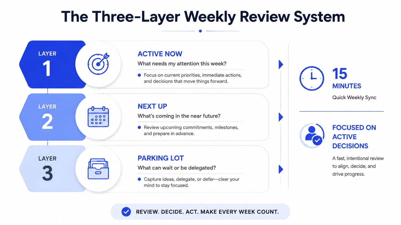
The three layers
Here is the weekly stack I would put in front of every Head of Sales.
Layer 1, leading indicators Track the inputs that create future pipeline. Calls completed. Sequence volume in Apollo, Clay, Lemlist, Instantly, or HubSpot. New opportunities created. Connect rate. If this layer drops, next month's pipeline usually drops after it.
Layer 2, conversion indicators This tells you whether the activity is worth anything. Reply rate. Meetings booked. Show rate. Discovery-to-proposal conversion. High activity and weak conversion usually means message, list quality, qualification, or rep skill. Low activity and strong conversion means the rep needs more volume, not new talk tracks.
Layer 3, outcome indicators Pipeline created. Deals advanced. Closed-won. Review them weekly, but don't overreact to a single week. Use a rolling trend, not one noisy snapshot.
The weekly meeting should end with one question per rep, what's the single biggest blocker between you and your next three meetings?
That question produces better management than another five minutes of metric recitation.
The essential sales performance KPIs you actually need
The majority of sales teams don't need more KPIs. Instead, they require fewer metrics, better grouped, and tied directly to decisions. The right answer to how to measure sales performance isn't a giant dashboard. It's a balanced scorecard that connects effort, efficiency, and outcomes.
Build a balanced scorecard
Your minimum set should cover output, efficiency, and pipeline health. The cleanest starting point is this set:
Win rate
Quota attainment
Pipeline coverage
Conversion rate
Deal size
Sales cycle length
Revenue per seller
That's the minimum dashboard major vendors consistently point to, and it's the right starting point because it avoids the trap of grading reps on activity alone, as summarized in this sales KPI framework from Highspot.
Yes, activity matters. No, it should not dominate the dashboard.
Here's how I group the KPI set in practice:
KPI group | What it diagnoses | Core measures |
|---|---|---|
Revenue output | Whether sellers are producing actual business results | quota attainment, revenue per seller, win rate |
Efficiency | Whether effort converts cleanly through the funnel | conversion rate, sales cycle length, deal size |
Pipeline health | Whether future revenue is being built at the right pace | pipeline coverage, new opportunities created, stage progression |
This structure matters because a rep can look active and still be ineffective. Net-new outreach volume without deal progression is not performance. It's motion.
What to leave off the main dashboard
I would keep the main dashboard intentionally strict. Do not lead with open rates, total dials, or sequence volume. Those are troubleshooting metrics, not management metrics.
Use them only when you're diagnosing a specific issue such as deliverability, targeting, or channel mix. They belong in the second screen, not the executive screen.
A rep can hit activity targets and still create zero useful pipeline. That's why quota alone is too late, and activity alone is too shallow.
If you're running outbound-heavy teams, keep a separate operating view for channel diagnostics in tools like Apollo, Sales Navigator, HeyReach, or HubSpot. But your core performance system should still answer three questions fast. Are we producing revenue, are we converting efficiently, and is future pipeline healthy?
The 60-second rep health dashboard
A manager should be able to read a rep's health in under a minute. If it takes longer, the dashboard is reporting too much and diagnosing too little.
Start with the visual. This is the kind of single-screen view I want in HubSpot or a BI layer connected to your CRM.
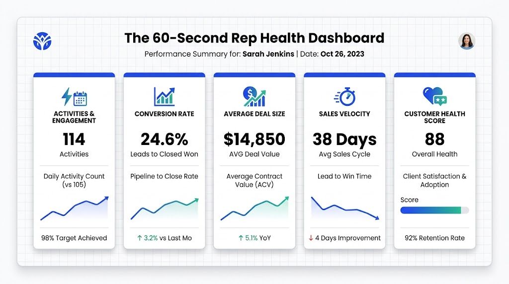
Top-line revenue hides weak conversion and uneven rep performance. Better analysis pairs revenue metrics with funnel diagnostics, including stage-to-stage drop-off and actual versus forecast outcomes, so managers can make specific coaching or territory decisions, as described in Indeed's guide to measuring sales performance.
The five widgets
These are the five widgets I would keep.
Meetings held versus booked, rolling window This is the most diagnostic ratio on the board. A rep who books plenty but holds very few is usually booking junk, skipping qualification, or failing pre-meeting confirmation.
Stage conversion funnel by rep Discovery to proposal. Proposal to close. Stage-by-stage leakage tells you where coaching belongs. Don't coach a closing problem when the actual issue is discovery quality.
Average time in stage by rep This catches stalls early. If one rep's proposal-stage time stretches while others stay normal, their pipeline is probably inflated.
Before adding the next two widgets, give managers a way to hear the deals behind the numbers. The coaching layer matters as much as the chart layer, and GROU's article on sales team coaching is useful if you need a practical manager workflow.
Pipeline coverage by rep This tells you whether the quarter is structurally safe or already fragile.
Activity versus outcome scatter One axis for activity, one for result. This instantly separates volume problems from skill problems.
Here's the key management distinction:
High activity, weak outcomes usually means skill, targeting, or message problems
Low activity, strong outcomes usually means a scale opportunity
Low activity, weak outcomes means intervention now
High activity, strong outcomes tells you who to study and replicate
Why the dashboard works
The strength of this layout is that every widget answers a management question. None of them exist just to make the dashboard look advanced.
For teams that want an external walkthrough of dashboard thinking, this short video is a useful complement to the framework above.
What I would deliberately exclude, open rates, email volume, and raw dial counts without connects. Those metrics can matter operationally, but they don't tell a frontline manager who needs help today.
Setting performance thresholds that trigger action
A metric without a threshold is just dashboard anxiety. You saw something move. So what. If there isn't a pre-decided action attached, your team will debate the number instead of fixing the issue.
Thresholds are management automation for human judgment. They reduce delay, remove inconsistency, and make expectations clear.
Pre-decide the response
Here is the operating principle. Every important metric should have a trigger and a response.
If a threshold is crossed once, decide whether it's noise or a real signal
If it persists, launch the pre-agreed intervention
If the intervention fails, escalate the action, not the meeting count
That keeps managers from improvising different standards for different reps.
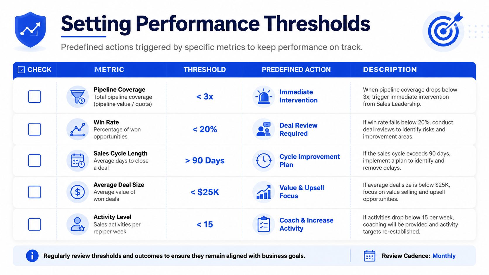
The threshold table I would actually run
Use a red-amber-green system if you want visual simplicity. If your team already uses this language in operations, GROU's RAG glossary entry is a practical reference.
Here are the thresholds that are absolutely essential:
Metric | Trigger | Action |
|---|---|---|
Meetings held to booked | below 60% over a rolling 30-day window | audit qualification, pre-meeting confirmation, and meeting source quality immediately |
Reply rate | below the segment's pessimistic benchmark, usually 3%, for 2 consecutive weeks | run a list and message audit within 48 hours |
Pipeline coverage | below 3x at any weekly check | increase top-of-funnel activity now and review whether target assignment is realistic |
Average time in proposal stage | above 21 days for a specific rep | inspect aging deals and clean inflated pipeline |
Discovery to proposal conversion | below 30% while booking rate stays healthy | coach discovery skill, not prospecting volume |
Operator rule: "Reply rate is low" is not a system. "Reply rate below the segment floor for two weeks triggers a list and message audit within 48 hours" is a system.
The point isn't the table itself. The point is that your team stops reacting emotionally to numbers and starts responding consistently to signals.
How to integrate qualitative feedback without the fluff
The dashboard tells you what broke. It doesn't tell you why. That's why pure metric reviews usually feel like audits and create defensive reps.
You need a structured qualitative layer, not vibes.
Use a 60/40 review structure
My recommendation is simple. Run performance reviews on a 60/40 split, 60% qualitative, 40% quantitative.
The quantitative side locates the issue. Low held rate. Weak discovery-to-proposal conversion. Long time in stage. The qualitative side explains the mechanism. Poor qualification. Weak agenda setting. Rushed discovery. Bad handoff notes.
This matters even more when raw output metrics create false comparisons. Some dashboards rank reps on quota attainment without adjusting for territory potential or segment mix, which can reward assignment quality rather than selling skill, as discussed in ExecVision's analysis of sales reporting gaps.

What structured qualitative input looks like
The qualitative layer should be gathered the same way every time.
Call review against a fixed rubric Review recorded calls and score opening, discovery depth, objection handling, and close. That turns "you're weak on discovery" into evidence tied to moments in the conversation.
Rep self-assessment first The rep scores their own period before the manager shares a view. The gap between self-perception and observable performance is usually where the coaching value sits.
Cross-functional handoff feedback Ask account management, delivery, or onboarding whether this rep closes clean deals or chaotic ones. That feedback often exposes qualification issues the CRM won't show.
Blocker conversation End every review with one open question, what's slowing you down that isn't in these numbers? Broken routing, poor ICP definition, unclear offer, and personal strain all show up here.
Metrics are the smoke detector. Qualitative review is the investigation.
Keep the output narrow. Every review should end with one or two behavior changes, not a laundry list. Managers who assign six improvements usually get zero.
Adapting the framework for your industry
The framework stays the same across sectors. The weighting changes. That's where most sales leaders get lazy.
A generic dashboard for every team creates blind spots. A legal tech team with longer evaluation cycles should not review the same way as an iGaming outbound pod trying to create conversations quickly from LinkedIn and email.
SaaS and legal tech
In SaaS and legal tech, I prioritize conversion and speed. Sales spend has to turn into durable revenue, not just one good month, and a more advanced approach is to unify CRM, finance, and customer success data, use cohort analysis and revenue-weighted views, and track metrics like quota attainment, win rates, revenue growth, average deal size, sales cycle length, and pipeline velocity together, as outlined in Varicent's sales performance framework.
What changes in practice:
Lead response time gets heavier weight when inbound or demo-led motion matters
Pipeline velocity matters more when monthly growth targets are tight
Revenue efficiency views matter more when finance is scrutinizing sales and marketing spend
If you're running a recurring revenue model, I'd also keep an eye on the magic number inside the finance layer, but I'd keep it out of the frontline rep dashboard.
Manufacturing and pharma
Manufacturing and pharma usually have fewer deals, longer cycles, and more stakeholders. That changes the operating emphasis.
I would put more management attention on:
Average time in stage, because stalls are expensive and often hidden
Deal size and stage progression, because one weak qualification decision distorts the quarter
Territory and segment context, because account quality varies more and raw attainment can mislead
In these environments, rep comparison without context is sloppy management. Review by territory, product line, and account type before you make capability judgments.
iGaming and fast-cycle outbound teams
Here I shift the front of the funnel forward. Closed revenue still matters, but the operating view needs stronger leading indicators across the conversation funnel.
That means I care more about:
Reply quality, not just reply count
Meeting acceptance and held rate by channel
Qualification rate by audience and message variant
Pipeline created from short outbound sprints
In channel-heavy motion using Apollo, Instantly, HeyReach, Clay, and Sales Navigator, upstream responsiveness often explains downstream performance faster than win rate does. Structure turns attention into pipeline only when you can separate volume from fit.
Your first step to a better measurement system
Don't rebuild the whole system this week. Pick one metric that forces clarity.
Start with meetings held versus booked on a rolling thirty-day view by rep. It's the fastest way to expose junk qualification, weak confirmation process, bad source quality, and sloppy calendar stuffing. It also creates a direct coaching path because the fixes are visible. Better qualification rules, better pre-meeting reminders, cleaner sourcing, and tighter rep accountability.
Then do this, in order:
Add the ratio to one manager dashboard
Review it weekly, not ad hoc
Set one trigger for intervention
Listen to the calls behind the weak ratios
Fix the process before you blame the person
If you can't trust that one ratio yet, your data capture is the first issue, not rep performance. Clean the meeting source, outcome logging, and lifecycle definitions first.
The fastest route to a better measurement system isn't more metrics. It's one diagnostic number, one fixed review cadence, and one pre-agreed action when the number slips.
GROU helps B2B teams turn scattered outbound, LinkedIn, and pipeline reporting into one operating system with clearer qualification rules, tighter feedback loops, and simpler dashboards. If your team has attention but not enough qualified conversations, review your current dashboard against the framework above, then compare it with how Grou structures pipeline measurement across content, outbound, and sales follow-up.
Most advice on how to measure sales performance is backward. It tells you to track revenue, quota attainment, and maybe win rate, then review the damage after the quarter is already gone.
That isn't management. That's autopsy.
A usable measurement system does two jobs. It spots drift early, and it tells a manager what action to take next. If your dashboard can't do that, it's decoration. If your weekly review turns into rep judgment, your team will game the numbers and hide the actual problem.
Table of Contents
Your sales dashboard is probably a liar
Most dashboards overstate control and understate risk. They show call volume, email volume, booked meetings, and top-line revenue, then pretend you've got a clear picture. You don't. You've got a pile of disconnected signals, many of them lagging, some of them vanity, and at least a few are probably unreliable because the underlying CRM hygiene is poor.
The first lie is timing. Revenue and closed-won tell you what already happened. Weekly management needs signals that show what will happen next if nothing changes.
The second lie is relevance. Major sales analytics vendors consistently point to a minimum dashboard built around win rate, quota attainment, pipeline coverage, conversion rate, deal size, sales cycle length, and revenue per seller, because activity-only metrics give only a rough sense of effort while outcome-focused metrics give a more accurate read on progress, as outlined in Highspot's breakdown of sales performance metrics.
The third lie is data trust. If stage movement is inconsistent, meeting outcomes aren't logged cleanly, or reps close-lost deals late, your dashboard is giving you false confidence. Before you debate metrics, clean the operating data. The MetricsWatch data quality guide is a useful reference for that groundwork.
Practical rule: If a manager needs a separate Slack message to ask what the dashboard really means, the dashboard failed.
For most B2B teams, I want one system that separates performance measurement into weekly course correction, monthly conversion diagnosis, and quarterly evaluation. That's the difference between reporting and control. If you need a shared definition of what belongs on a real sales dashboard, GROU's dashboard glossary entry is a solid baseline.
The three-layer weekly review system
Weekly reviews should be short, fixed, and boring in the best way. Same time every week. Numbers reviewed before the call. Fifteen minutes. The meeting is for decisions, not for reading a report out loud.
A layered KPI system works because it combines leading and lagging indicators and reviews them on different cadences, which helps isolate bottlenecks, as explained in SalesScreen's guidance on sales performance metrics.
Weekly is for drift detection
Weekly measurement is not where you judge people. Weekly is where you catch slippage early enough to do something useful about it.
If you use a weekly number as a verdict on rep quality, reps will optimize for appearance. They'll stuff calendars, keep dead deals open, and chase low-quality activity. Then your dashboard gets busier while pipeline quality gets worse.
Teams running distributed sales pods often document this rhythm asynchronously first, then use the live call for blockers and decisions. If you need a practical format for that, look at how remote teams use weekblast updates. The reporting cadence matters as much as the KPI choice. GROU also has a useful reference on reporting cadence.
The three layers
Here is the weekly stack I would put in front of every Head of Sales.
Layer 1, leading indicators Track the inputs that create future pipeline. Calls completed. Sequence volume in Apollo, Clay, Lemlist, Instantly, or HubSpot. New opportunities created. Connect rate. If this layer drops, next month's pipeline usually drops after it.
Layer 2, conversion indicators This tells you whether the activity is worth anything. Reply rate. Meetings booked. Show rate. Discovery-to-proposal conversion. High activity and weak conversion usually means message, list quality, qualification, or rep skill. Low activity and strong conversion means the rep needs more volume, not new talk tracks.
Layer 3, outcome indicators Pipeline created. Deals advanced. Closed-won. Review them weekly, but don't overreact to a single week. Use a rolling trend, not one noisy snapshot.
The weekly meeting should end with one question per rep, what's the single biggest blocker between you and your next three meetings?
That question produces better management than another five minutes of metric recitation.
The essential sales performance KPIs you actually need
The majority of sales teams don't need more KPIs. Instead, they require fewer metrics, better grouped, and tied directly to decisions. The right answer to how to measure sales performance isn't a giant dashboard. It's a balanced scorecard that connects effort, efficiency, and outcomes.
Build a balanced scorecard
Your minimum set should cover output, efficiency, and pipeline health. The cleanest starting point is this set:
Win rate
Quota attainment
Pipeline coverage
Conversion rate
Deal size
Sales cycle length
Revenue per seller
That's the minimum dashboard major vendors consistently point to, and it's the right starting point because it avoids the trap of grading reps on activity alone, as summarized in this sales KPI framework from Highspot.
Yes, activity matters. No, it should not dominate the dashboard.
Here's how I group the KPI set in practice:
KPI group | What it diagnoses | Core measures |
|---|---|---|
Revenue output | Whether sellers are producing actual business results | quota attainment, revenue per seller, win rate |
Efficiency | Whether effort converts cleanly through the funnel | conversion rate, sales cycle length, deal size |
Pipeline health | Whether future revenue is being built at the right pace | pipeline coverage, new opportunities created, stage progression |
This structure matters because a rep can look active and still be ineffective. Net-new outreach volume without deal progression is not performance. It's motion.
What to leave off the main dashboard
I would keep the main dashboard intentionally strict. Do not lead with open rates, total dials, or sequence volume. Those are troubleshooting metrics, not management metrics.
Use them only when you're diagnosing a specific issue such as deliverability, targeting, or channel mix. They belong in the second screen, not the executive screen.
A rep can hit activity targets and still create zero useful pipeline. That's why quota alone is too late, and activity alone is too shallow.
If you're running outbound-heavy teams, keep a separate operating view for channel diagnostics in tools like Apollo, Sales Navigator, HeyReach, or HubSpot. But your core performance system should still answer three questions fast. Are we producing revenue, are we converting efficiently, and is future pipeline healthy?
The 60-second rep health dashboard
A manager should be able to read a rep's health in under a minute. If it takes longer, the dashboard is reporting too much and diagnosing too little.
Start with the visual. This is the kind of single-screen view I want in HubSpot or a BI layer connected to your CRM.
Top-line revenue hides weak conversion and uneven rep performance. Better analysis pairs revenue metrics with funnel diagnostics, including stage-to-stage drop-off and actual versus forecast outcomes, so managers can make specific coaching or territory decisions, as described in Indeed's guide to measuring sales performance.
The five widgets
These are the five widgets I would keep.
Meetings held versus booked, rolling window This is the most diagnostic ratio on the board. A rep who books plenty but holds very few is usually booking junk, skipping qualification, or failing pre-meeting confirmation.
Stage conversion funnel by rep Discovery to proposal. Proposal to close. Stage-by-stage leakage tells you where coaching belongs. Don't coach a closing problem when the actual issue is discovery quality.
Average time in stage by rep This catches stalls early. If one rep's proposal-stage time stretches while others stay normal, their pipeline is probably inflated.
Before adding the next two widgets, give managers a way to hear the deals behind the numbers. The coaching layer matters as much as the chart layer, and GROU's article on sales team coaching is useful if you need a practical manager workflow.
Pipeline coverage by rep This tells you whether the quarter is structurally safe or already fragile.
Activity versus outcome scatter One axis for activity, one for result. This instantly separates volume problems from skill problems.
Here's the key management distinction:
High activity, weak outcomes usually means skill, targeting, or message problems
Low activity, strong outcomes usually means a scale opportunity
Low activity, weak outcomes means intervention now
High activity, strong outcomes tells you who to study and replicate
Why the dashboard works
The strength of this layout is that every widget answers a management question. None of them exist just to make the dashboard look advanced.
For teams that want an external walkthrough of dashboard thinking, this short video is a useful complement to the framework above.
What I would deliberately exclude, open rates, email volume, and raw dial counts without connects. Those metrics can matter operationally, but they don't tell a frontline manager who needs help today.
Setting performance thresholds that trigger action
A metric without a threshold is just dashboard anxiety. You saw something move. So what. If there isn't a pre-decided action attached, your team will debate the number instead of fixing the issue.
Thresholds are management automation for human judgment. They reduce delay, remove inconsistency, and make expectations clear.
Pre-decide the response
Here is the operating principle. Every important metric should have a trigger and a response.
If a threshold is crossed once, decide whether it's noise or a real signal
If it persists, launch the pre-agreed intervention
If the intervention fails, escalate the action, not the meeting count
That keeps managers from improvising different standards for different reps.
The threshold table I would actually run
Use a red-amber-green system if you want visual simplicity. If your team already uses this language in operations, GROU's RAG glossary entry is a practical reference.
Here are the thresholds that are absolutely essential:
Metric | Trigger | Action |
|---|---|---|
Meetings held to booked | below 60% over a rolling 30-day window | audit qualification, pre-meeting confirmation, and meeting source quality immediately |
Reply rate | below the segment's pessimistic benchmark, usually 3%, for 2 consecutive weeks | run a list and message audit within 48 hours |
Pipeline coverage | below 3x at any weekly check | increase top-of-funnel activity now and review whether target assignment is realistic |
Average time in proposal stage | above 21 days for a specific rep | inspect aging deals and clean inflated pipeline |
Discovery to proposal conversion | below 30% while booking rate stays healthy | coach discovery skill, not prospecting volume |
Operator rule: "Reply rate is low" is not a system. "Reply rate below the segment floor for two weeks triggers a list and message audit within 48 hours" is a system.
The point isn't the table itself. The point is that your team stops reacting emotionally to numbers and starts responding consistently to signals.
How to integrate qualitative feedback without the fluff
The dashboard tells you what broke. It doesn't tell you why. That's why pure metric reviews usually feel like audits and create defensive reps.
You need a structured qualitative layer, not vibes.
Use a 60/40 review structure
My recommendation is simple. Run performance reviews on a 60/40 split, 60% qualitative, 40% quantitative.
The quantitative side locates the issue. Low held rate. Weak discovery-to-proposal conversion. Long time in stage. The qualitative side explains the mechanism. Poor qualification. Weak agenda setting. Rushed discovery. Bad handoff notes.
This matters even more when raw output metrics create false comparisons. Some dashboards rank reps on quota attainment without adjusting for territory potential or segment mix, which can reward assignment quality rather than selling skill, as discussed in ExecVision's analysis of sales reporting gaps.
What structured qualitative input looks like
The qualitative layer should be gathered the same way every time.
Call review against a fixed rubric Review recorded calls and score opening, discovery depth, objection handling, and close. That turns "you're weak on discovery" into evidence tied to moments in the conversation.
Rep self-assessment first The rep scores their own period before the manager shares a view. The gap between self-perception and observable performance is usually where the coaching value sits.
Cross-functional handoff feedback Ask account management, delivery, or onboarding whether this rep closes clean deals or chaotic ones. That feedback often exposes qualification issues the CRM won't show.
Blocker conversation End every review with one open question, what's slowing you down that isn't in these numbers? Broken routing, poor ICP definition, unclear offer, and personal strain all show up here.
Metrics are the smoke detector. Qualitative review is the investigation.
Keep the output narrow. Every review should end with one or two behavior changes, not a laundry list. Managers who assign six improvements usually get zero.
Adapting the framework for your industry
The framework stays the same across sectors. The weighting changes. That's where most sales leaders get lazy.
A generic dashboard for every team creates blind spots. A legal tech team with longer evaluation cycles should not review the same way as an iGaming outbound pod trying to create conversations quickly from LinkedIn and email.
SaaS and legal tech
In SaaS and legal tech, I prioritize conversion and speed. Sales spend has to turn into durable revenue, not just one good month, and a more advanced approach is to unify CRM, finance, and customer success data, use cohort analysis and revenue-weighted views, and track metrics like quota attainment, win rates, revenue growth, average deal size, sales cycle length, and pipeline velocity together, as outlined in Varicent's sales performance framework.
What changes in practice:
Lead response time gets heavier weight when inbound or demo-led motion matters
Pipeline velocity matters more when monthly growth targets are tight
Revenue efficiency views matter more when finance is scrutinizing sales and marketing spend
If you're running a recurring revenue model, I'd also keep an eye on the magic number inside the finance layer, but I'd keep it out of the frontline rep dashboard.
Manufacturing and pharma
Manufacturing and pharma usually have fewer deals, longer cycles, and more stakeholders. That changes the operating emphasis.
I would put more management attention on:
Average time in stage, because stalls are expensive and often hidden
Deal size and stage progression, because one weak qualification decision distorts the quarter
Territory and segment context, because account quality varies more and raw attainment can mislead
In these environments, rep comparison without context is sloppy management. Review by territory, product line, and account type before you make capability judgments.
iGaming and fast-cycle outbound teams
Here I shift the front of the funnel forward. Closed revenue still matters, but the operating view needs stronger leading indicators across the conversation funnel.
That means I care more about:
Reply quality, not just reply count
Meeting acceptance and held rate by channel
Qualification rate by audience and message variant
Pipeline created from short outbound sprints
In channel-heavy motion using Apollo, Instantly, HeyReach, Clay, and Sales Navigator, upstream responsiveness often explains downstream performance faster than win rate does. Structure turns attention into pipeline only when you can separate volume from fit.
Your first step to a better measurement system
Don't rebuild the whole system this week. Pick one metric that forces clarity.
Start with meetings held versus booked on a rolling thirty-day view by rep. It's the fastest way to expose junk qualification, weak confirmation process, bad source quality, and sloppy calendar stuffing. It also creates a direct coaching path because the fixes are visible. Better qualification rules, better pre-meeting reminders, cleaner sourcing, and tighter rep accountability.
Then do this, in order:
Add the ratio to one manager dashboard
Review it weekly, not ad hoc
Set one trigger for intervention
Listen to the calls behind the weak ratios
Fix the process before you blame the person
If you can't trust that one ratio yet, your data capture is the first issue, not rep performance. Clean the meeting source, outcome logging, and lifecycle definitions first.
The fastest route to a better measurement system isn't more metrics. It's one diagnostic number, one fixed review cadence, and one pre-agreed action when the number slips.
GROU helps B2B teams turn scattered outbound, LinkedIn, and pipeline reporting into one operating system with clearer qualification rules, tighter feedback loops, and simpler dashboards. If your team has attention but not enough qualified conversations, review your current dashboard against the framework above, then compare it with how Grou structures pipeline measurement across content, outbound, and sales follow-up.

Pipeline OS Newsletter
Build qualified pipeline
Get weekly tactics to generate demand, improve lead quality, and book more meetings.
Recent posts


Trusted by industry leaders
Trusted by industry leaders
Trusted by industry leaders
Ready to build qualified pipeline?
Ready to build qualified pipeline?
Ready to build qualified pipeline?
Book a call to see if we're the right fit, or take the 2-minute quiz to get a clear starting point.
Book a call to see if we're the right fit, or take the 2-minute quiz to get a clear starting point.
Book a call to see if we're the right fit, or take the 2-minute quiz to get a clear starting point.
" height="30.21639343089746px" id="hfGbXmQR2" width="30.216393430897455px"/></svg>)
Copyright © 2026 – All Right Reserved
Company
Resources
Copyright © 2026 – All Right Reserved
Copyright © 2026 – All Right Reserved