%22%3E%3C/path%3E%3Cpath d=%22M 63.072 7.554 C 62.258 8.022 61.577 8.689 61.092 9.493 L 61.092 7.076 L 57.158 7.076 L 57.158 22.64 L 61.089 22.64 L 61.089 14.888 C 61.089 13.446 61.403 12.434 62.03 11.853 C 62.818 11.218 63.818 10.907 64.826 10.982 L 65.868 10.982 L 65.868 6.851 C 64.891 6.834 63.926 7.076 63.073 7.554 Z%22 fill=%22rgb(17,17,17)%22%3E%3C/path%3E%3Cpath d=%22M 78.916 7.82 C 76.363 6.49 73.321 6.49 70.768 7.82 C 69.562 8.473 68.564 9.451 67.888 10.644 C 67.167 11.931 66.803 13.387 66.834 14.862 C 66.804 16.332 67.157 17.785 67.86 19.077 C 68.515 20.267 69.494 21.246 70.684 21.901 C 71.924 22.576 73.318 22.92 74.73 22.898 C 76.164 22.918 77.58 22.575 78.846 21.901 C 80.062 21.247 81.073 20.27 81.768 19.077 C 82.506 17.797 82.88 16.339 82.85 14.862 C 82.88 13.389 82.517 11.934 81.797 10.647 C 81.12 9.455 80.122 8.477 78.917 7.824 M 78.803 14.862 C 78.829 15.739 78.636 16.608 78.241 17.391 C 77.903 18.046 77.38 18.588 76.738 18.95 C 76.124 19.293 75.432 19.472 74.729 19.47 C 73.668 19.497 72.648 19.061 71.934 18.276 C 71.139 17.323 70.741 16.1 70.823 14.862 C 70.741 13.62 71.149 12.395 71.959 11.45 C 72.687 10.667 73.715 10.233 74.783 10.256 C 75.859 10.236 76.894 10.67 77.635 11.45 C 78.464 12.387 78.884 13.616 78.801 14.864%22 fill=%22rgb(17,17,17)%22%3E%3C/path%3E%3Cpath d=%22M 95.906 7.076 L 95.906 15.646 C 95.975 16.68 95.643 17.701 94.979 18.498 C 94.311 19.184 93.379 19.547 92.422 19.495 C 91.475 19.544 90.553 19.18 89.894 18.498 C 89.23 17.701 88.898 16.68 88.967 15.646 L 88.967 7.076 L 85.033 7.076 L 85.033 16.207 C 85 17.449 85.275 18.68 85.834 19.79 C 86.327 20.75 87.095 21.542 88.039 22.065 C 89.033 22.594 90.145 22.861 91.271 22.838 C 92.188 22.847 93.095 22.65 93.926 22.263 C 94.708 21.905 95.388 21.36 95.906 20.675 L 95.906 22.645 L 99.865 22.645 L 99.865 7.076 Z%22 fill=%22rgb(17,17,17)%22%3E%3C/path%3E%3Cpath d=%22M 4.513 15.626 C 4.511 10.815 7.606 6.549 12.181 5.059 C 16.756 3.57 21.77 5.195 24.601 9.086 L 27.816 5.87 C 24.074 1.186 17.981 -0.943 12.137 0.393 C 6.292 1.728 1.728 6.292 0.393 12.137 C -0.943 17.981 1.186 24.074 5.87 27.816 L 9.085 24.601 C 6.214 22.512 4.515 19.177 4.513 15.626%22 fill=%22rgb(32,62,235)%22%3E%3C/path%3E%3Cpath d=%22M 17.114 14.343 L 13.354 18.01 L 13.354 18.026 L 21.071 18.026 L 11.412 27.609 L 17.389 27.609 L 23.999 21.081 L 23.999 28.316 L 24.005 28.316 L 27.967 24.393 L 27.967 14.343 Z%22 fill=%22rgb(32,62,235)%22%3E%3C/path%3E%3C/g%3E%3C/svg%3E) ×
× ××
××›
›
›
›
LinkedIn Impressions in 2026: Why High Reach Hurts B2B Pipeline
LinkedIn Impressions in 2026: Why High Reach Hurts B2B Pipeline
LinkedIn Impressions in 2026: Why High Reach Hurts B2B Pipeline
LinkedIn Impressions in 2026: Why High Reach Hurts B2B Pipeline
LinkedIn Impressions in 2026: Why High Reach Hurts B2B Pipeline
LinkedIn Impressions in 2026: Why High Reach Hurts B2B Pipeline

Author
Aljaz Peklaj

Most advice on impressions on LinkedIn points you toward the wrong goal. It tells you to chase bigger distribution, more views, more visible posts. For B2B teams, that often creates broader attention and weaker pipeline.
Impressions are an exposure signal, not proof of reach, engagement, or revenue.
High-impression formats often underperform on qualified conversations.
Weekly and monthly review beats real-time dashboard watching.
The right question isn't “how do we get more impressions?”, it's “which impressions turn into ICP-fit conversations?”
Table of Contents
What impressions are (and what they are not)
If you're going to use impressions on LinkedIn as an operating metric, you need to define them correctly. An impression isn't a click, isn't a read, and isn't a buyer signal. It's a counted exposure event.
One technical benchmark used by analytics vendors says a LinkedIn impression is recorded when content is viewable for at least 300 milliseconds with at least 50% of the post in view, which makes it closer to a validated display event than a simple page load, as noted by Dreamdata's explanation of LinkedIn impressions.

The three metrics people keep mixing together
Teams often blur three separate things:
Metric | What it tells you | What it doesn't tell you |
|---|---|---|
Impressions | How often content was shown | Whether new people saw it or cared |
Reach | How many unique people saw it | Whether they engaged |
Engagement | Whether people acted | Whether the audience was ICP-fit |
That distinction matters because repeated views from the same person can inflate impression counts. If you're looking for a clean definition that works across platforms, this breakdown of social media impression metrics is useful because it frames impressions as exposure, not outcome.
For internal alignment, it also helps to keep a shared definition in your own team docs. We usually point clients to a simple reference like this impressions glossary entry so sales, content, and RevOps aren't using the same word to mean three different things.
Practical rule: If a metric can go up while revenue quality goes down, it belongs in diagnostics, not in your north-star KPI stack.
What impressions are good for
Impressions matter early in the chain. They tell you whether LinkedIn is surfacing your message at all. If a post gets buried, no downstream metric can save it.
They also help diagnose feed fit. If impressions are structurally weak across otherwise solid posts, the issue is often packaging, topic selection, or account distribution. If impressions are healthy but conversations stay flat, the issue usually sits further down the chain, in message quality or audience fit.
What impressions are not good for
They aren't a proxy for buying intent. A post can rack up feed exposure and still produce nothing meaningful for pipeline. That happens all the time with broad advice posts, trend commentary, and content built to trigger lightweight engagement.
Treat impressions as the top layer of signal. Useful, yes. Sufficient, no.
The pipeline trap of high-impression content formats
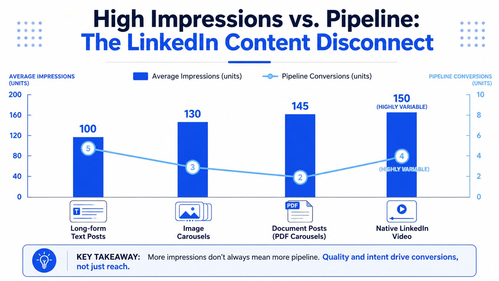
Here's the verdict. The LinkedIn formats that produce the most impressions often produce the weakest pipeline quality.
Across client programs, document posts and carousels usually win the impression race. Long-form text usually wins the inbound conversation race. If you're serious about revenue, you shouldn't build your content mix around the format currently getting algorithmic preference.
What the market baseline gets wrong
A platform baseline is useful, but only in context. Statista's LinkedIn benchmark reports about 696 average impressions per post in 2023, around 811 in 2024, and about 812 in 2025, while benchmark guidance also notes that a healthy post may reach roughly 10% to 30% of a page's followers organically. That's directionally helpful. It's not enough to make content decisions.
The trap is obvious once you operate a few programs at scale. Teams see a format delivering outsized distribution and assume it's therefore the format to double down on. It usually isn't.
What actually happens in content testing
In our work, document posts tend to generate the highest per-post impression counts. Carousels are close behind. Video can spike hard, but it's inconsistent. Long-form text is steadier and usually less flashy.
That still doesn't make the top-impression format the right one.
In one client program over a 90-day test window, the average per-post impression picture looked like this:
Long-form text posts → roughly 4,200 impressions per post
Carousels → roughly 6,800
Document posts → roughly 9,400
Native video → roughly 5,100, with a range from 800 to 22,000
Articles → roughly 480
Now, for an often-overlooked insight. In that same period, long-form text posts produced 78% of inbound DMs from ICP-fit prospects, while document posts produced 12%, despite leading on impressions.
That pattern repeats more often than most content teams want to admit.
High-impression content often pulls in broad, low-fit attention. Narrower content with stronger substance usually pulls in fewer people and better buyers.
Why this trade-off shows up
High-distribution formats are easy to consume and easy for LinkedIn to circulate. That often means they spread beyond the audience segment that can buy.
Long-form text creates more friction, but it's the right kind. It asks for attention. It filters casual scrollers out. Buyers who stay with it often care about the underlying decision, pain, or operational view.
If you're investing in video, this matters even more. Teams thinking about scaling short form video for growth should separate distribution upside from conversion quality. Video can earn attention. It doesn't automatically earn qualified demand.
A lot of what gets labeled as “good LinkedIn performance” belongs in the vanity metrics bucket. It looks strong in the platform. It doesn't travel well into CRM evidence.
What to do instead
Use format mix intentionally:
Keep long-form text as the conversion layer. That's where strong points of view, buyer pain, and hard decisions tend to convert into DMs.
Use carousels and document posts as awareness support. Good for broader exposure, weaker as the center of a pipeline motion.
Be careful with articles. They usually don't justify the production effort if your goal is feed distribution.
Treat video as conditional. If the founder is strong on camera and the message is sharp, use it. If not, don't force it.
The wrong content strategy asks, “Which format gets the most impressions?” The better one asks, “Which format attracts the people we want in pipeline?”
A structured system for tracking LinkedIn performance
Don't check post impressions every hour. It creates noise, shortens your decision horizon, and pushes teams toward tactics they'd never approve in a quarterly review.
Impressions only tell you that a post was shown for roughly 300 milliseconds, not whether it drove clicks, comments, or leads, so they belong in a leading-indicator layer rather than a revenue dashboard, as explained in Valley's guidance on LinkedIn impressions.
The cadence that actually works
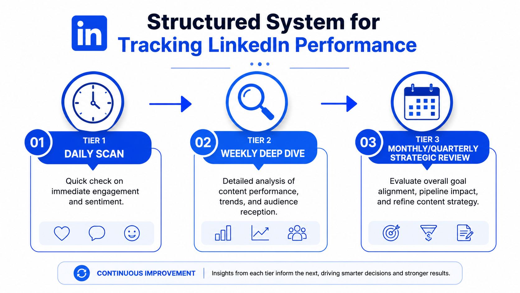
We use a three-layer review system. It keeps the team close enough to the data to learn, without turning analytics into a distraction.
Weekly review
Open native LinkedIn analytics once a week. Spend about 10 minutes reviewing impressions, engagement rate, comments, profile views, and follower movement. Compare against the prior 4-week baseline, not yesterday.Monthly review
Pull post-level data into a spreadsheet. Spend about 45 minutes segmenting by topic, format, and post objective. During this, patterns start becoming visible.Quarterly review
Step back for about 90 minutes and review the whole content system. Are the themes still aligned to ICP pain? Are profile views coming from the right companies? Are DMs converting into meetings?
What goes in the sheet
A basic Google Sheet is enough for many teams. Columns should be simple:
Date and author so you can separate person, page, and founder effects
Format and topic pillar so you can compare text, carousel, document, and video against real themes
Impressions and engagement rate so top-of-funnel distribution stays visible
Comments count and DMs within 72 hours because those usually tell you more than likes
CRM outcome such as qualified conversation, meeting booked, or no fit
If the program is mature, tools like Shield Analytics or Inlytics can add historical depth. For CRM linkage, HubSpot is usually enough. If you need a tighter reporting model across channels, a multi-touch attribution framework helps separate post influence from direct last-touch conversion.
Operator note: The numbers that matter most usually don't live inside LinkedIn. They live in the CRM, in DM logs, and in your meeting notes.
What to weight heavily, and what to ignore
The weighting matters more than the dashboard layout. We bias decisions toward signals that predict sales conversations.
Signal | Why it matters |
|---|---|
ICP-fit DMs | Closest content metric to pipeline creation |
Engagement per impression | Better efficiency signal than raw exposure |
Comments | Strong clue that the post is creating thought, not just passing views |
Profile views from target roles | Tells you whether the right people are curious |
Impressions | Useful trend signal, weak standalone KPI |
We don't set automated alerts for single-post spikes or drops. We don't push live dashboards into Slack. We don't make strategy changes based on one hot post.
For teams that want a managed operating layer, tools and services can sit around this stack. Native LinkedIn analytics, Google Sheets, HubSpot, Shield, Inlytics, and even a structured service like Grou can all work. The important part isn't the software choice. It's that your review cadence points back to qualified conversations, not platform applause.
How to generate impressions that convert to pipeline
The posts that convert best usually don't look engineered for reach. They look honest, specific, and expensive to fake.
One of the strongest examples we saw was a founder post about firing a client mid-retainer after the client asked us to send 5,000 generic emails per week. It wasn't a carousel, wasn't a polished video, and didn't contain a pitch. It was a plain-text story about a decision.

That post was 247 words long. The account's average post at the time drew roughly 4,200 impressions. This one reached 28,400 impressions, generated 287 likes, 94 comments, 11 inbound DMs from ICP-fit prospects within 72 hours, 3 booked meetings, and 1 closed deal.
Why that post worked
It worked because it gave buyers something real to evaluate.
First, it told a specific story. Not a lesson disguised as content. Not a list. Not a generic “we believe in quality” statement. It opened on a moment, walked through the internal decision, and ended on the principle behind the choice.
Second, it took a position some readers would disagree with. That mattered. Comment sections get stronger when readers have to react, not just approve.
Third, it signaled values that the right buyers care about. A founder reading that story could infer how the agency would behave under pressure. That's a stronger sales signal than any service summary.
Posts about hard decisions usually outperform posts about achievements. Buyers learn more from your trade-offs than from your wins.
The structure worth repeating
You can't template authenticity, but you can borrow the structure.
Start with a real operating moment. A pricing call, a hiring miss, a client refusal, a sales process change.
Name the stakes clearly. What was at risk, and why was the decision difficult?
Show the reasoning. Buyers trust thought process more than slogans.
End on the market implication. Don't tack on a CTA. Let the reader connect the dots.
For teams building a repeatable publishing system, this is where a strong LinkedIn content strategy matters. You need recurring content pillars built from actual commercial decisions, not just thought leadership themes.
A useful reference on format and message pacing sits below.
What not to copy from this example
Don't copy the surface move. “We fired a client” isn't the lesson. The lesson is that truth travels further than formatting tricks.
This kind of outlier post is rare. The honest expectation is that maybe 1 in 30 to 1 in 50 posts will materially outperform the average. That's why your system needs to work on normal weeks, not just on breakout moments.
And don't add a sales pitch at the end. In posts like this, the pitch weakens the signal. The buyer already knows what to do if the story is relevant.
Optimizing your profile to convert attention
Content gets you viewed. Your profile decides whether that attention turns into a conversation.
LinkedIn doesn't offer true native A/B testing for profile elements, so the practical method is sequential testing. Change one element, let it run long enough to stabilize, then compare against a baseline. That's slower than people want, but it's the only way to get signal you can trust.
What changed when the headline changed
One founder profile started with a plain job-title headline, “CEO at [Company].” We tested two alternatives across 60-day windows after a 60-day baseline.
Variant A used a value-prop headline. Variant B used an outcome-led headline: “We help B2B teams add €500k+ to pipeline in 90 days | [Company].”
The result was clear. Variant A increased profile views by roughly 14% over baseline. Variant B increased profile views by roughly 22%. The bigger difference showed up lower in the funnel. Variant B produced roughly 35% more inbound DMs from ICP-fit prospects than baseline, while Variant A produced roughly 18% more.
Why specificity wins
A strong headline answers the silent buyer question, “Why should I care about this person?” Job titles rarely do that. Vague value props don't do it either.
Outcome-led headlines work because they compress relevance. They tell the buyer who you help, what result you aim for, and why a profile view should continue.
A simple pattern works well:
Weak headline | Stronger headline |
|---|---|
CEO at [Company] | Helping [ICP] achieve [specific outcome] |
Founder, advisor, speaker | We help [ICP] solve [specific commercial problem] |
Growth specialist for B2B | Helping [ICP] add [outcome] in [timeframe] |
The same principle carries into the broader profile build. This comparison of LinkedIn page vs profile for B2B is useful if you're deciding where founder authority should sit versus company messaging.
Your profile shouldn't read like a résumé. It should read like the conversion layer for the audience your content already attracted.
What not to do
Avoid personality-first headlines unless personality is central to the sale. “Dad, builder, coffee addict” might get a smile. It rarely gets a qualified DM.
Also avoid constant tweaking. Frequent changes produce noisy data and make it harder for the market to build recognition around a clear promise. Pick one variable, run it for a real period, then evaluate.
LinkedIn impression benchmarks and how to react
Benchmarking impressions on LinkedIn is useful only if you don't stop at the benchmark. The external average gives you context. Your own trailing trend gives you a decision.
A useful diagnostic detail from Typefully's breakdown of LinkedIn impressions is that impressions count every display, including repeated views by the same member, while members reached counts unique viewers. If your impression-to-reach ratio climbs, LinkedIn may be re-serving your content to the same segment instead of broadening distribution.
The benchmark to care about
The public benchmark tells you whether you're broadly inside or outside platform norms. Your operating benchmark should be your own trailing 12-week average, segmented by post type and topic.
That keeps you from making two common mistakes:
calling a healthy niche account “underperforming” because it doesn't match broad platform averages
calling a broad account “successful” because it gets seen a lot by the same wrong people
A separate practical input is staying aware of distribution shifts. If you want a market-level read on platform behavior, this overview of LinkedIn algorithm changes 2026 is worth watching, not because it gives you a shortcut, but because it helps explain why some formats or post behaviors suddenly stop getting easy exposure.
A simple reaction framework
Use the pattern below when you review your numbers.
High impressions, low DMs
Your content is probably too broad, too educational, or too detached from buyer stakes. Narrow the topic. Add stronger points of view. Write for one decision-maker, not for “the market.”Low impressions, strong DMs
Usually a good problem. The audience is small, but the fit is strong. Keep the substance, then improve packaging and consistency rather than rewriting the positioning.Low impressions, low DMs
You likely have a distribution and message problem together. Rework hooks, posting cadence, profile positioning, and topic relevance at the same time.Rising impressions, weak meeting quality
Don't celebrate yet. Check whether the new attention is coming from the wrong company size, wrong geography, or peer audience instead of buyers.
The right response to impression data is almost never “post more of the format that spiked.” It's usually “tighten the message and check whether the audience got closer to revenue.”
Add one column to your weekly content sheet by Monday: ICP-fit DMs within 72 hours of post. Then review your last 10 posts and mark which ones produced broad attention versus real buying conversations. GROU works with B2B teams globally to connect LinkedIn content, outbound, and CRM tracking into one pipeline system. The method is simple, consistent review of exposure, engagement quality, and sales outcomes so attention gets measured by what it turns into, not by how impressive it looks in-platform.
Most advice on impressions on LinkedIn points you toward the wrong goal. It tells you to chase bigger distribution, more views, more visible posts. For B2B teams, that often creates broader attention and weaker pipeline.
Impressions are an exposure signal, not proof of reach, engagement, or revenue.
High-impression formats often underperform on qualified conversations.
Weekly and monthly review beats real-time dashboard watching.
The right question isn't “how do we get more impressions?”, it's “which impressions turn into ICP-fit conversations?”
Table of Contents
What impressions are (and what they are not)
If you're going to use impressions on LinkedIn as an operating metric, you need to define them correctly. An impression isn't a click, isn't a read, and isn't a buyer signal. It's a counted exposure event.
One technical benchmark used by analytics vendors says a LinkedIn impression is recorded when content is viewable for at least 300 milliseconds with at least 50% of the post in view, which makes it closer to a validated display event than a simple page load, as noted by Dreamdata's explanation of LinkedIn impressions.
The three metrics people keep mixing together
Teams often blur three separate things:
Metric | What it tells you | What it doesn't tell you |
|---|---|---|
Impressions | How often content was shown | Whether new people saw it or cared |
Reach | How many unique people saw it | Whether they engaged |
Engagement | Whether people acted | Whether the audience was ICP-fit |
That distinction matters because repeated views from the same person can inflate impression counts. If you're looking for a clean definition that works across platforms, this breakdown of social media impression metrics is useful because it frames impressions as exposure, not outcome.
For internal alignment, it also helps to keep a shared definition in your own team docs. We usually point clients to a simple reference like this impressions glossary entry so sales, content, and RevOps aren't using the same word to mean three different things.
Practical rule: If a metric can go up while revenue quality goes down, it belongs in diagnostics, not in your north-star KPI stack.
What impressions are good for
Impressions matter early in the chain. They tell you whether LinkedIn is surfacing your message at all. If a post gets buried, no downstream metric can save it.
They also help diagnose feed fit. If impressions are structurally weak across otherwise solid posts, the issue is often packaging, topic selection, or account distribution. If impressions are healthy but conversations stay flat, the issue usually sits further down the chain, in message quality or audience fit.
What impressions are not good for
They aren't a proxy for buying intent. A post can rack up feed exposure and still produce nothing meaningful for pipeline. That happens all the time with broad advice posts, trend commentary, and content built to trigger lightweight engagement.
Treat impressions as the top layer of signal. Useful, yes. Sufficient, no.
The pipeline trap of high-impression content formats
Here's the verdict. The LinkedIn formats that produce the most impressions often produce the weakest pipeline quality.
Across client programs, document posts and carousels usually win the impression race. Long-form text usually wins the inbound conversation race. If you're serious about revenue, you shouldn't build your content mix around the format currently getting algorithmic preference.
What the market baseline gets wrong
A platform baseline is useful, but only in context. Statista's LinkedIn benchmark reports about 696 average impressions per post in 2023, around 811 in 2024, and about 812 in 2025, while benchmark guidance also notes that a healthy post may reach roughly 10% to 30% of a page's followers organically. That's directionally helpful. It's not enough to make content decisions.
The trap is obvious once you operate a few programs at scale. Teams see a format delivering outsized distribution and assume it's therefore the format to double down on. It usually isn't.
What actually happens in content testing
In our work, document posts tend to generate the highest per-post impression counts. Carousels are close behind. Video can spike hard, but it's inconsistent. Long-form text is steadier and usually less flashy.
That still doesn't make the top-impression format the right one.
In one client program over a 90-day test window, the average per-post impression picture looked like this:
Long-form text posts → roughly 4,200 impressions per post
Carousels → roughly 6,800
Document posts → roughly 9,400
Native video → roughly 5,100, with a range from 800 to 22,000
Articles → roughly 480
Now, for an often-overlooked insight. In that same period, long-form text posts produced 78% of inbound DMs from ICP-fit prospects, while document posts produced 12%, despite leading on impressions.
That pattern repeats more often than most content teams want to admit.
High-impression content often pulls in broad, low-fit attention. Narrower content with stronger substance usually pulls in fewer people and better buyers.
Why this trade-off shows up
High-distribution formats are easy to consume and easy for LinkedIn to circulate. That often means they spread beyond the audience segment that can buy.
Long-form text creates more friction, but it's the right kind. It asks for attention. It filters casual scrollers out. Buyers who stay with it often care about the underlying decision, pain, or operational view.
If you're investing in video, this matters even more. Teams thinking about scaling short form video for growth should separate distribution upside from conversion quality. Video can earn attention. It doesn't automatically earn qualified demand.
A lot of what gets labeled as “good LinkedIn performance” belongs in the vanity metrics bucket. It looks strong in the platform. It doesn't travel well into CRM evidence.
What to do instead
Use format mix intentionally:
Keep long-form text as the conversion layer. That's where strong points of view, buyer pain, and hard decisions tend to convert into DMs.
Use carousels and document posts as awareness support. Good for broader exposure, weaker as the center of a pipeline motion.
Be careful with articles. They usually don't justify the production effort if your goal is feed distribution.
Treat video as conditional. If the founder is strong on camera and the message is sharp, use it. If not, don't force it.
The wrong content strategy asks, “Which format gets the most impressions?” The better one asks, “Which format attracts the people we want in pipeline?”
A structured system for tracking LinkedIn performance
Don't check post impressions every hour. It creates noise, shortens your decision horizon, and pushes teams toward tactics they'd never approve in a quarterly review.
Impressions only tell you that a post was shown for roughly 300 milliseconds, not whether it drove clicks, comments, or leads, so they belong in a leading-indicator layer rather than a revenue dashboard, as explained in Valley's guidance on LinkedIn impressions.
The cadence that actually works
We use a three-layer review system. It keeps the team close enough to the data to learn, without turning analytics into a distraction.
Weekly review
Open native LinkedIn analytics once a week. Spend about 10 minutes reviewing impressions, engagement rate, comments, profile views, and follower movement. Compare against the prior 4-week baseline, not yesterday.Monthly review
Pull post-level data into a spreadsheet. Spend about 45 minutes segmenting by topic, format, and post objective. During this, patterns start becoming visible.Quarterly review
Step back for about 90 minutes and review the whole content system. Are the themes still aligned to ICP pain? Are profile views coming from the right companies? Are DMs converting into meetings?
What goes in the sheet
A basic Google Sheet is enough for many teams. Columns should be simple:
Date and author so you can separate person, page, and founder effects
Format and topic pillar so you can compare text, carousel, document, and video against real themes
Impressions and engagement rate so top-of-funnel distribution stays visible
Comments count and DMs within 72 hours because those usually tell you more than likes
CRM outcome such as qualified conversation, meeting booked, or no fit
If the program is mature, tools like Shield Analytics or Inlytics can add historical depth. For CRM linkage, HubSpot is usually enough. If you need a tighter reporting model across channels, a multi-touch attribution framework helps separate post influence from direct last-touch conversion.
Operator note: The numbers that matter most usually don't live inside LinkedIn. They live in the CRM, in DM logs, and in your meeting notes.
What to weight heavily, and what to ignore
The weighting matters more than the dashboard layout. We bias decisions toward signals that predict sales conversations.
Signal | Why it matters |
|---|---|
ICP-fit DMs | Closest content metric to pipeline creation |
Engagement per impression | Better efficiency signal than raw exposure |
Comments | Strong clue that the post is creating thought, not just passing views |
Profile views from target roles | Tells you whether the right people are curious |
Impressions | Useful trend signal, weak standalone KPI |
We don't set automated alerts for single-post spikes or drops. We don't push live dashboards into Slack. We don't make strategy changes based on one hot post.
For teams that want a managed operating layer, tools and services can sit around this stack. Native LinkedIn analytics, Google Sheets, HubSpot, Shield, Inlytics, and even a structured service like Grou can all work. The important part isn't the software choice. It's that your review cadence points back to qualified conversations, not platform applause.
How to generate impressions that convert to pipeline
The posts that convert best usually don't look engineered for reach. They look honest, specific, and expensive to fake.
One of the strongest examples we saw was a founder post about firing a client mid-retainer after the client asked us to send 5,000 generic emails per week. It wasn't a carousel, wasn't a polished video, and didn't contain a pitch. It was a plain-text story about a decision.
That post was 247 words long. The account's average post at the time drew roughly 4,200 impressions. This one reached 28,400 impressions, generated 287 likes, 94 comments, 11 inbound DMs from ICP-fit prospects within 72 hours, 3 booked meetings, and 1 closed deal.
Why that post worked
It worked because it gave buyers something real to evaluate.
First, it told a specific story. Not a lesson disguised as content. Not a list. Not a generic “we believe in quality” statement. It opened on a moment, walked through the internal decision, and ended on the principle behind the choice.
Second, it took a position some readers would disagree with. That mattered. Comment sections get stronger when readers have to react, not just approve.
Third, it signaled values that the right buyers care about. A founder reading that story could infer how the agency would behave under pressure. That's a stronger sales signal than any service summary.
Posts about hard decisions usually outperform posts about achievements. Buyers learn more from your trade-offs than from your wins.
The structure worth repeating
You can't template authenticity, but you can borrow the structure.
Start with a real operating moment. A pricing call, a hiring miss, a client refusal, a sales process change.
Name the stakes clearly. What was at risk, and why was the decision difficult?
Show the reasoning. Buyers trust thought process more than slogans.
End on the market implication. Don't tack on a CTA. Let the reader connect the dots.
For teams building a repeatable publishing system, this is where a strong LinkedIn content strategy matters. You need recurring content pillars built from actual commercial decisions, not just thought leadership themes.
A useful reference on format and message pacing sits below.
What not to copy from this example
Don't copy the surface move. “We fired a client” isn't the lesson. The lesson is that truth travels further than formatting tricks.
This kind of outlier post is rare. The honest expectation is that maybe 1 in 30 to 1 in 50 posts will materially outperform the average. That's why your system needs to work on normal weeks, not just on breakout moments.
And don't add a sales pitch at the end. In posts like this, the pitch weakens the signal. The buyer already knows what to do if the story is relevant.
Optimizing your profile to convert attention
Content gets you viewed. Your profile decides whether that attention turns into a conversation.
LinkedIn doesn't offer true native A/B testing for profile elements, so the practical method is sequential testing. Change one element, let it run long enough to stabilize, then compare against a baseline. That's slower than people want, but it's the only way to get signal you can trust.
What changed when the headline changed
One founder profile started with a plain job-title headline, “CEO at [Company].” We tested two alternatives across 60-day windows after a 60-day baseline.
Variant A used a value-prop headline. Variant B used an outcome-led headline: “We help B2B teams add €500k+ to pipeline in 90 days | [Company].”
The result was clear. Variant A increased profile views by roughly 14% over baseline. Variant B increased profile views by roughly 22%. The bigger difference showed up lower in the funnel. Variant B produced roughly 35% more inbound DMs from ICP-fit prospects than baseline, while Variant A produced roughly 18% more.
Why specificity wins
A strong headline answers the silent buyer question, “Why should I care about this person?” Job titles rarely do that. Vague value props don't do it either.
Outcome-led headlines work because they compress relevance. They tell the buyer who you help, what result you aim for, and why a profile view should continue.
A simple pattern works well:
Weak headline | Stronger headline |
|---|---|
CEO at [Company] | Helping [ICP] achieve [specific outcome] |
Founder, advisor, speaker | We help [ICP] solve [specific commercial problem] |
Growth specialist for B2B | Helping [ICP] add [outcome] in [timeframe] |
The same principle carries into the broader profile build. This comparison of LinkedIn page vs profile for B2B is useful if you're deciding where founder authority should sit versus company messaging.
Your profile shouldn't read like a résumé. It should read like the conversion layer for the audience your content already attracted.
What not to do
Avoid personality-first headlines unless personality is central to the sale. “Dad, builder, coffee addict” might get a smile. It rarely gets a qualified DM.
Also avoid constant tweaking. Frequent changes produce noisy data and make it harder for the market to build recognition around a clear promise. Pick one variable, run it for a real period, then evaluate.
LinkedIn impression benchmarks and how to react
Benchmarking impressions on LinkedIn is useful only if you don't stop at the benchmark. The external average gives you context. Your own trailing trend gives you a decision.
A useful diagnostic detail from Typefully's breakdown of LinkedIn impressions is that impressions count every display, including repeated views by the same member, while members reached counts unique viewers. If your impression-to-reach ratio climbs, LinkedIn may be re-serving your content to the same segment instead of broadening distribution.
The benchmark to care about
The public benchmark tells you whether you're broadly inside or outside platform norms. Your operating benchmark should be your own trailing 12-week average, segmented by post type and topic.
That keeps you from making two common mistakes:
calling a healthy niche account “underperforming” because it doesn't match broad platform averages
calling a broad account “successful” because it gets seen a lot by the same wrong people
A separate practical input is staying aware of distribution shifts. If you want a market-level read on platform behavior, this overview of LinkedIn algorithm changes 2026 is worth watching, not because it gives you a shortcut, but because it helps explain why some formats or post behaviors suddenly stop getting easy exposure.
A simple reaction framework
Use the pattern below when you review your numbers.
High impressions, low DMs
Your content is probably too broad, too educational, or too detached from buyer stakes. Narrow the topic. Add stronger points of view. Write for one decision-maker, not for “the market.”Low impressions, strong DMs
Usually a good problem. The audience is small, but the fit is strong. Keep the substance, then improve packaging and consistency rather than rewriting the positioning.Low impressions, low DMs
You likely have a distribution and message problem together. Rework hooks, posting cadence, profile positioning, and topic relevance at the same time.Rising impressions, weak meeting quality
Don't celebrate yet. Check whether the new attention is coming from the wrong company size, wrong geography, or peer audience instead of buyers.
The right response to impression data is almost never “post more of the format that spiked.” It's usually “tighten the message and check whether the audience got closer to revenue.”
Add one column to your weekly content sheet by Monday: ICP-fit DMs within 72 hours of post. Then review your last 10 posts and mark which ones produced broad attention versus real buying conversations. GROU works with B2B teams globally to connect LinkedIn content, outbound, and CRM tracking into one pipeline system. The method is simple, consistent review of exposure, engagement quality, and sales outcomes so attention gets measured by what it turns into, not by how impressive it looks in-platform.
Most advice on impressions on LinkedIn points you toward the wrong goal. It tells you to chase bigger distribution, more views, more visible posts. For B2B teams, that often creates broader attention and weaker pipeline.
Impressions are an exposure signal, not proof of reach, engagement, or revenue.
High-impression formats often underperform on qualified conversations.
Weekly and monthly review beats real-time dashboard watching.
The right question isn't “how do we get more impressions?”, it's “which impressions turn into ICP-fit conversations?”
Table of Contents
What impressions are (and what they are not)
If you're going to use impressions on LinkedIn as an operating metric, you need to define them correctly. An impression isn't a click, isn't a read, and isn't a buyer signal. It's a counted exposure event.
One technical benchmark used by analytics vendors says a LinkedIn impression is recorded when content is viewable for at least 300 milliseconds with at least 50% of the post in view, which makes it closer to a validated display event than a simple page load, as noted by Dreamdata's explanation of LinkedIn impressions.
The three metrics people keep mixing together
Teams often blur three separate things:
Metric | What it tells you | What it doesn't tell you |
|---|---|---|
Impressions | How often content was shown | Whether new people saw it or cared |
Reach | How many unique people saw it | Whether they engaged |
Engagement | Whether people acted | Whether the audience was ICP-fit |
That distinction matters because repeated views from the same person can inflate impression counts. If you're looking for a clean definition that works across platforms, this breakdown of social media impression metrics is useful because it frames impressions as exposure, not outcome.
For internal alignment, it also helps to keep a shared definition in your own team docs. We usually point clients to a simple reference like this impressions glossary entry so sales, content, and RevOps aren't using the same word to mean three different things.
Practical rule: If a metric can go up while revenue quality goes down, it belongs in diagnostics, not in your north-star KPI stack.
What impressions are good for
Impressions matter early in the chain. They tell you whether LinkedIn is surfacing your message at all. If a post gets buried, no downstream metric can save it.
They also help diagnose feed fit. If impressions are structurally weak across otherwise solid posts, the issue is often packaging, topic selection, or account distribution. If impressions are healthy but conversations stay flat, the issue usually sits further down the chain, in message quality or audience fit.
What impressions are not good for
They aren't a proxy for buying intent. A post can rack up feed exposure and still produce nothing meaningful for pipeline. That happens all the time with broad advice posts, trend commentary, and content built to trigger lightweight engagement.
Treat impressions as the top layer of signal. Useful, yes. Sufficient, no.
The pipeline trap of high-impression content formats
Here's the verdict. The LinkedIn formats that produce the most impressions often produce the weakest pipeline quality.
Across client programs, document posts and carousels usually win the impression race. Long-form text usually wins the inbound conversation race. If you're serious about revenue, you shouldn't build your content mix around the format currently getting algorithmic preference.
What the market baseline gets wrong
A platform baseline is useful, but only in context. Statista's LinkedIn benchmark reports about 696 average impressions per post in 2023, around 811 in 2024, and about 812 in 2025, while benchmark guidance also notes that a healthy post may reach roughly 10% to 30% of a page's followers organically. That's directionally helpful. It's not enough to make content decisions.
The trap is obvious once you operate a few programs at scale. Teams see a format delivering outsized distribution and assume it's therefore the format to double down on. It usually isn't.
What actually happens in content testing
In our work, document posts tend to generate the highest per-post impression counts. Carousels are close behind. Video can spike hard, but it's inconsistent. Long-form text is steadier and usually less flashy.
That still doesn't make the top-impression format the right one.
In one client program over a 90-day test window, the average per-post impression picture looked like this:
Long-form text posts → roughly 4,200 impressions per post
Carousels → roughly 6,800
Document posts → roughly 9,400
Native video → roughly 5,100, with a range from 800 to 22,000
Articles → roughly 480
Now, for an often-overlooked insight. In that same period, long-form text posts produced 78% of inbound DMs from ICP-fit prospects, while document posts produced 12%, despite leading on impressions.
That pattern repeats more often than most content teams want to admit.
High-impression content often pulls in broad, low-fit attention. Narrower content with stronger substance usually pulls in fewer people and better buyers.
Why this trade-off shows up
High-distribution formats are easy to consume and easy for LinkedIn to circulate. That often means they spread beyond the audience segment that can buy.
Long-form text creates more friction, but it's the right kind. It asks for attention. It filters casual scrollers out. Buyers who stay with it often care about the underlying decision, pain, or operational view.
If you're investing in video, this matters even more. Teams thinking about scaling short form video for growth should separate distribution upside from conversion quality. Video can earn attention. It doesn't automatically earn qualified demand.
A lot of what gets labeled as “good LinkedIn performance” belongs in the vanity metrics bucket. It looks strong in the platform. It doesn't travel well into CRM evidence.
What to do instead
Use format mix intentionally:
Keep long-form text as the conversion layer. That's where strong points of view, buyer pain, and hard decisions tend to convert into DMs.
Use carousels and document posts as awareness support. Good for broader exposure, weaker as the center of a pipeline motion.
Be careful with articles. They usually don't justify the production effort if your goal is feed distribution.
Treat video as conditional. If the founder is strong on camera and the message is sharp, use it. If not, don't force it.
The wrong content strategy asks, “Which format gets the most impressions?” The better one asks, “Which format attracts the people we want in pipeline?”
A structured system for tracking LinkedIn performance
Don't check post impressions every hour. It creates noise, shortens your decision horizon, and pushes teams toward tactics they'd never approve in a quarterly review.
Impressions only tell you that a post was shown for roughly 300 milliseconds, not whether it drove clicks, comments, or leads, so they belong in a leading-indicator layer rather than a revenue dashboard, as explained in Valley's guidance on LinkedIn impressions.
The cadence that actually works
We use a three-layer review system. It keeps the team close enough to the data to learn, without turning analytics into a distraction.
Weekly review
Open native LinkedIn analytics once a week. Spend about 10 minutes reviewing impressions, engagement rate, comments, profile views, and follower movement. Compare against the prior 4-week baseline, not yesterday.Monthly review
Pull post-level data into a spreadsheet. Spend about 45 minutes segmenting by topic, format, and post objective. During this, patterns start becoming visible.Quarterly review
Step back for about 90 minutes and review the whole content system. Are the themes still aligned to ICP pain? Are profile views coming from the right companies? Are DMs converting into meetings?
What goes in the sheet
A basic Google Sheet is enough for many teams. Columns should be simple:
Date and author so you can separate person, page, and founder effects
Format and topic pillar so you can compare text, carousel, document, and video against real themes
Impressions and engagement rate so top-of-funnel distribution stays visible
Comments count and DMs within 72 hours because those usually tell you more than likes
CRM outcome such as qualified conversation, meeting booked, or no fit
If the program is mature, tools like Shield Analytics or Inlytics can add historical depth. For CRM linkage, HubSpot is usually enough. If you need a tighter reporting model across channels, a multi-touch attribution framework helps separate post influence from direct last-touch conversion.
Operator note: The numbers that matter most usually don't live inside LinkedIn. They live in the CRM, in DM logs, and in your meeting notes.
What to weight heavily, and what to ignore
The weighting matters more than the dashboard layout. We bias decisions toward signals that predict sales conversations.
Signal | Why it matters |
|---|---|
ICP-fit DMs | Closest content metric to pipeline creation |
Engagement per impression | Better efficiency signal than raw exposure |
Comments | Strong clue that the post is creating thought, not just passing views |
Profile views from target roles | Tells you whether the right people are curious |
Impressions | Useful trend signal, weak standalone KPI |
We don't set automated alerts for single-post spikes or drops. We don't push live dashboards into Slack. We don't make strategy changes based on one hot post.
For teams that want a managed operating layer, tools and services can sit around this stack. Native LinkedIn analytics, Google Sheets, HubSpot, Shield, Inlytics, and even a structured service like Grou can all work. The important part isn't the software choice. It's that your review cadence points back to qualified conversations, not platform applause.
How to generate impressions that convert to pipeline
The posts that convert best usually don't look engineered for reach. They look honest, specific, and expensive to fake.
One of the strongest examples we saw was a founder post about firing a client mid-retainer after the client asked us to send 5,000 generic emails per week. It wasn't a carousel, wasn't a polished video, and didn't contain a pitch. It was a plain-text story about a decision.
That post was 247 words long. The account's average post at the time drew roughly 4,200 impressions. This one reached 28,400 impressions, generated 287 likes, 94 comments, 11 inbound DMs from ICP-fit prospects within 72 hours, 3 booked meetings, and 1 closed deal.
Why that post worked
It worked because it gave buyers something real to evaluate.
First, it told a specific story. Not a lesson disguised as content. Not a list. Not a generic “we believe in quality” statement. It opened on a moment, walked through the internal decision, and ended on the principle behind the choice.
Second, it took a position some readers would disagree with. That mattered. Comment sections get stronger when readers have to react, not just approve.
Third, it signaled values that the right buyers care about. A founder reading that story could infer how the agency would behave under pressure. That's a stronger sales signal than any service summary.
Posts about hard decisions usually outperform posts about achievements. Buyers learn more from your trade-offs than from your wins.
The structure worth repeating
You can't template authenticity, but you can borrow the structure.
Start with a real operating moment. A pricing call, a hiring miss, a client refusal, a sales process change.
Name the stakes clearly. What was at risk, and why was the decision difficult?
Show the reasoning. Buyers trust thought process more than slogans.
End on the market implication. Don't tack on a CTA. Let the reader connect the dots.
For teams building a repeatable publishing system, this is where a strong LinkedIn content strategy matters. You need recurring content pillars built from actual commercial decisions, not just thought leadership themes.
A useful reference on format and message pacing sits below.
What not to copy from this example
Don't copy the surface move. “We fired a client” isn't the lesson. The lesson is that truth travels further than formatting tricks.
This kind of outlier post is rare. The honest expectation is that maybe 1 in 30 to 1 in 50 posts will materially outperform the average. That's why your system needs to work on normal weeks, not just on breakout moments.
And don't add a sales pitch at the end. In posts like this, the pitch weakens the signal. The buyer already knows what to do if the story is relevant.
Optimizing your profile to convert attention
Content gets you viewed. Your profile decides whether that attention turns into a conversation.
LinkedIn doesn't offer true native A/B testing for profile elements, so the practical method is sequential testing. Change one element, let it run long enough to stabilize, then compare against a baseline. That's slower than people want, but it's the only way to get signal you can trust.
What changed when the headline changed
One founder profile started with a plain job-title headline, “CEO at [Company].” We tested two alternatives across 60-day windows after a 60-day baseline.
Variant A used a value-prop headline. Variant B used an outcome-led headline: “We help B2B teams add €500k+ to pipeline in 90 days | [Company].”
The result was clear. Variant A increased profile views by roughly 14% over baseline. Variant B increased profile views by roughly 22%. The bigger difference showed up lower in the funnel. Variant B produced roughly 35% more inbound DMs from ICP-fit prospects than baseline, while Variant A produced roughly 18% more.
Why specificity wins
A strong headline answers the silent buyer question, “Why should I care about this person?” Job titles rarely do that. Vague value props don't do it either.
Outcome-led headlines work because they compress relevance. They tell the buyer who you help, what result you aim for, and why a profile view should continue.
A simple pattern works well:
Weak headline | Stronger headline |
|---|---|
CEO at [Company] | Helping [ICP] achieve [specific outcome] |
Founder, advisor, speaker | We help [ICP] solve [specific commercial problem] |
Growth specialist for B2B | Helping [ICP] add [outcome] in [timeframe] |
The same principle carries into the broader profile build. This comparison of LinkedIn page vs profile for B2B is useful if you're deciding where founder authority should sit versus company messaging.
Your profile shouldn't read like a résumé. It should read like the conversion layer for the audience your content already attracted.
What not to do
Avoid personality-first headlines unless personality is central to the sale. “Dad, builder, coffee addict” might get a smile. It rarely gets a qualified DM.
Also avoid constant tweaking. Frequent changes produce noisy data and make it harder for the market to build recognition around a clear promise. Pick one variable, run it for a real period, then evaluate.
LinkedIn impression benchmarks and how to react
Benchmarking impressions on LinkedIn is useful only if you don't stop at the benchmark. The external average gives you context. Your own trailing trend gives you a decision.
A useful diagnostic detail from Typefully's breakdown of LinkedIn impressions is that impressions count every display, including repeated views by the same member, while members reached counts unique viewers. If your impression-to-reach ratio climbs, LinkedIn may be re-serving your content to the same segment instead of broadening distribution.
The benchmark to care about
The public benchmark tells you whether you're broadly inside or outside platform norms. Your operating benchmark should be your own trailing 12-week average, segmented by post type and topic.
That keeps you from making two common mistakes:
calling a healthy niche account “underperforming” because it doesn't match broad platform averages
calling a broad account “successful” because it gets seen a lot by the same wrong people
A separate practical input is staying aware of distribution shifts. If you want a market-level read on platform behavior, this overview of LinkedIn algorithm changes 2026 is worth watching, not because it gives you a shortcut, but because it helps explain why some formats or post behaviors suddenly stop getting easy exposure.
A simple reaction framework
Use the pattern below when you review your numbers.
High impressions, low DMs
Your content is probably too broad, too educational, or too detached from buyer stakes. Narrow the topic. Add stronger points of view. Write for one decision-maker, not for “the market.”Low impressions, strong DMs
Usually a good problem. The audience is small, but the fit is strong. Keep the substance, then improve packaging and consistency rather than rewriting the positioning.Low impressions, low DMs
You likely have a distribution and message problem together. Rework hooks, posting cadence, profile positioning, and topic relevance at the same time.Rising impressions, weak meeting quality
Don't celebrate yet. Check whether the new attention is coming from the wrong company size, wrong geography, or peer audience instead of buyers.
The right response to impression data is almost never “post more of the format that spiked.” It's usually “tighten the message and check whether the audience got closer to revenue.”
Add one column to your weekly content sheet by Monday: ICP-fit DMs within 72 hours of post. Then review your last 10 posts and mark which ones produced broad attention versus real buying conversations. GROU works with B2B teams globally to connect LinkedIn content, outbound, and CRM tracking into one pipeline system. The method is simple, consistent review of exposure, engagement quality, and sales outcomes so attention gets measured by what it turns into, not by how impressive it looks in-platform.
Pipeline OS Newsletter
Build qualified pipeline
Get weekly tactics to generate demand, improve lead quality, and book more meetings.





Trusted by industry leaders
Trusted by industry leaders
Trusted by industry leaders
Ready to build qualified pipeline?
Ready to build qualified pipeline?
Ready to build qualified pipeline?
Book a call to see if we're the right fit, or take the 2-minute quiz to get a clear starting point.
Book a call to see if we're the right fit, or take the 2-minute quiz to get a clear starting point.
Book a call to see if we're the right fit, or take the 2-minute quiz to get a clear starting point.
" height="30.21639343089746px" id="hfGbXmQR2" width="30.216393430897455px"/></svg>)
Copyright © 2026 – All Right Reserved
Copyright © 2026 – All Right Reserved
Copyright © 2026 – All Right Reserved