%22%3E%3C/path%3E%3Cpath d=%22M 63.072 7.554 C 62.258 8.022 61.577 8.689 61.092 9.493 L 61.092 7.076 L 57.158 7.076 L 57.158 22.64 L 61.089 22.64 L 61.089 14.888 C 61.089 13.446 61.403 12.434 62.03 11.853 C 62.818 11.218 63.818 10.907 64.826 10.982 L 65.868 10.982 L 65.868 6.851 C 64.891 6.834 63.926 7.076 63.073 7.554 Z%22 fill=%22rgb(17,17,17)%22%3E%3C/path%3E%3Cpath d=%22M 78.916 7.82 C 76.363 6.49 73.321 6.49 70.768 7.82 C 69.562 8.473 68.564 9.451 67.888 10.644 C 67.167 11.931 66.803 13.387 66.834 14.862 C 66.804 16.332 67.157 17.785 67.86 19.077 C 68.515 20.267 69.494 21.246 70.684 21.901 C 71.924 22.576 73.318 22.92 74.73 22.898 C 76.164 22.918 77.58 22.575 78.846 21.901 C 80.062 21.247 81.073 20.27 81.768 19.077 C 82.506 17.797 82.88 16.339 82.85 14.862 C 82.88 13.389 82.517 11.934 81.797 10.647 C 81.12 9.455 80.122 8.477 78.917 7.824 M 78.803 14.862 C 78.829 15.739 78.636 16.608 78.241 17.391 C 77.903 18.046 77.38 18.588 76.738 18.95 C 76.124 19.293 75.432 19.472 74.729 19.47 C 73.668 19.497 72.648 19.061 71.934 18.276 C 71.139 17.323 70.741 16.1 70.823 14.862 C 70.741 13.62 71.149 12.395 71.959 11.45 C 72.687 10.667 73.715 10.233 74.783 10.256 C 75.859 10.236 76.894 10.67 77.635 11.45 C 78.464 12.387 78.884 13.616 78.801 14.864%22 fill=%22rgb(17,17,17)%22%3E%3C/path%3E%3Cpath d=%22M 95.906 7.076 L 95.906 15.646 C 95.975 16.68 95.643 17.701 94.979 18.498 C 94.311 19.184 93.379 19.547 92.422 19.495 C 91.475 19.544 90.553 19.18 89.894 18.498 C 89.23 17.701 88.898 16.68 88.967 15.646 L 88.967 7.076 L 85.033 7.076 L 85.033 16.207 C 85 17.449 85.275 18.68 85.834 19.79 C 86.327 20.75 87.095 21.542 88.039 22.065 C 89.033 22.594 90.145 22.861 91.271 22.838 C 92.188 22.847 93.095 22.65 93.926 22.263 C 94.708 21.905 95.388 21.36 95.906 20.675 L 95.906 22.645 L 99.865 22.645 L 99.865 7.076 Z%22 fill=%22rgb(17,17,17)%22%3E%3C/path%3E%3Cpath d=%22M 4.513 15.626 C 4.511 10.815 7.606 6.549 12.181 5.059 C 16.756 3.57 21.77 5.195 24.601 9.086 L 27.816 5.87 C 24.074 1.186 17.981 -0.943 12.137 0.393 C 6.292 1.728 1.728 6.292 0.393 12.137 C -0.943 17.981 1.186 24.074 5.87 27.816 L 9.085 24.601 C 6.214 22.512 4.515 19.177 4.513 15.626%22 fill=%22rgb(32,62,235)%22%3E%3C/path%3E%3Cpath d=%22M 17.114 14.343 L 13.354 18.01 L 13.354 18.026 L 21.071 18.026 L 11.412 27.609 L 17.389 27.609 L 23.999 21.081 L 23.999 28.316 L 24.005 28.316 L 27.967 24.393 L 27.967 14.343 Z%22 fill=%22rgb(32,62,235)%22%3E%3C/path%3E%3C/g%3E%3C/svg%3E) ×
× ××
××›
›
›
›
KPIs for lead generation: 8 metrics that matter in 2026
KPIs for lead generation: 8 metrics that matter in 2026
KPIs for lead generation: 8 metrics that matter in 2026
KPIs for lead generation: 8 metrics that matter in 2026
KPIs for lead generation: 8 metrics that matter in 2026
KPIs for lead generation: 8 metrics that matter in 2026

Author
Aljaz Peklaj

You're probably staring at a dashboard full of reply rates, meetings booked, CPL, and open rates, and still can't say what next quarter's revenue will look like. A fundamental challenge with many lead generation indicators is that they measure activity, not the pipeline that closes. Structure turns attention into pipeline, and the dashboard has to prove it.
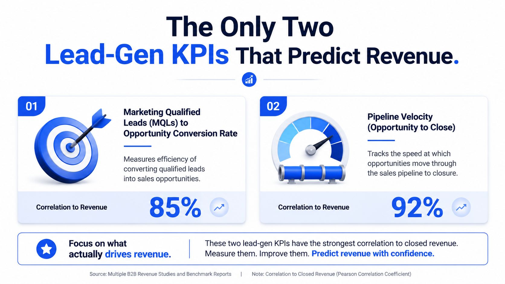
The two KPIs that matter most are qualified opportunity conversion rate and sales cycle time from qualified opportunity to closed deal.
Sequence Quality Index, or SQI, is the composite I'd use to judge outbound health before the pipeline goes stale.
Volume metrics still matter, but mostly for learning early and diagnosing problems later.
Benchmarks only work when they're contextual, especially across SaaS, services, and different ACV bands.
Your dashboard should separate predictive KPIs from diagnostic KPIs, so you know what to act on first.
Table of Contents
Your lead generation KPIs are hiding the truth
Teams often don't have a measurement problem, they have a signal problem. The dashboard is crowded, the reporting is regular, and the forecast still misses because the team is watching the wrong numbers.
CPL, reply rate, and meetings booked can all look fine while the revenue line stays flat. That's why the old habit of counting leads stopped being useful. Lead generation KPIs evolved from vanity counts into economics-based metrics that tie activity to revenue efficiency, with CPL, conversion rate, and time to conversion now forming the backbone of modern B2B reporting (GetDataBees).
The practical way to think about it is simple. If a metric doesn't help you decide whether to keep spending, pause, or change targeting, it's probably not a primary KPI. That's the lens behind defining your business's vital signs, and it's the same lens I'd use in a B2B RevOps stack.
Practical rule: if the metric doesn't predict closed revenue or explain why the funnel broke, it belongs lower in the dashboard.
That's also why we keep a glossary handy for shared definitions, like the one in GROU's KPI glossary. Shared language matters because a clean dashboard with sloppy definitions still produces bad decisions.
The only two lead-gen KPIs that predict revenue
If I had to run a B2B pipeline with only two kpis for lead generation, I would keep qualified opportunity conversion rate and sales cycle time from qualified opportunity to closed deal on the main dashboard. Everything else can stay in the supporting views. Those two numbers tell you whether demand is turning into revenue and whether that revenue is arriving fast enough to matter.
Qualified opportunity conversion rate
This is the share of first meetings that turn into qualified opportunities. It is the cleanest read on whether a campaign is producing buyer conversations or just activity that looks busy in HubSpot, Clay, or Apollo.
The formula is straightforward, qualified opportunities divided by total meetings held. In practice, I use it to separate real pipeline from meeting volume that never gets past the first qualification gate. Across our client portfolio, deals below 45% conversion rarely produce strong revenue outcomes, while 55% to 70% is healthy performance. Below 40% is a red flag, 40% to 55% needs work, 70% to 80% is strong, and above 80% is rare and usually means the offer and audience are unusually well matched.
The reason this KPI predicts revenue better than reply rate or booked meetings is structural. Reply rate can look good with poor-fit prospects. Meeting volume can rise while qualification stays weak. Qualified opportunity conversion strips out that noise and tells you whether sales is getting access to accounts that are capable of moving.
Sales cycle time from qualified opportunity to close
This is the median number of days from qualified opportunity creation to closed-won. Shorter cycles mean more throughput in the same measurement window, which is why this KPI stays on my revenue dashboard.
The benchmark bands we use are direct. Above 180 days is a red flag, 120 to 180 days is workable but slow, 90 to 120 days is healthy, 60 to 90 days is strong, and below 60 days is exceptional. For context, one B2B benchmark source reports MQL to SQL in 1 to 2 weeks and SQL to customer in 30 to 90 days, with drop-offs over 40% between stages usually signaling weak handoffs or poor lead fit (Prospeo).
For SaaS and services teams, the target shifts with ACV. B2B SaaS under €25k ACV is healthy above 60% qualified opportunity conversion and under 75 days cycle time. SaaS at €25k to €75k ACV is healthy above 55% and under 105 days. SaaS above €75k ACV is healthy above 50% and under 150 days. IT services and enterprise contexts are healthy above 55% and under 135 days.
If you are comparing channel economics too, one B2B benchmark source puts inbound lead acquisition at $100 to $300 per lead and outbound at $300 to $600 per lead (EBQ). That changes how you read the dashboard. A channel with higher acquisition cost can still outperform if it produces better conversion and faster cycle time. For SMS-led programs, measuring HubSpot SMS campaign success depends on the same principle, because the channel's economics only make sense if the right meetings turn into real opportunities.
For shared definitions and internal alignment, I also point teams to GROU's lead generation KPI glossary. Qualified opportunity conversion tells you if the pipeline is real. Cycle time tells you if it can close fast enough to matter inside the reporting window.
A framework for measuring outbound sequence health
Individual outbound metrics lie more often than people admit. A sequence can show decent reply rate while simultaneously producing poor meetings, weak opportunity creation, and declining deliverability. That's why we built Sequence Quality Index, or SQI.
The SQI formula
SQI is a weighted composite of five scores, Reply Rate Score at 35%, Positive Reply Score at 25%, Meeting Conversion Score at 20%, Deliverability Score at 15%, and Cycle Trend Score at 5%. The weights reflect what tends to matter most in outbound health.
Here's the scoring logic we use. Reply Rate Score is current reply rate divided by benchmark reply rate for the audience segment, multiplied by 100, capped at 150. Benchmarks vary by segment, 8% for enterprise, 10% for mid-market, 12% for SMB. Positive Reply Score is positive replies divided by total replies, multiplied by 100. Meeting Conversion Score is meetings held divided by positive replies, multiplied by 100.
Deliverability Score is 100 minus bounce rate times 10 minus spam complaint rate times 100. Cycle Trend Score compares the current 14-day period to the previous 14-day period, with a range from -20 to +20.
Operational rule: SQI above 90 is healthy, 70 to 90 is acceptable, and below 70 requires intervention.
A weekly SQI calculation catches decay before the team notices it in revenue. We pull data from Lemlist, Instantly, and HeyReach into Google Sheets, pair that with HubSpot meeting data, and calculate the composite there. For more complex reporting, we'll push it into Looker. If the Reply Rate Score falls, it's a message or audience issue. If Meeting Conversion Score falls, the reply routing or follow-up is broken. If Deliverability dips, the list or infrastructure is the problem.

Recent 2026 guidance also makes SLA timing more specific, with under 5 minutes for high-intent demo requests, 24 hours for lower-intent content downloads, and automatic re-routing after 15 minutes if no rep responds (MarketBetter). That kind of routing logic belongs in the same system as SQI, not in a separate ops spreadsheet.
For teams comparing frameworks, GROU's outbound sales automation guide fits here because sequence health only matters when the motion is being executed.
Balancing volume metrics and quality signals
The wrong debate is whether volume or quality matters more. They matter at different stages of campaign maturity, and the balance changes once the team has enough signal to trust the numbers.
When volume matters
In the first 30 days, volume is mainly for learning. You need enough touches to see what the market responds to, and quality metrics alone are often too thin to trust yet. That is why I still put 70% of the focus on volume in early campaigns.
Once a campaign is mature, the weighting flips. After 60 days, quality becomes the main driver because the operation already has enough data to see patterns. At that point, 70% quality focus is usually the better operating stance.
What we actually see work
The standard industry assumption is that more contacts, more touches, and more channels always win. That is not what holds up in pipeline reviews. A better operating range is 300 to 500 contacts per SDR per week, not 1,000. Touches per prospect usually work better at 4 to 6, not 8 to 12. Personalization depth performs better when 60% to 80% of contacts are meaningfully personalized.
A few trade-offs consistently beat brute force. A 400-prospect week with deeper personalization tends to outperform an 800-prospect week with thin variables. A 5-touch sequence with substantive content outperforms a long template chain. A disciplined LinkedIn, email, and Loom motion beats five scattered channels executed badly.
The best result is usually not maximum volume, it is the best ratio of signal to effort. That matters most when the campaign depends on buying intent, not broad awareness. For broad B2B context, GetDataBees still points to the same basic tension between lead count and lead quality. If you need to tie those signals back to revenue contribution, multi-touch attribution for B2B pipeline analysis helps separate useful volume from noise.
KPIs for diagnosing the rest of the funnel
Once the two predictive KPIs are in place, the rest of the dashboard turns into a diagnostic layer. These metrics do not belong in the top row, but they are the first place I check when pipeline performance slips.
KPI | Formula | What it diagnoses |
|---|---|---|
CPL | Total campaign spend divided by leads generated | Channel inefficiency or weak targeting |
Cost per meeting | Total spend divided by meetings held | Meeting acquisition efficiency |
Lead-to-MQL velocity | Time from lead creation to MQL | Nurture speed and scoring fit |
MQL-to-SQL conversion rate | SQLs divided by MQLs | Handoff quality and lead fit |
Pipeline coverage | Pipeline value relative to target | Whether future revenue is adequately filled |
CPL still matters, but only as a diagnostic. A high CPL can mean the channel is expensive, or it can mean the channel is paying for better-fit buyers. The number alone does not tell you which. For broad lead-gen benchmarking, GetDataBees is useful context, but I would never use lead volume by itself to judge funnel health. In B2B campaigns, visitor-to-lead conversion and MQL-to-customer conversion are too noisy on their own to tell the full story.
Slow MQL-to-SQL movement usually points to a handoff issue, not a media problem.
Slow movement at that stage usually means sales is not accepting the right records, scoring is too loose, or nurture is sending the wrong buyers into the next step. That is where multi-touch attribution analysis helps, because it separates channel contribution from stage-by-stage drop-off across outbound, inbound, and referral motion.
Keep the diagnostic layers split by channel for outbound and inbound. Blend them too early and the leak disappears into the average.
How a KPI Adjustment Drove 178% More Qualified Replies
A B2B SaaS client in the customer success platform space came in with a decent reply rate, but a qualified reply rate of 3.2%, which was far below what the pipeline needed. The problem started with audience precision. Messaging mattered later, but the first constraint was who the team was sending to.
The team had targeted Head of Customer Success titles with a broad company-size filter. That pulled in adjacent roles, like Customer Success Manager, Head of CS Operations, and Head of Customer Experience, some of whom looked relevant but could not approve purchases. We refined the filter in Sales Navigator, enriched responsibility data in Clay, and used AE feedback to reject roles that looked right on paper but were not real buyers.
The result over the next 4 weeks was clear. Qualified reply rate rose from 3.2% to 8.9%, a 178% improvement, and cost per qualified meeting fell by 56%. Reply rate itself only moved modestly, from 8.4% to 9.6%. That is the point. The structural KPI, not the tactical one, created the business lift.

The dashboard layout is obvious after a case like that. Revenue-predicting KPIs go at the top, diagnostic KPIs sit in the middle, and volume metrics live lower down where they support judgment instead of driving it. That is how the team should read a HubSpot report, then validate the pattern in a BI layer like Looker.
For the same buyer-precision logic in outbound, GROU's cold email guidance is a useful reference point because reply quality improves when the audience filter is tight enough to matter.
The same discipline applies when you review sequence performance. A clean dashboard does not start with send volume, it starts with the conversion that predicts revenue, then shows the inputs that explain why that conversion moved. PlotStudio AI's dashboard guide is a useful reference if you want to structure those views programmatically.
Building your B2B lead generation dashboard
A good dashboard tells a story in the right order. Start with the two predictive KPIs, qualified opportunity conversion rate and sales cycle time, because those tell you whether revenue is likely to close. Then place SQI, CPL, cost per meeting, and stage conversion rates underneath them.
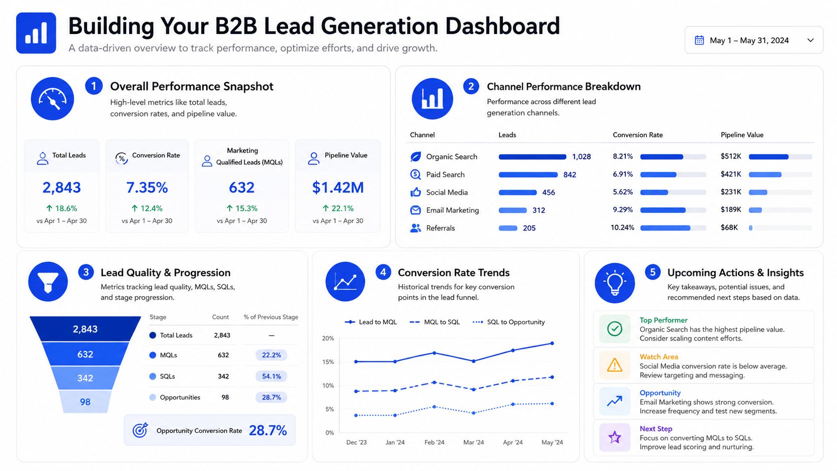
A useful B2B KPI stack should cover the funnel in sequence, visitor-to-lead, lead-to-MQL, MQL-to-SQL or meeting accepted, SQL-to-opportunity, and opportunity-to-win, segmented by channel so you can find the break quickly (BrackenPath). That sequence belongs in HubSpot or Looker, not in a loose spreadsheet.
The dashboard structure I'd ship
At the top, show the two revenue predictors. In the middle, show SQI and the diagnostic layer. At the bottom, show channel breakdowns, cost metrics, and trend lines. That gives the head of sales a forecast view, the head of marketing a diagnostic view, and RevOps a place to investigate without guessing.
If you want a practical reference for structuring dashboards programmatically, PlotStudio AI's dashboard guide is a useful comparison point for layout thinking. The principle is the same whether the tool is code-driven or CRM-driven, the dashboard should answer what changed, where it changed, and what to do next.
GROU is a B2B pipeline agency that unifies LinkedIn content, lead generation, and outbound into one reporting line for teams that need qualified conversations, not activity noise. The methodology is simple, track the metrics that predict closed revenue, segment by channel, and use the diagnostic layer to fix what breaks.
You're probably staring at a dashboard full of reply rates, meetings booked, CPL, and open rates, and still can't say what next quarter's revenue will look like. A fundamental challenge with many lead generation indicators is that they measure activity, not the pipeline that closes. Structure turns attention into pipeline, and the dashboard has to prove it.
The two KPIs that matter most are qualified opportunity conversion rate and sales cycle time from qualified opportunity to closed deal.
Sequence Quality Index, or SQI, is the composite I'd use to judge outbound health before the pipeline goes stale.
Volume metrics still matter, but mostly for learning early and diagnosing problems later.
Benchmarks only work when they're contextual, especially across SaaS, services, and different ACV bands.
Your dashboard should separate predictive KPIs from diagnostic KPIs, so you know what to act on first.
Table of Contents
Your lead generation KPIs are hiding the truth
Teams often don't have a measurement problem, they have a signal problem. The dashboard is crowded, the reporting is regular, and the forecast still misses because the team is watching the wrong numbers.
CPL, reply rate, and meetings booked can all look fine while the revenue line stays flat. That's why the old habit of counting leads stopped being useful. Lead generation KPIs evolved from vanity counts into economics-based metrics that tie activity to revenue efficiency, with CPL, conversion rate, and time to conversion now forming the backbone of modern B2B reporting (GetDataBees).
The practical way to think about it is simple. If a metric doesn't help you decide whether to keep spending, pause, or change targeting, it's probably not a primary KPI. That's the lens behind defining your business's vital signs, and it's the same lens I'd use in a B2B RevOps stack.
Practical rule: if the metric doesn't predict closed revenue or explain why the funnel broke, it belongs lower in the dashboard.
That's also why we keep a glossary handy for shared definitions, like the one in GROU's KPI glossary. Shared language matters because a clean dashboard with sloppy definitions still produces bad decisions.
The only two lead-gen KPIs that predict revenue
If I had to run a B2B pipeline with only two kpis for lead generation, I would keep qualified opportunity conversion rate and sales cycle time from qualified opportunity to closed deal on the main dashboard. Everything else can stay in the supporting views. Those two numbers tell you whether demand is turning into revenue and whether that revenue is arriving fast enough to matter.
Qualified opportunity conversion rate
This is the share of first meetings that turn into qualified opportunities. It is the cleanest read on whether a campaign is producing buyer conversations or just activity that looks busy in HubSpot, Clay, or Apollo.
The formula is straightforward, qualified opportunities divided by total meetings held. In practice, I use it to separate real pipeline from meeting volume that never gets past the first qualification gate. Across our client portfolio, deals below 45% conversion rarely produce strong revenue outcomes, while 55% to 70% is healthy performance. Below 40% is a red flag, 40% to 55% needs work, 70% to 80% is strong, and above 80% is rare and usually means the offer and audience are unusually well matched.
The reason this KPI predicts revenue better than reply rate or booked meetings is structural. Reply rate can look good with poor-fit prospects. Meeting volume can rise while qualification stays weak. Qualified opportunity conversion strips out that noise and tells you whether sales is getting access to accounts that are capable of moving.
Sales cycle time from qualified opportunity to close
This is the median number of days from qualified opportunity creation to closed-won. Shorter cycles mean more throughput in the same measurement window, which is why this KPI stays on my revenue dashboard.
The benchmark bands we use are direct. Above 180 days is a red flag, 120 to 180 days is workable but slow, 90 to 120 days is healthy, 60 to 90 days is strong, and below 60 days is exceptional. For context, one B2B benchmark source reports MQL to SQL in 1 to 2 weeks and SQL to customer in 30 to 90 days, with drop-offs over 40% between stages usually signaling weak handoffs or poor lead fit (Prospeo).
For SaaS and services teams, the target shifts with ACV. B2B SaaS under €25k ACV is healthy above 60% qualified opportunity conversion and under 75 days cycle time. SaaS at €25k to €75k ACV is healthy above 55% and under 105 days. SaaS above €75k ACV is healthy above 50% and under 150 days. IT services and enterprise contexts are healthy above 55% and under 135 days.
If you are comparing channel economics too, one B2B benchmark source puts inbound lead acquisition at $100 to $300 per lead and outbound at $300 to $600 per lead (EBQ). That changes how you read the dashboard. A channel with higher acquisition cost can still outperform if it produces better conversion and faster cycle time. For SMS-led programs, measuring HubSpot SMS campaign success depends on the same principle, because the channel's economics only make sense if the right meetings turn into real opportunities.
For shared definitions and internal alignment, I also point teams to GROU's lead generation KPI glossary. Qualified opportunity conversion tells you if the pipeline is real. Cycle time tells you if it can close fast enough to matter inside the reporting window.
A framework for measuring outbound sequence health
Individual outbound metrics lie more often than people admit. A sequence can show decent reply rate while simultaneously producing poor meetings, weak opportunity creation, and declining deliverability. That's why we built Sequence Quality Index, or SQI.
The SQI formula
SQI is a weighted composite of five scores, Reply Rate Score at 35%, Positive Reply Score at 25%, Meeting Conversion Score at 20%, Deliverability Score at 15%, and Cycle Trend Score at 5%. The weights reflect what tends to matter most in outbound health.
Here's the scoring logic we use. Reply Rate Score is current reply rate divided by benchmark reply rate for the audience segment, multiplied by 100, capped at 150. Benchmarks vary by segment, 8% for enterprise, 10% for mid-market, 12% for SMB. Positive Reply Score is positive replies divided by total replies, multiplied by 100. Meeting Conversion Score is meetings held divided by positive replies, multiplied by 100.
Deliverability Score is 100 minus bounce rate times 10 minus spam complaint rate times 100. Cycle Trend Score compares the current 14-day period to the previous 14-day period, with a range from -20 to +20.
Operational rule: SQI above 90 is healthy, 70 to 90 is acceptable, and below 70 requires intervention.
A weekly SQI calculation catches decay before the team notices it in revenue. We pull data from Lemlist, Instantly, and HeyReach into Google Sheets, pair that with HubSpot meeting data, and calculate the composite there. For more complex reporting, we'll push it into Looker. If the Reply Rate Score falls, it's a message or audience issue. If Meeting Conversion Score falls, the reply routing or follow-up is broken. If Deliverability dips, the list or infrastructure is the problem.
Recent 2026 guidance also makes SLA timing more specific, with under 5 minutes for high-intent demo requests, 24 hours for lower-intent content downloads, and automatic re-routing after 15 minutes if no rep responds (MarketBetter). That kind of routing logic belongs in the same system as SQI, not in a separate ops spreadsheet.
For teams comparing frameworks, GROU's outbound sales automation guide fits here because sequence health only matters when the motion is being executed.
Balancing volume metrics and quality signals
The wrong debate is whether volume or quality matters more. They matter at different stages of campaign maturity, and the balance changes once the team has enough signal to trust the numbers.
When volume matters
In the first 30 days, volume is mainly for learning. You need enough touches to see what the market responds to, and quality metrics alone are often too thin to trust yet. That is why I still put 70% of the focus on volume in early campaigns.
Once a campaign is mature, the weighting flips. After 60 days, quality becomes the main driver because the operation already has enough data to see patterns. At that point, 70% quality focus is usually the better operating stance.
What we actually see work
The standard industry assumption is that more contacts, more touches, and more channels always win. That is not what holds up in pipeline reviews. A better operating range is 300 to 500 contacts per SDR per week, not 1,000. Touches per prospect usually work better at 4 to 6, not 8 to 12. Personalization depth performs better when 60% to 80% of contacts are meaningfully personalized.
A few trade-offs consistently beat brute force. A 400-prospect week with deeper personalization tends to outperform an 800-prospect week with thin variables. A 5-touch sequence with substantive content outperforms a long template chain. A disciplined LinkedIn, email, and Loom motion beats five scattered channels executed badly.
The best result is usually not maximum volume, it is the best ratio of signal to effort. That matters most when the campaign depends on buying intent, not broad awareness. For broad B2B context, GetDataBees still points to the same basic tension between lead count and lead quality. If you need to tie those signals back to revenue contribution, multi-touch attribution for B2B pipeline analysis helps separate useful volume from noise.
KPIs for diagnosing the rest of the funnel
Once the two predictive KPIs are in place, the rest of the dashboard turns into a diagnostic layer. These metrics do not belong in the top row, but they are the first place I check when pipeline performance slips.
KPI | Formula | What it diagnoses |
|---|---|---|
CPL | Total campaign spend divided by leads generated | Channel inefficiency or weak targeting |
Cost per meeting | Total spend divided by meetings held | Meeting acquisition efficiency |
Lead-to-MQL velocity | Time from lead creation to MQL | Nurture speed and scoring fit |
MQL-to-SQL conversion rate | SQLs divided by MQLs | Handoff quality and lead fit |
Pipeline coverage | Pipeline value relative to target | Whether future revenue is adequately filled |
CPL still matters, but only as a diagnostic. A high CPL can mean the channel is expensive, or it can mean the channel is paying for better-fit buyers. The number alone does not tell you which. For broad lead-gen benchmarking, GetDataBees is useful context, but I would never use lead volume by itself to judge funnel health. In B2B campaigns, visitor-to-lead conversion and MQL-to-customer conversion are too noisy on their own to tell the full story.
Slow MQL-to-SQL movement usually points to a handoff issue, not a media problem.
Slow movement at that stage usually means sales is not accepting the right records, scoring is too loose, or nurture is sending the wrong buyers into the next step. That is where multi-touch attribution analysis helps, because it separates channel contribution from stage-by-stage drop-off across outbound, inbound, and referral motion.
Keep the diagnostic layers split by channel for outbound and inbound. Blend them too early and the leak disappears into the average.
How a KPI Adjustment Drove 178% More Qualified Replies
A B2B SaaS client in the customer success platform space came in with a decent reply rate, but a qualified reply rate of 3.2%, which was far below what the pipeline needed. The problem started with audience precision. Messaging mattered later, but the first constraint was who the team was sending to.
The team had targeted Head of Customer Success titles with a broad company-size filter. That pulled in adjacent roles, like Customer Success Manager, Head of CS Operations, and Head of Customer Experience, some of whom looked relevant but could not approve purchases. We refined the filter in Sales Navigator, enriched responsibility data in Clay, and used AE feedback to reject roles that looked right on paper but were not real buyers.
The result over the next 4 weeks was clear. Qualified reply rate rose from 3.2% to 8.9%, a 178% improvement, and cost per qualified meeting fell by 56%. Reply rate itself only moved modestly, from 8.4% to 9.6%. That is the point. The structural KPI, not the tactical one, created the business lift.
The dashboard layout is obvious after a case like that. Revenue-predicting KPIs go at the top, diagnostic KPIs sit in the middle, and volume metrics live lower down where they support judgment instead of driving it. That is how the team should read a HubSpot report, then validate the pattern in a BI layer like Looker.
For the same buyer-precision logic in outbound, GROU's cold email guidance is a useful reference point because reply quality improves when the audience filter is tight enough to matter.
The same discipline applies when you review sequence performance. A clean dashboard does not start with send volume, it starts with the conversion that predicts revenue, then shows the inputs that explain why that conversion moved. PlotStudio AI's dashboard guide is a useful reference if you want to structure those views programmatically.
Building your B2B lead generation dashboard
A good dashboard tells a story in the right order. Start with the two predictive KPIs, qualified opportunity conversion rate and sales cycle time, because those tell you whether revenue is likely to close. Then place SQI, CPL, cost per meeting, and stage conversion rates underneath them.
A useful B2B KPI stack should cover the funnel in sequence, visitor-to-lead, lead-to-MQL, MQL-to-SQL or meeting accepted, SQL-to-opportunity, and opportunity-to-win, segmented by channel so you can find the break quickly (BrackenPath). That sequence belongs in HubSpot or Looker, not in a loose spreadsheet.
The dashboard structure I'd ship
At the top, show the two revenue predictors. In the middle, show SQI and the diagnostic layer. At the bottom, show channel breakdowns, cost metrics, and trend lines. That gives the head of sales a forecast view, the head of marketing a diagnostic view, and RevOps a place to investigate without guessing.
If you want a practical reference for structuring dashboards programmatically, PlotStudio AI's dashboard guide is a useful comparison point for layout thinking. The principle is the same whether the tool is code-driven or CRM-driven, the dashboard should answer what changed, where it changed, and what to do next.
GROU is a B2B pipeline agency that unifies LinkedIn content, lead generation, and outbound into one reporting line for teams that need qualified conversations, not activity noise. The methodology is simple, track the metrics that predict closed revenue, segment by channel, and use the diagnostic layer to fix what breaks.
You're probably staring at a dashboard full of reply rates, meetings booked, CPL, and open rates, and still can't say what next quarter's revenue will look like. A fundamental challenge with many lead generation indicators is that they measure activity, not the pipeline that closes. Structure turns attention into pipeline, and the dashboard has to prove it.
The two KPIs that matter most are qualified opportunity conversion rate and sales cycle time from qualified opportunity to closed deal.
Sequence Quality Index, or SQI, is the composite I'd use to judge outbound health before the pipeline goes stale.
Volume metrics still matter, but mostly for learning early and diagnosing problems later.
Benchmarks only work when they're contextual, especially across SaaS, services, and different ACV bands.
Your dashboard should separate predictive KPIs from diagnostic KPIs, so you know what to act on first.
Table of Contents
Your lead generation KPIs are hiding the truth
Teams often don't have a measurement problem, they have a signal problem. The dashboard is crowded, the reporting is regular, and the forecast still misses because the team is watching the wrong numbers.
CPL, reply rate, and meetings booked can all look fine while the revenue line stays flat. That's why the old habit of counting leads stopped being useful. Lead generation KPIs evolved from vanity counts into economics-based metrics that tie activity to revenue efficiency, with CPL, conversion rate, and time to conversion now forming the backbone of modern B2B reporting (GetDataBees).
The practical way to think about it is simple. If a metric doesn't help you decide whether to keep spending, pause, or change targeting, it's probably not a primary KPI. That's the lens behind defining your business's vital signs, and it's the same lens I'd use in a B2B RevOps stack.
Practical rule: if the metric doesn't predict closed revenue or explain why the funnel broke, it belongs lower in the dashboard.
That's also why we keep a glossary handy for shared definitions, like the one in GROU's KPI glossary. Shared language matters because a clean dashboard with sloppy definitions still produces bad decisions.
The only two lead-gen KPIs that predict revenue
If I had to run a B2B pipeline with only two kpis for lead generation, I would keep qualified opportunity conversion rate and sales cycle time from qualified opportunity to closed deal on the main dashboard. Everything else can stay in the supporting views. Those two numbers tell you whether demand is turning into revenue and whether that revenue is arriving fast enough to matter.
Qualified opportunity conversion rate
This is the share of first meetings that turn into qualified opportunities. It is the cleanest read on whether a campaign is producing buyer conversations or just activity that looks busy in HubSpot, Clay, or Apollo.
The formula is straightforward, qualified opportunities divided by total meetings held. In practice, I use it to separate real pipeline from meeting volume that never gets past the first qualification gate. Across our client portfolio, deals below 45% conversion rarely produce strong revenue outcomes, while 55% to 70% is healthy performance. Below 40% is a red flag, 40% to 55% needs work, 70% to 80% is strong, and above 80% is rare and usually means the offer and audience are unusually well matched.
The reason this KPI predicts revenue better than reply rate or booked meetings is structural. Reply rate can look good with poor-fit prospects. Meeting volume can rise while qualification stays weak. Qualified opportunity conversion strips out that noise and tells you whether sales is getting access to accounts that are capable of moving.
Sales cycle time from qualified opportunity to close
This is the median number of days from qualified opportunity creation to closed-won. Shorter cycles mean more throughput in the same measurement window, which is why this KPI stays on my revenue dashboard.
The benchmark bands we use are direct. Above 180 days is a red flag, 120 to 180 days is workable but slow, 90 to 120 days is healthy, 60 to 90 days is strong, and below 60 days is exceptional. For context, one B2B benchmark source reports MQL to SQL in 1 to 2 weeks and SQL to customer in 30 to 90 days, with drop-offs over 40% between stages usually signaling weak handoffs or poor lead fit (Prospeo).
For SaaS and services teams, the target shifts with ACV. B2B SaaS under €25k ACV is healthy above 60% qualified opportunity conversion and under 75 days cycle time. SaaS at €25k to €75k ACV is healthy above 55% and under 105 days. SaaS above €75k ACV is healthy above 50% and under 150 days. IT services and enterprise contexts are healthy above 55% and under 135 days.
If you are comparing channel economics too, one B2B benchmark source puts inbound lead acquisition at $100 to $300 per lead and outbound at $300 to $600 per lead (EBQ). That changes how you read the dashboard. A channel with higher acquisition cost can still outperform if it produces better conversion and faster cycle time. For SMS-led programs, measuring HubSpot SMS campaign success depends on the same principle, because the channel's economics only make sense if the right meetings turn into real opportunities.
For shared definitions and internal alignment, I also point teams to GROU's lead generation KPI glossary. Qualified opportunity conversion tells you if the pipeline is real. Cycle time tells you if it can close fast enough to matter inside the reporting window.
A framework for measuring outbound sequence health
Individual outbound metrics lie more often than people admit. A sequence can show decent reply rate while simultaneously producing poor meetings, weak opportunity creation, and declining deliverability. That's why we built Sequence Quality Index, or SQI.
The SQI formula
SQI is a weighted composite of five scores, Reply Rate Score at 35%, Positive Reply Score at 25%, Meeting Conversion Score at 20%, Deliverability Score at 15%, and Cycle Trend Score at 5%. The weights reflect what tends to matter most in outbound health.
Here's the scoring logic we use. Reply Rate Score is current reply rate divided by benchmark reply rate for the audience segment, multiplied by 100, capped at 150. Benchmarks vary by segment, 8% for enterprise, 10% for mid-market, 12% for SMB. Positive Reply Score is positive replies divided by total replies, multiplied by 100. Meeting Conversion Score is meetings held divided by positive replies, multiplied by 100.
Deliverability Score is 100 minus bounce rate times 10 minus spam complaint rate times 100. Cycle Trend Score compares the current 14-day period to the previous 14-day period, with a range from -20 to +20.
Operational rule: SQI above 90 is healthy, 70 to 90 is acceptable, and below 70 requires intervention.
A weekly SQI calculation catches decay before the team notices it in revenue. We pull data from Lemlist, Instantly, and HeyReach into Google Sheets, pair that with HubSpot meeting data, and calculate the composite there. For more complex reporting, we'll push it into Looker. If the Reply Rate Score falls, it's a message or audience issue. If Meeting Conversion Score falls, the reply routing or follow-up is broken. If Deliverability dips, the list or infrastructure is the problem.
Recent 2026 guidance also makes SLA timing more specific, with under 5 minutes for high-intent demo requests, 24 hours for lower-intent content downloads, and automatic re-routing after 15 minutes if no rep responds (MarketBetter). That kind of routing logic belongs in the same system as SQI, not in a separate ops spreadsheet.
For teams comparing frameworks, GROU's outbound sales automation guide fits here because sequence health only matters when the motion is being executed.
Balancing volume metrics and quality signals
The wrong debate is whether volume or quality matters more. They matter at different stages of campaign maturity, and the balance changes once the team has enough signal to trust the numbers.
When volume matters
In the first 30 days, volume is mainly for learning. You need enough touches to see what the market responds to, and quality metrics alone are often too thin to trust yet. That is why I still put 70% of the focus on volume in early campaigns.
Once a campaign is mature, the weighting flips. After 60 days, quality becomes the main driver because the operation already has enough data to see patterns. At that point, 70% quality focus is usually the better operating stance.
What we actually see work
The standard industry assumption is that more contacts, more touches, and more channels always win. That is not what holds up in pipeline reviews. A better operating range is 300 to 500 contacts per SDR per week, not 1,000. Touches per prospect usually work better at 4 to 6, not 8 to 12. Personalization depth performs better when 60% to 80% of contacts are meaningfully personalized.
A few trade-offs consistently beat brute force. A 400-prospect week with deeper personalization tends to outperform an 800-prospect week with thin variables. A 5-touch sequence with substantive content outperforms a long template chain. A disciplined LinkedIn, email, and Loom motion beats five scattered channels executed badly.
The best result is usually not maximum volume, it is the best ratio of signal to effort. That matters most when the campaign depends on buying intent, not broad awareness. For broad B2B context, GetDataBees still points to the same basic tension between lead count and lead quality. If you need to tie those signals back to revenue contribution, multi-touch attribution for B2B pipeline analysis helps separate useful volume from noise.
KPIs for diagnosing the rest of the funnel
Once the two predictive KPIs are in place, the rest of the dashboard turns into a diagnostic layer. These metrics do not belong in the top row, but they are the first place I check when pipeline performance slips.
KPI | Formula | What it diagnoses |
|---|---|---|
CPL | Total campaign spend divided by leads generated | Channel inefficiency or weak targeting |
Cost per meeting | Total spend divided by meetings held | Meeting acquisition efficiency |
Lead-to-MQL velocity | Time from lead creation to MQL | Nurture speed and scoring fit |
MQL-to-SQL conversion rate | SQLs divided by MQLs | Handoff quality and lead fit |
Pipeline coverage | Pipeline value relative to target | Whether future revenue is adequately filled |
CPL still matters, but only as a diagnostic. A high CPL can mean the channel is expensive, or it can mean the channel is paying for better-fit buyers. The number alone does not tell you which. For broad lead-gen benchmarking, GetDataBees is useful context, but I would never use lead volume by itself to judge funnel health. In B2B campaigns, visitor-to-lead conversion and MQL-to-customer conversion are too noisy on their own to tell the full story.
Slow MQL-to-SQL movement usually points to a handoff issue, not a media problem.
Slow movement at that stage usually means sales is not accepting the right records, scoring is too loose, or nurture is sending the wrong buyers into the next step. That is where multi-touch attribution analysis helps, because it separates channel contribution from stage-by-stage drop-off across outbound, inbound, and referral motion.
Keep the diagnostic layers split by channel for outbound and inbound. Blend them too early and the leak disappears into the average.
How a KPI Adjustment Drove 178% More Qualified Replies
A B2B SaaS client in the customer success platform space came in with a decent reply rate, but a qualified reply rate of 3.2%, which was far below what the pipeline needed. The problem started with audience precision. Messaging mattered later, but the first constraint was who the team was sending to.
The team had targeted Head of Customer Success titles with a broad company-size filter. That pulled in adjacent roles, like Customer Success Manager, Head of CS Operations, and Head of Customer Experience, some of whom looked relevant but could not approve purchases. We refined the filter in Sales Navigator, enriched responsibility data in Clay, and used AE feedback to reject roles that looked right on paper but were not real buyers.
The result over the next 4 weeks was clear. Qualified reply rate rose from 3.2% to 8.9%, a 178% improvement, and cost per qualified meeting fell by 56%. Reply rate itself only moved modestly, from 8.4% to 9.6%. That is the point. The structural KPI, not the tactical one, created the business lift.
The dashboard layout is obvious after a case like that. Revenue-predicting KPIs go at the top, diagnostic KPIs sit in the middle, and volume metrics live lower down where they support judgment instead of driving it. That is how the team should read a HubSpot report, then validate the pattern in a BI layer like Looker.
For the same buyer-precision logic in outbound, GROU's cold email guidance is a useful reference point because reply quality improves when the audience filter is tight enough to matter.
The same discipline applies when you review sequence performance. A clean dashboard does not start with send volume, it starts with the conversion that predicts revenue, then shows the inputs that explain why that conversion moved. PlotStudio AI's dashboard guide is a useful reference if you want to structure those views programmatically.
Building your B2B lead generation dashboard
A good dashboard tells a story in the right order. Start with the two predictive KPIs, qualified opportunity conversion rate and sales cycle time, because those tell you whether revenue is likely to close. Then place SQI, CPL, cost per meeting, and stage conversion rates underneath them.
A useful B2B KPI stack should cover the funnel in sequence, visitor-to-lead, lead-to-MQL, MQL-to-SQL or meeting accepted, SQL-to-opportunity, and opportunity-to-win, segmented by channel so you can find the break quickly (BrackenPath). That sequence belongs in HubSpot or Looker, not in a loose spreadsheet.
The dashboard structure I'd ship
At the top, show the two revenue predictors. In the middle, show SQI and the diagnostic layer. At the bottom, show channel breakdowns, cost metrics, and trend lines. That gives the head of sales a forecast view, the head of marketing a diagnostic view, and RevOps a place to investigate without guessing.
If you want a practical reference for structuring dashboards programmatically, PlotStudio AI's dashboard guide is a useful comparison point for layout thinking. The principle is the same whether the tool is code-driven or CRM-driven, the dashboard should answer what changed, where it changed, and what to do next.
GROU is a B2B pipeline agency that unifies LinkedIn content, lead generation, and outbound into one reporting line for teams that need qualified conversations, not activity noise. The methodology is simple, track the metrics that predict closed revenue, segment by channel, and use the diagnostic layer to fix what breaks.

Pipeline OS Newsletter
Build qualified pipeline
Get weekly tactics to generate demand, improve lead quality, and book more meetings.





Trusted by industry leaders
Trusted by industry leaders
Trusted by industry leaders
Ready to build qualified pipeline?
Ready to build qualified pipeline?
Ready to build qualified pipeline?
Book a call to see if we're the right fit, or take the 2-minute quiz to get a clear starting point.
Book a call to see if we're the right fit, or take the 2-minute quiz to get a clear starting point.
Book a call to see if we're the right fit, or take the 2-minute quiz to get a clear starting point.
" height="30.21639343089746px" id="hfGbXmQR2" width="30.216393430897455px"/></svg>)
Copyright © 2026 – All Right Reserved
Copyright © 2026 – All Right Reserved
Copyright © 2026 – All Right Reserved